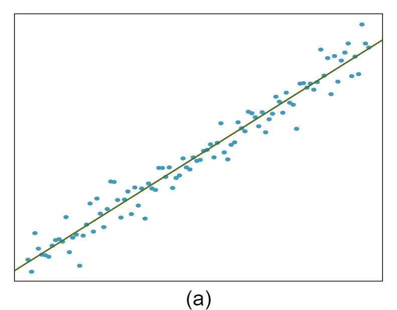
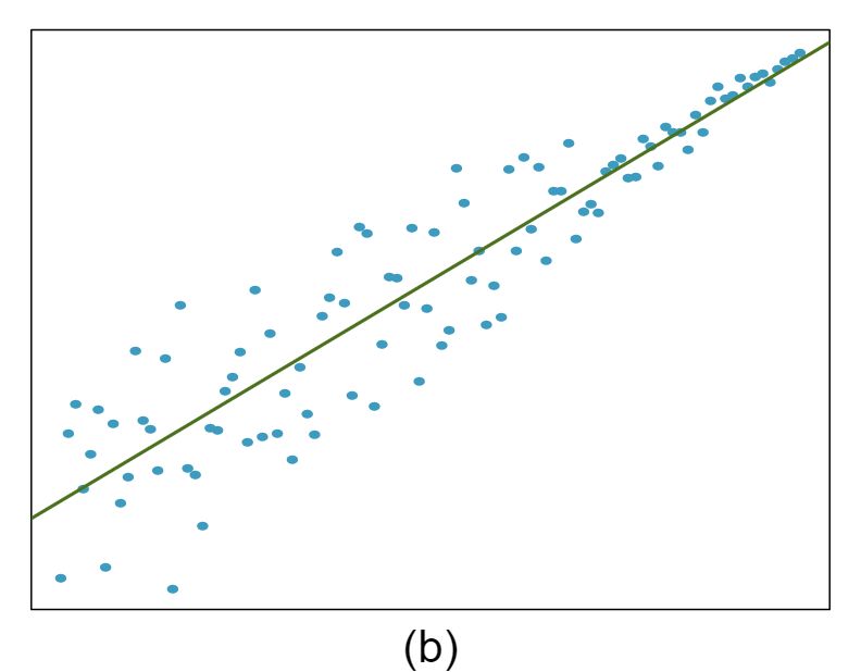
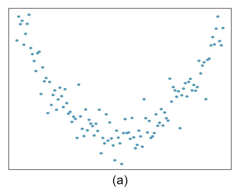
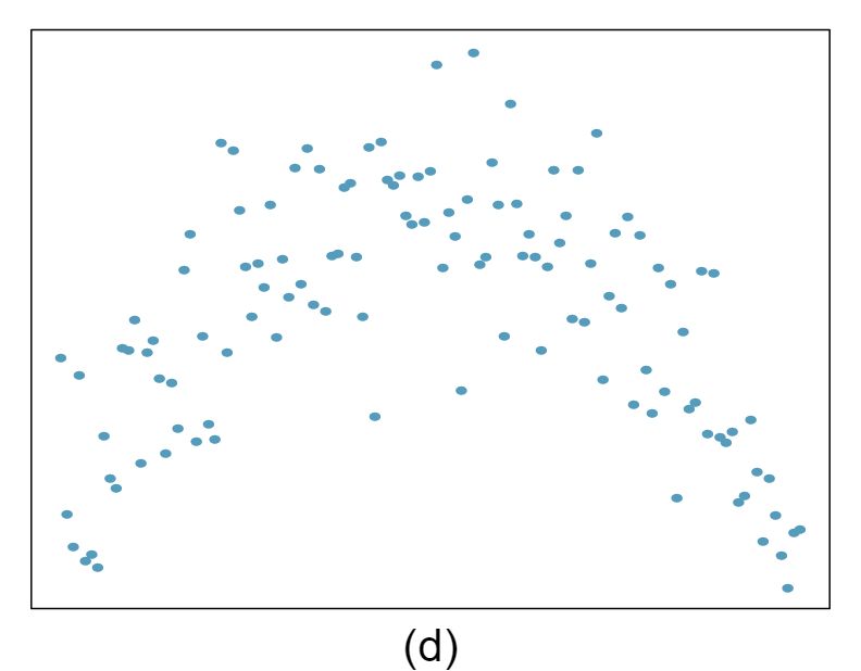
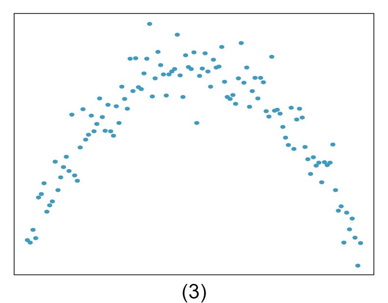
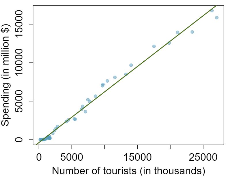
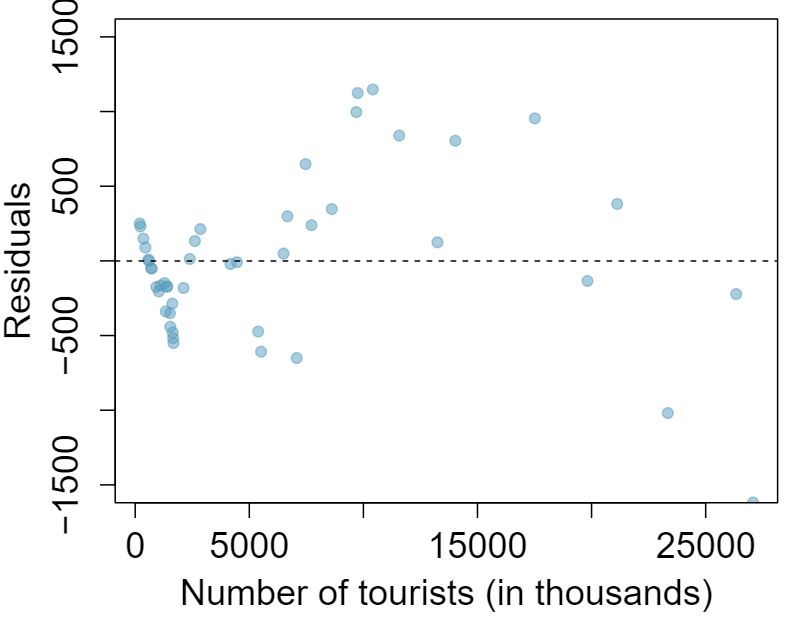
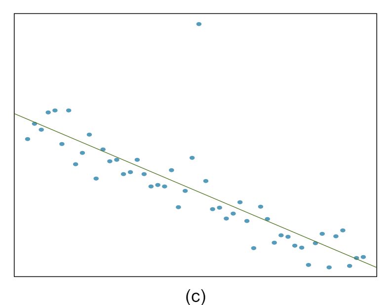
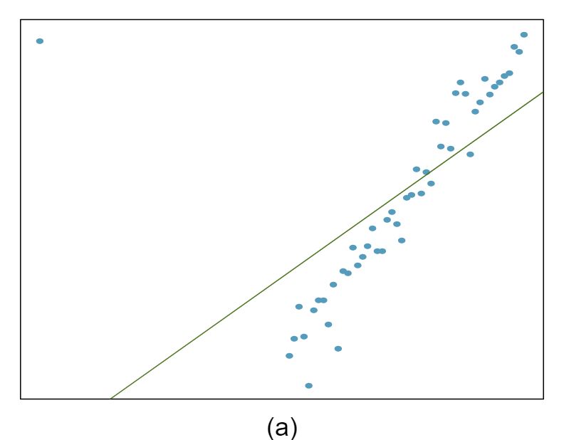
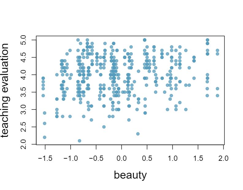
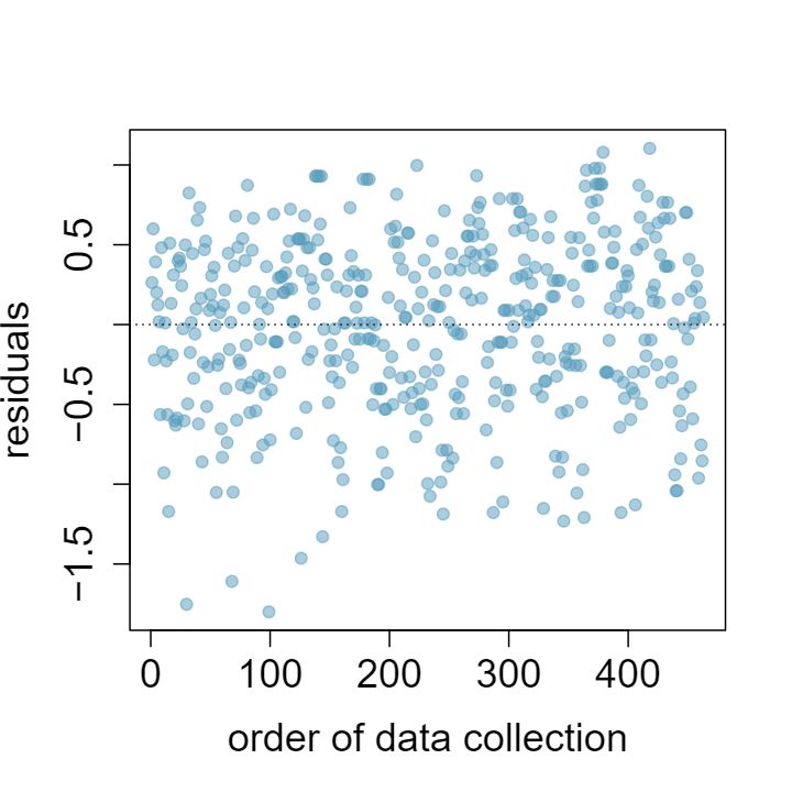
1 Visualize the residuals
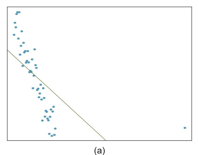
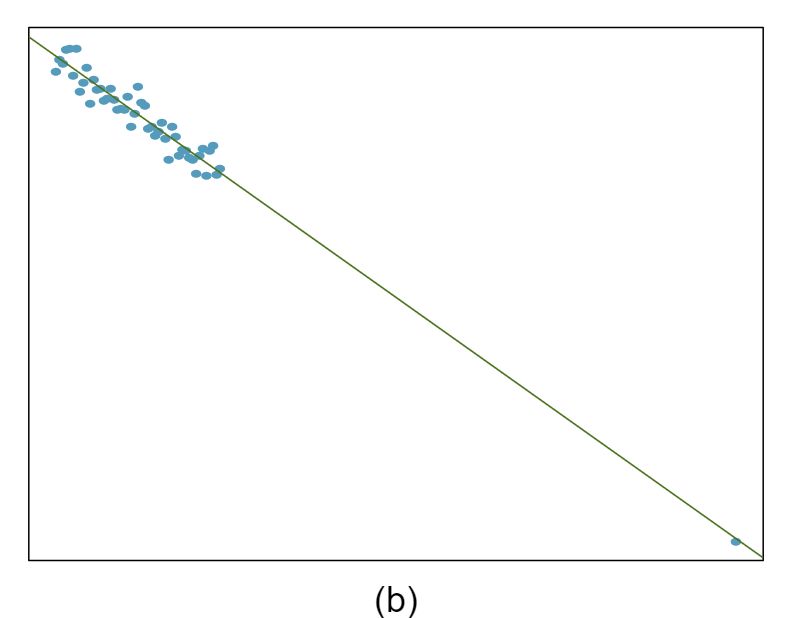
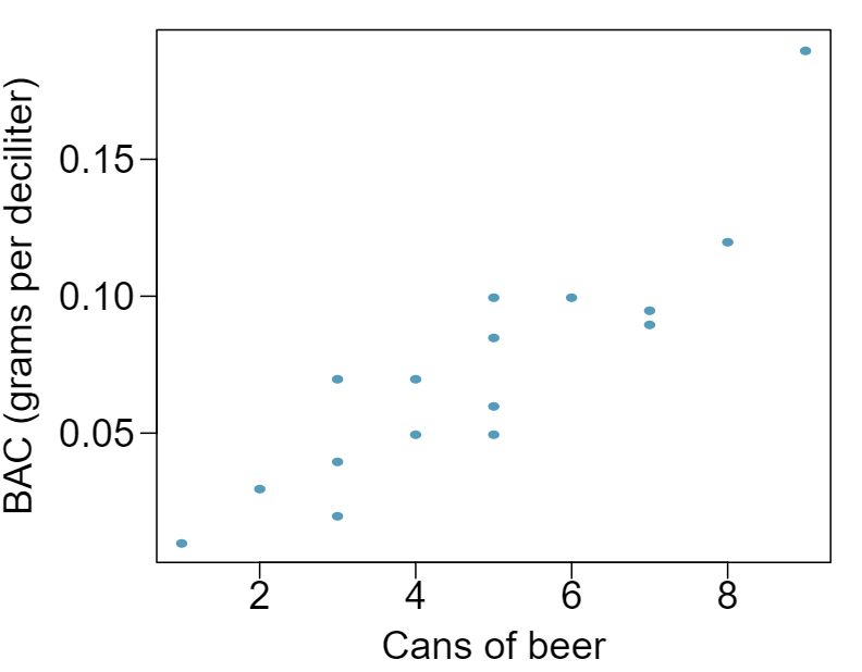
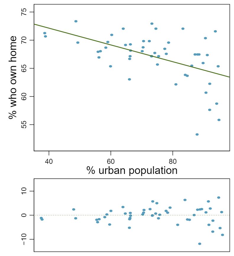
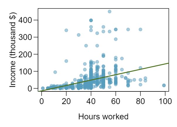
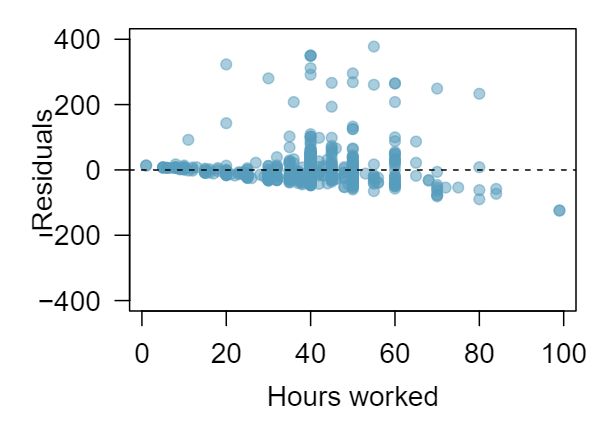
The scatterplots shown below each have a superimposed regression line. If we were to construct a residual plot (residuals versus \(x\)) for each, describe what those plots would look like.
Answer 1The residual plot will show randomly distributed residuals around 0. The variance is also approximately constant.
The residuals will show a fan shape, with higher variability for smaller \(x\text{.}\) There will also be many points on the right above the line. There is trouble with the model being fit here.
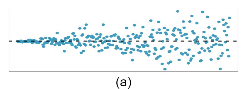
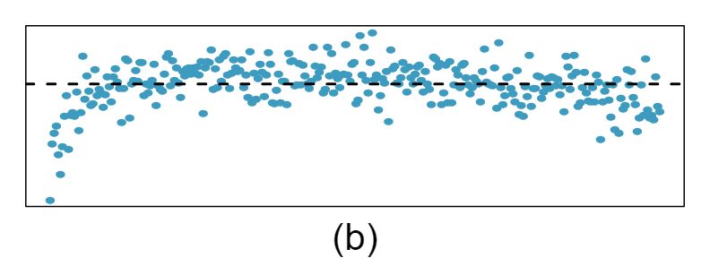
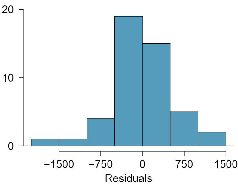
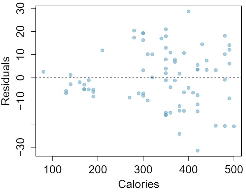
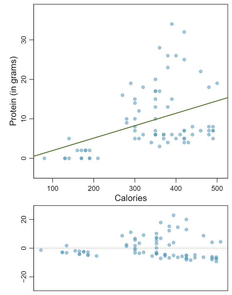
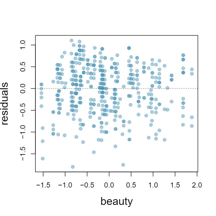
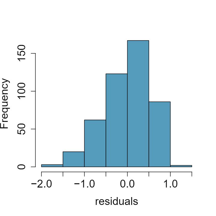
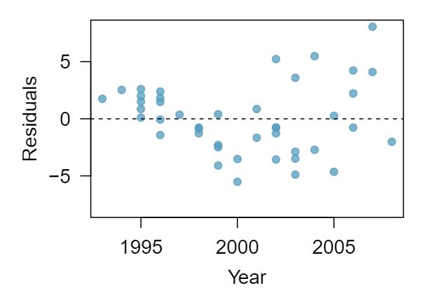
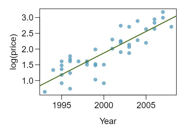
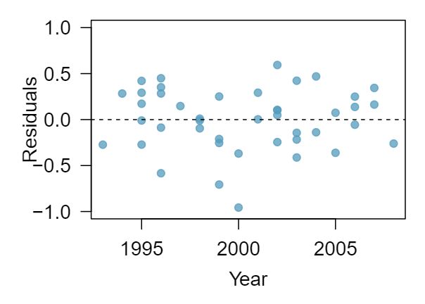
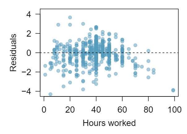
2 Trends in the residuals
Shown below are two plots of residuals remaining after fitting a linear model to two different sets of data. Describe important features and determine if a linear model would be appropriate for these data. Explain your reasoning.
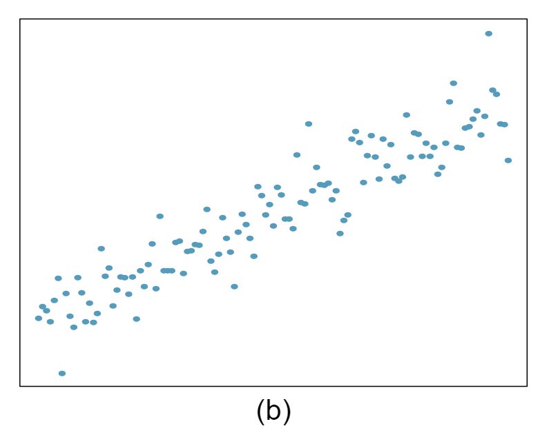
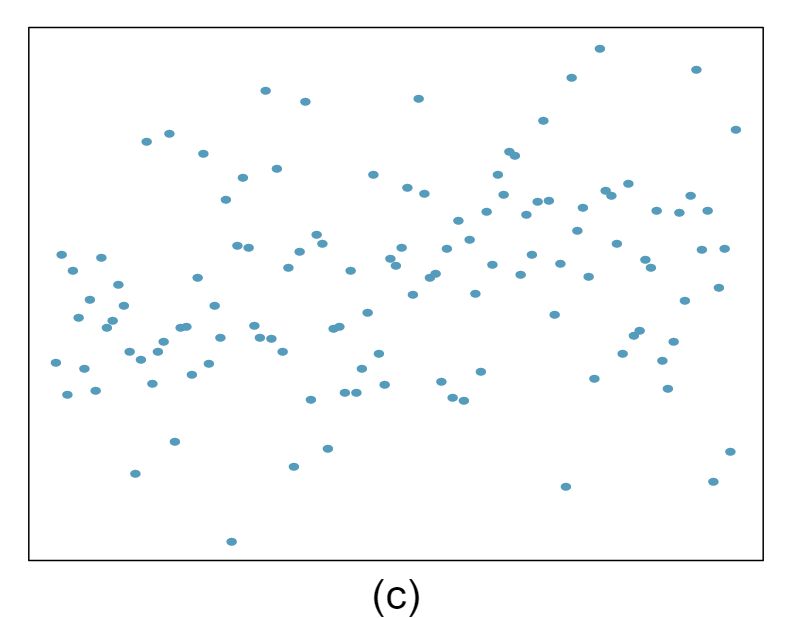
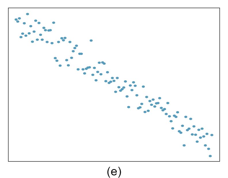
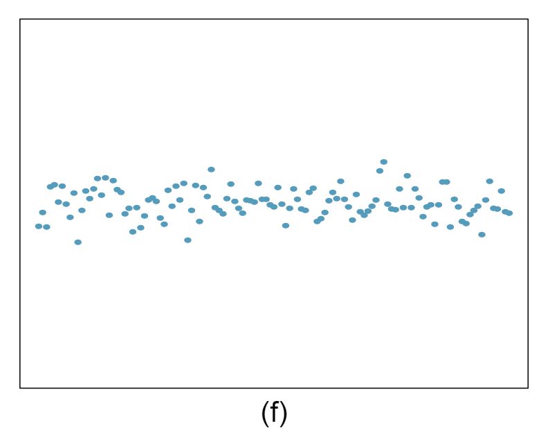
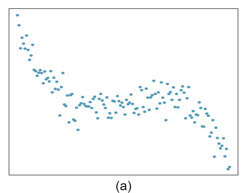
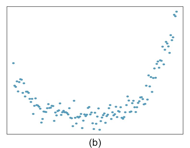
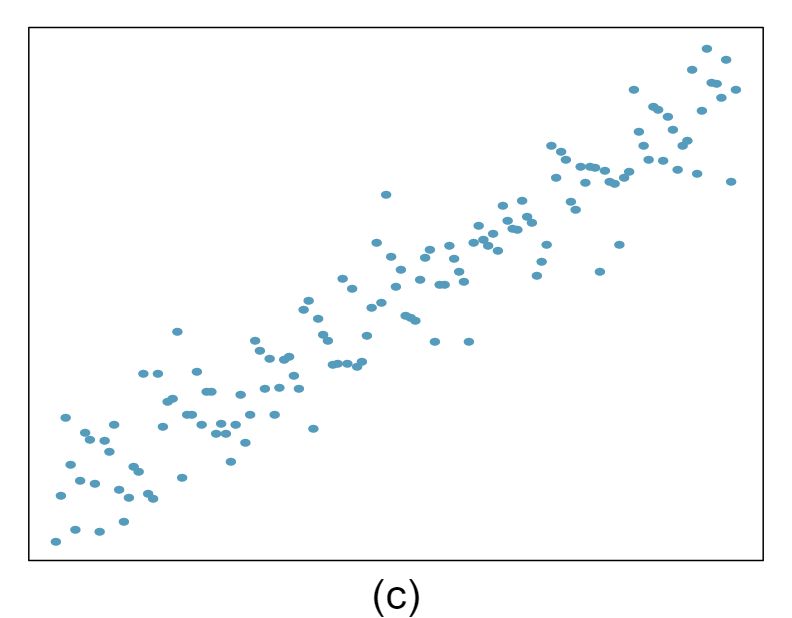
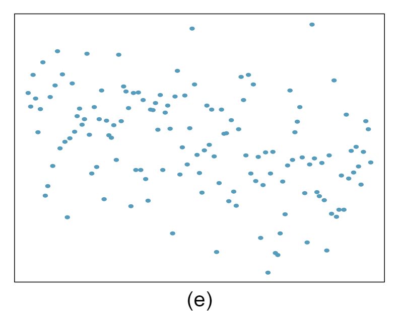
3 Identify relationships, Part I
For each of the six plots, identify the strength of the relationship (e.g. weak, moderate, or strong) in the data and whether fitting a linear model would be reasonable.
Answer 1Strong relationship, but a straight line would not fit the data.
Strong relationship, and a linear fit would be reasonable.
Weak relationship, and trying a linear fit would be reasonable.
Moderate relationship, but a straight line would not fit the data. (e) Strong relationship, and a linear fit would be reasonable.
Strong relationship, and a linear fit would be reasonable.
Weak relationship, and trying a linear fit would be reasonable.
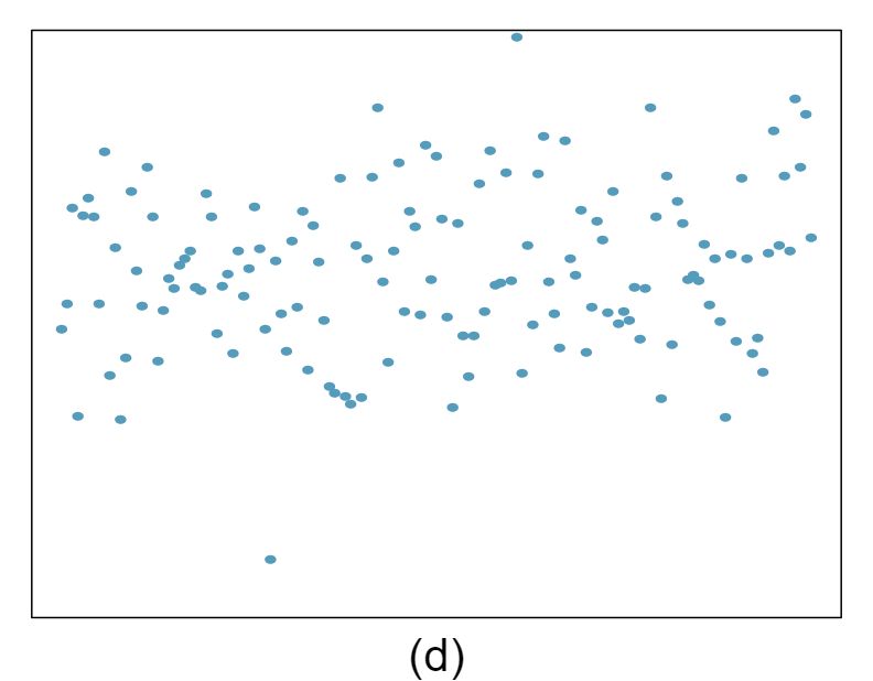
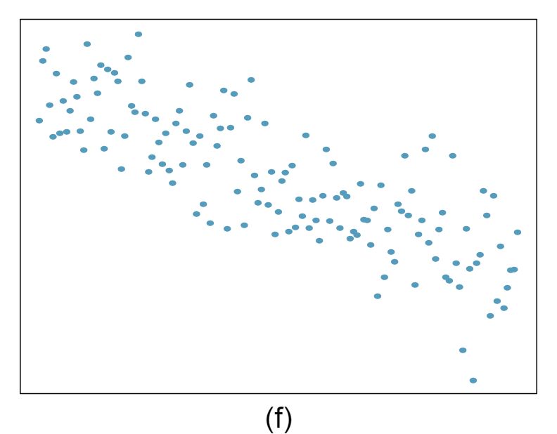
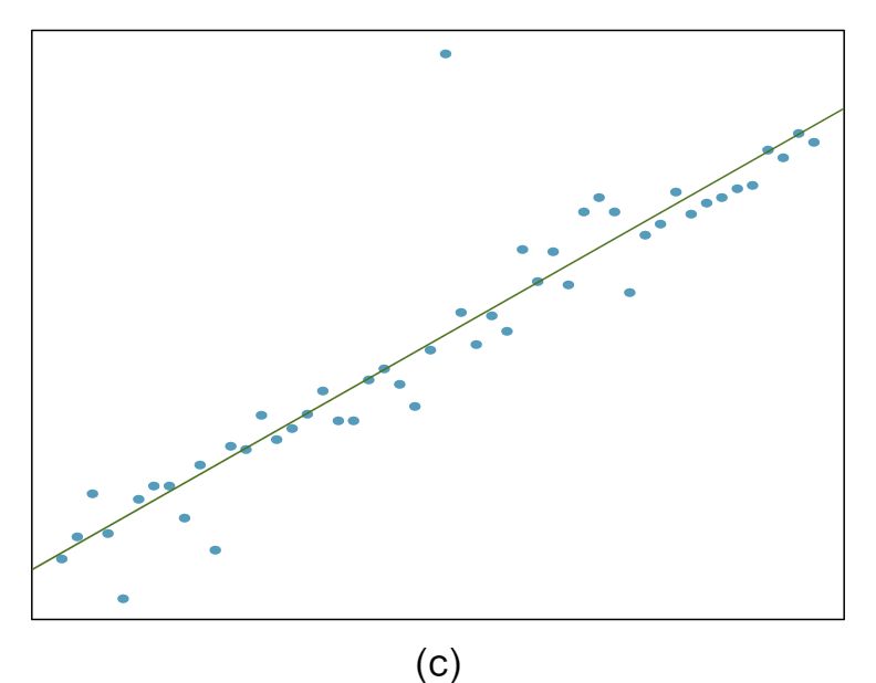
4 Identify relationships, Part II
For each of the six plots, identify the strength of the relationship (e.g. weak, moderate, or strong) in the data and whether fitting a linear model would be reasonable.
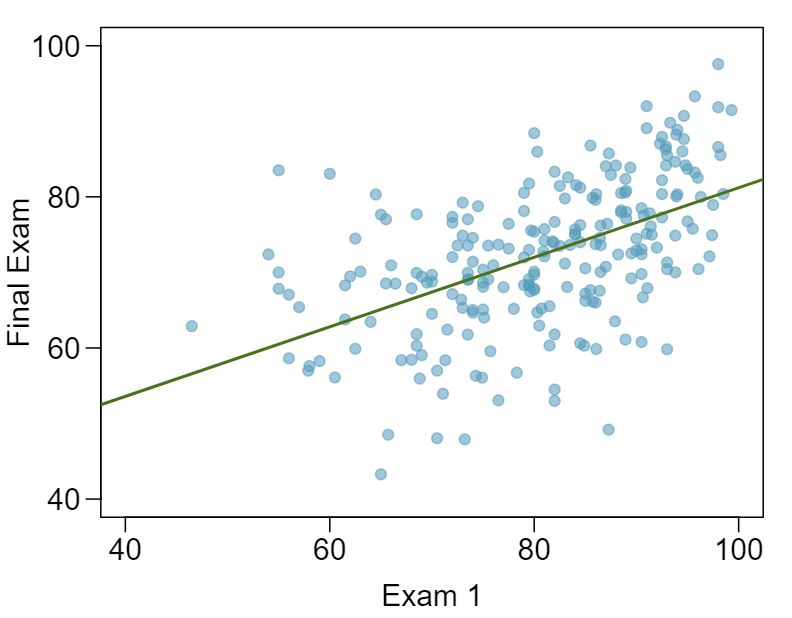
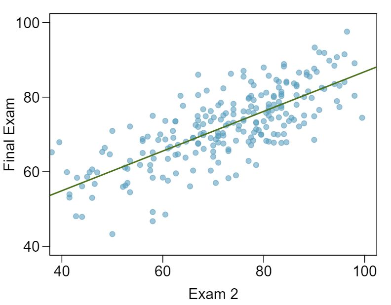
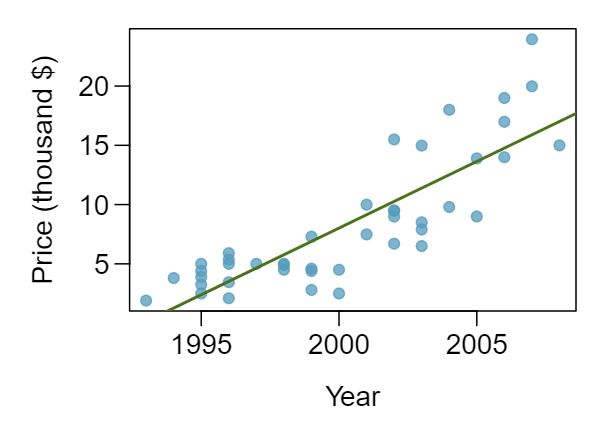
5 Exams and grades
The two scatterplots below show the relationship between final and mid-semester exam grades recorded during several years for a Statistics course at a university.
- Based on these graphs, which of the two exams has the strongest correlation with the final exam grade? Explain. Answer
Exam 2 since there is less of a scatter in the plot of final exam grade versus exam 2. Notice that the relationship between Exam 1 and the Final Exam appears to be slightly nonlinear.
- Can you think of a reason why the correlation between the exam you chose in part (a) and the final exam is higher? Answer
Exam 2 and the final are relatively close to each other chronologically, or Exam 2 may be cumulative so has greater similarities in material to the final exam. Answers may vary for part (b).
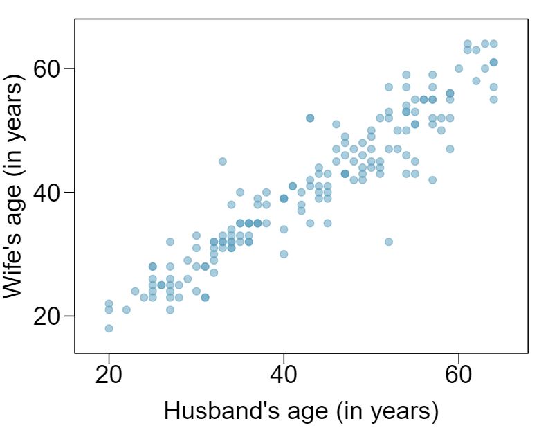
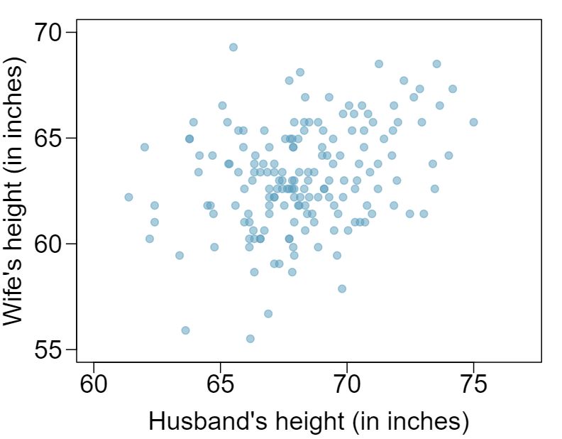
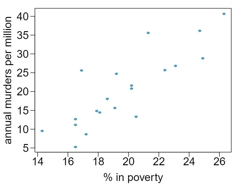
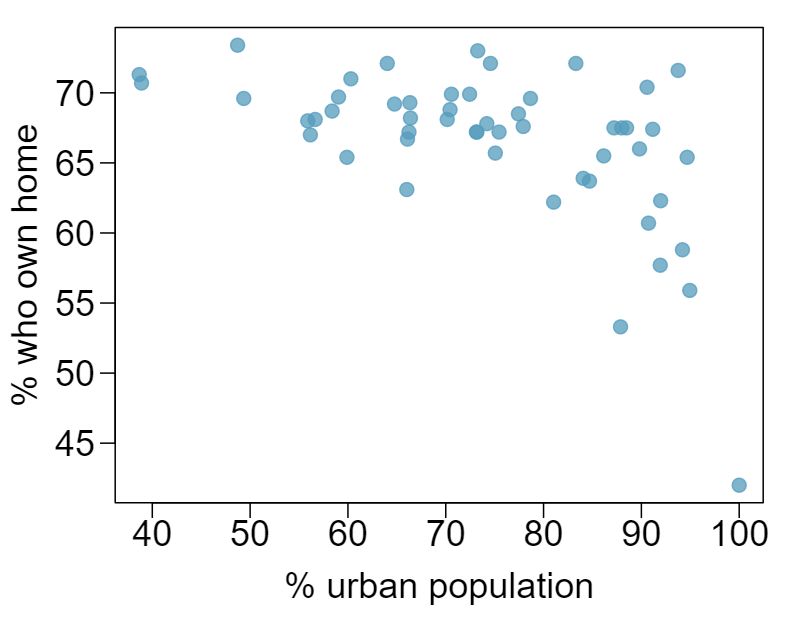
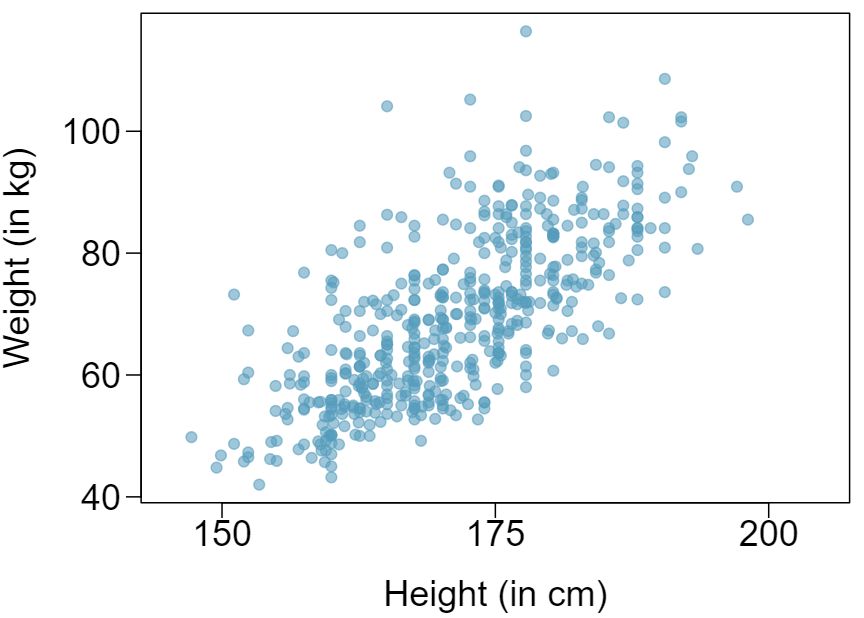
6 Husbands and wives, Part I
The Great Britain Office of Population Census and Surveys once collected data on a random sample of 170 married couples in Britain, recording the age (in years) and heights (converted here to inches) of the husbands and wives. 1 The first scatterplot shows the wife's age plotted against her husband's age, and the second plot shows wife's height plotted against husband's height.
Describe the relationship between husbands' and wives' ages.
Describe the relationship between husbands' and wives' heights.
Which plot shows a stronger correlation? Explain your reasoning.
Data on heights were originally collected in centimeters, and then converted to inches. Does this conversion affect the correlation between husbands' and wives' heights?
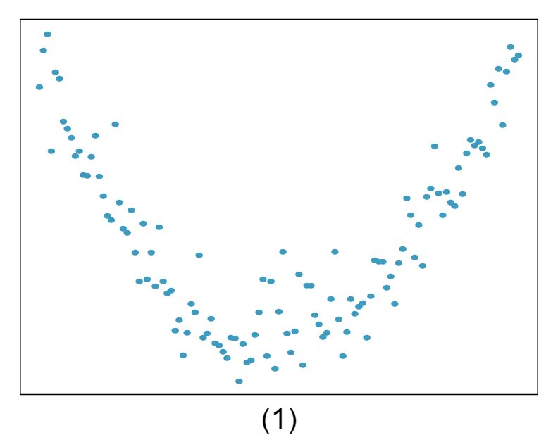
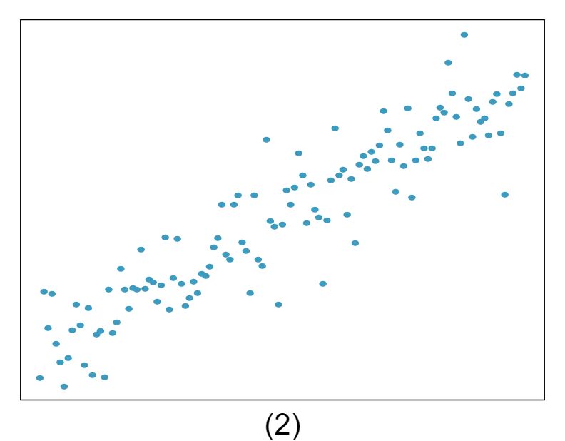
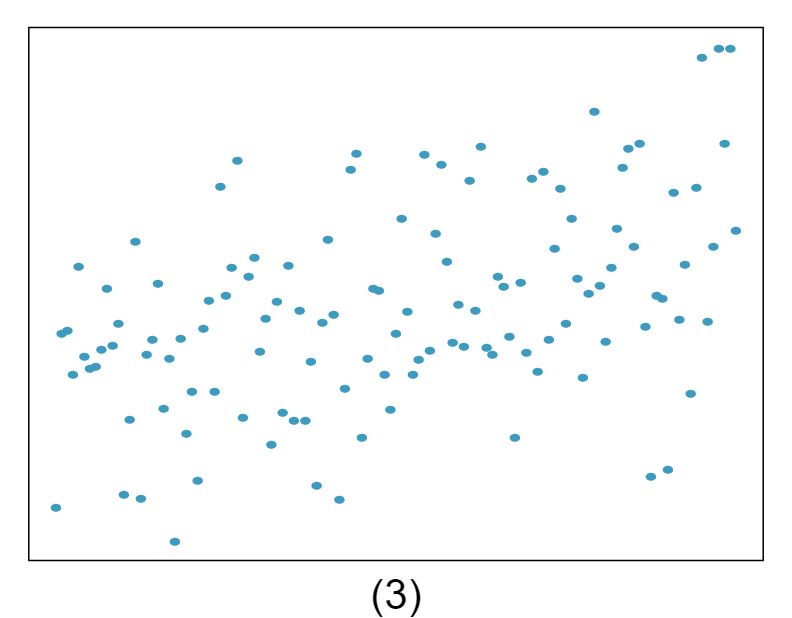
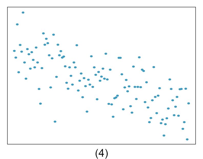
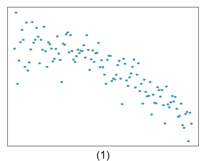
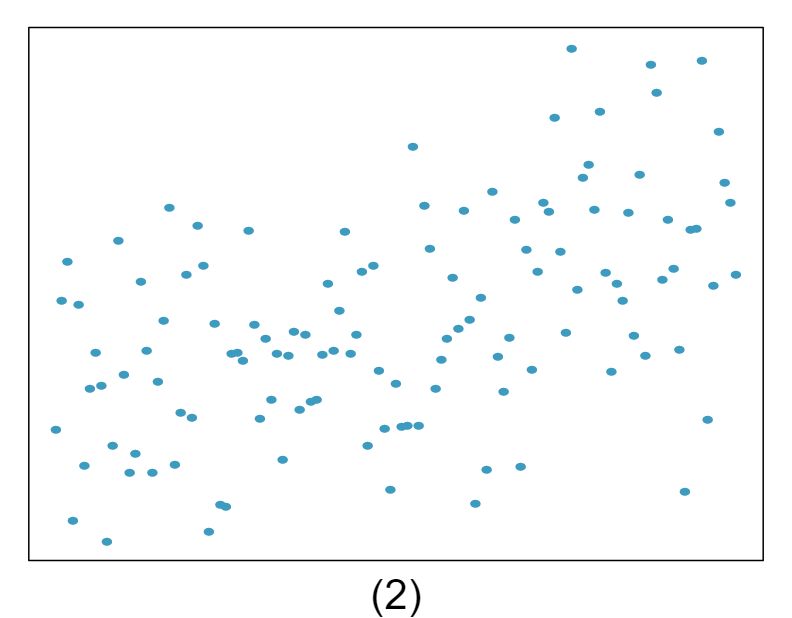
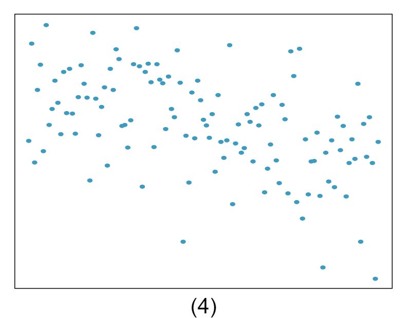
7 Match the correlation, Part I
Match the calculated correlations to the corresponding scatterplot.
- \(r = -0.7\) Answer
\(r = -0.7\) \(\rightarrow\) (4).
- \(r = 0.45\) Answer
\(r = 0.45\) \(\rightarrow\) (3).
- \(r = 0.06\) Answer
\(r = 0.06\) \(\rightarrow\) (1).
- \(r = 0.92\) Answer
\(r = 0.92\) \(\rightarrow\) (2).
8 Match the correlation, Part II
Match the calculated correlations to the corresponding scatterplot.
\(r = 0.49\)
\(r = -0.48\)
\(r = -0.03\)
\(r = -0.85\)
9 True / False
Determine if the following statements are true or false. If false, explain why.
- A correlation coefficient of -0.90 indicates a stronger linear relationship than a correlation coefficient of 0.5. Answer
- Correlation is a measure of the association between any two variables. Answer
False, correlation is a measure of the linear association between any two numerical variables.
10 Guess the correlation
Eduardo and Rosie are both collecting data on number of rainy days in a year and the total rainfall for the year. Eduardo records rainfall in inches and Rosie in centimeters. How will their correlation coefficients compare?
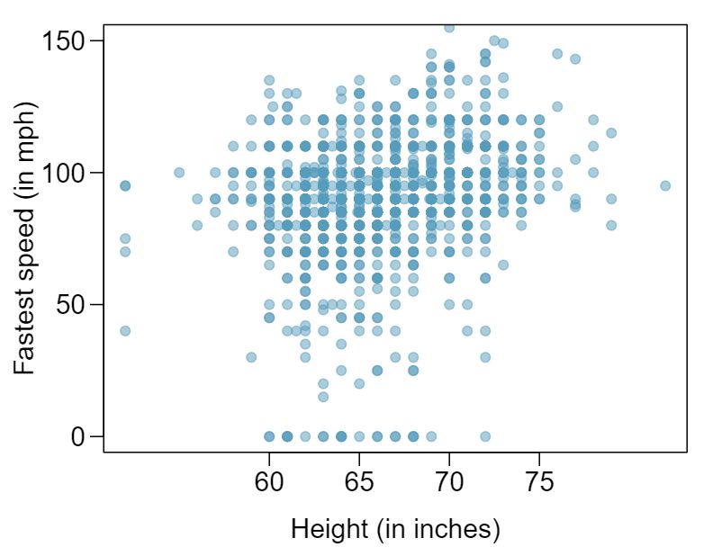
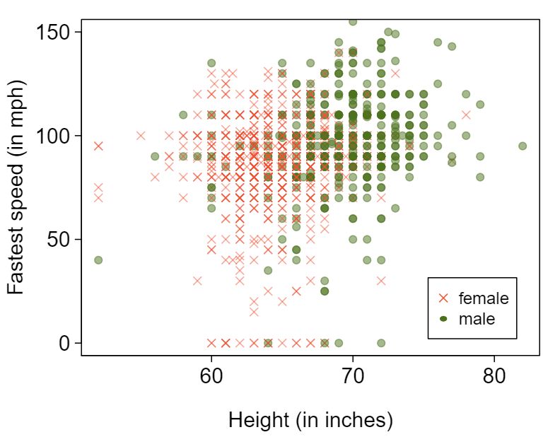
11 Speed and height
1,302 UCLA students were asked to fill out a survey where they were asked about their height, fastest speed they have ever driven, and gender. The first scatterplot displays the relationship between height and fastest speed, and the second scatterplot displays the breakdown by gender in this relationship.
- Describe the relationship between height and fastest speed. Answer
The relationship is positive, weak, and possibly linear. However, there do appear to be some anomalous observations along the left where several students have the same height that is notably far from the cloud of the other points. Additionally, there are many students who appear not to have driven a car, and they are represented by a set of points along the bottom of the scatterplot.
- Why do you think these variables are positively associated? Answer
There is no obvious explanation why simply being tall should lead a person to drive faster. However, one confounding factor is gender. Males tend to be taller than females on average, and personal experiences (anecdotal) may suggest they drive faster. If we were to follow-up on this suspicion, we would find that sociological studies confirm this suspicion.
- What role does gender play in the relationship between height and fastest driving speed? Answer
Males are taller on average and they drive faster. The gender variable is indeed an important confounding variable.
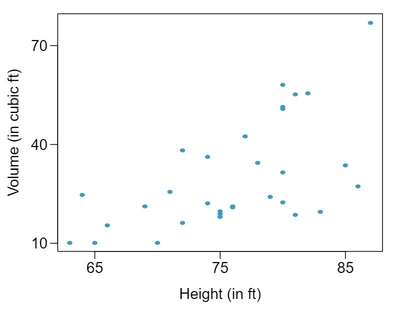
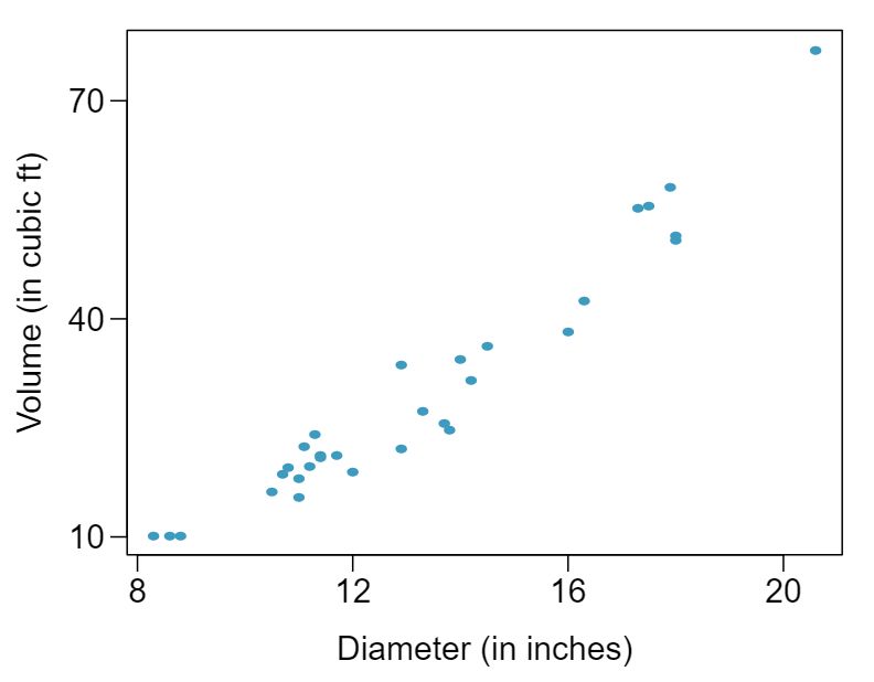
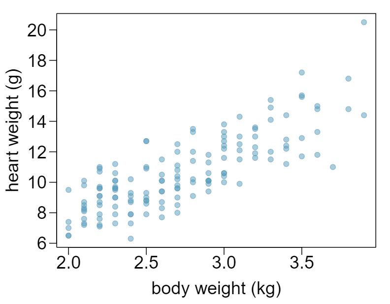
12 Trees
The scatterplots below show the relationship between height, diameter, and volume of timber in 31 felled black cherry trees. The diameter of the tree is measured 4.5 feet above the ground. 2
Describe the relationship between volume and height of these trees.
Describe the relationship between volume and diameter of these trees.
Suppose you have height and diameter measurements for another black cherry tree. Which of these variables would be preferable to use to predict the volume of timber in this tree using a simple linear regression model? Explain your reasoning.
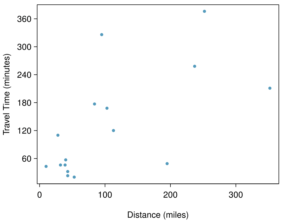
13 The Coast Starlight, Part I
The Coast Starlight Amtrak train runs from Seattle to Los Angeles. The scatterplot below displays the distance between each stop (in miles) and the amount of time it takes to travel from one stop to another (in minutes).
- Describe the relationship between distance and travel time. Answer
There is a somewhat weak, positive, possibly linear relationship between the distance traveled and travel time. There is clustering near the lower left corner that we should take special note of.
- How would the relationship change if travel time was instead measured in hours, and distance was instead measured in kilometers? Answer
Changing the units will not change the form, direction or strength of the relationship between the two variables. If longer distances measured in miles are associated with longer travel time measured in minutes, longer distances measured in kilometers will be associated with longer travel time measured in hours
- Correlation between travel time (in miles) and distance (in minutes) is \(r = 0.636\text{.}\) What is the correlation between travel time (in kilometers) and distance (in hours)? Answer
Changing units doesn't affect correlation: \(r = 0.636\text{.}\)
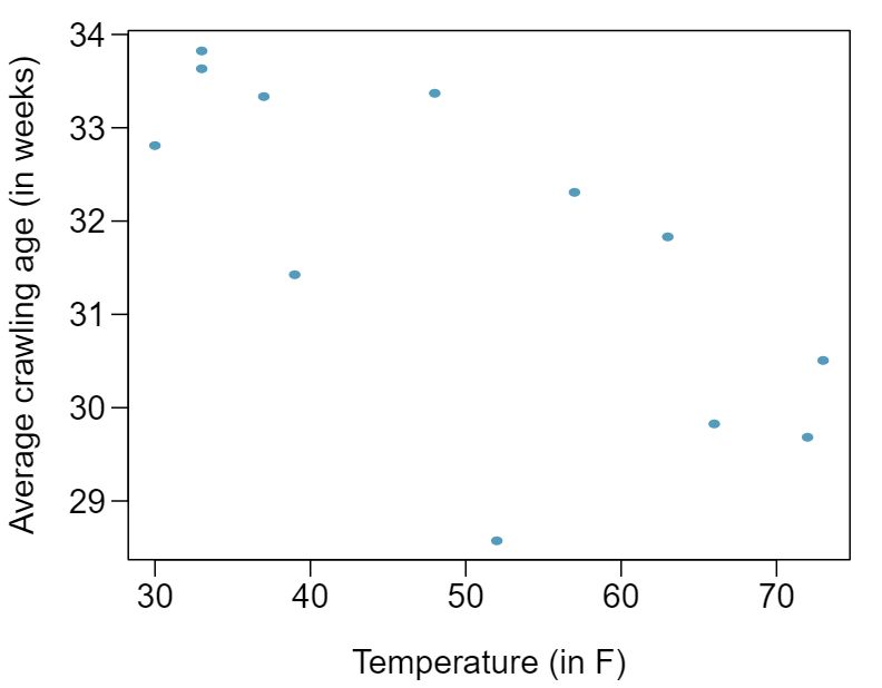
14 Crawling babies, Part I
A study conducted at the University of Denver investigated whether babies take longer to learn to crawl in cold months, when they are often bundled in clothes that restrict their movement, than in warmer months. 3 Infants born during the study year were split into twelve groups, one for each birth month. We consider the average crawling age of babies in each group against the average temperature when the babies are six months old (that's when babies often begin trying to crawl). Temperature is measured in degrees Fahrenheit°F and age is measured in weeks.
Describe the relationship between temperature and crawling age.
How would the relationship change if temperature was measured in degrees Celsius and age was measured in months?
The correlation between temperature in °F and age in weeks was \(r=-0.70\text{.}\) If we converted the temperature to °F and age to months, what would the correlation be?
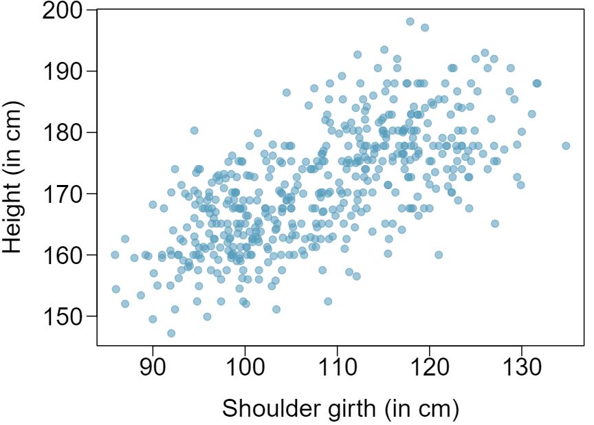
15 Body measurements, Part I
Researchers studying anthropometry collected body girth measurements and skeletal diameter measurements, as well as age, weight, height and gender for 507 physically active individuals. 4 The scatterplot below shows the relationship between height and shoulder girth (over deltoid muscles), both measured in centimeters.
- Describe the relationship between shoulder girth and height. Answer
There is a moderate, positive, and linear relationship between shoulder girth and height.
- How would the relationship change if shoulder girth was measured in inches while the units of height remained in centimeters? Answer
Changing the units, even if just for one of the variables, will not change the form, direction or strength of the relationship between the two variables.
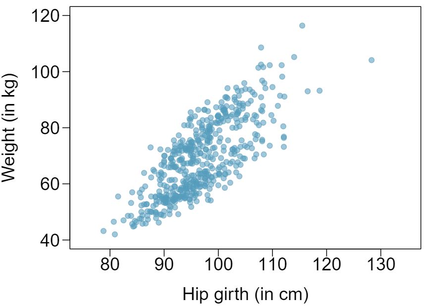
16 Body measurements, Part II
The scatterplot below shows the relationship between weight measured in kilograms and hip girth measured in centimeters from the data described in Exercise 8.6.15.
Describe the relationship between hip girth and weight.
How would the relationship change if weight was measured in pounds while the units for hip girth remained in centimeters?
17 Correlation, Part I
What would be the correlation between the ages of husbands and wives if men always married woman who were
- 3 years younger than themselves? Answer
In each part, we may write the husband ages as a linear function of the wife ages:\(age_{H} = age_{W} + 3\)
- 2 years older than themselves? Answer
In each part, we may write the husband ages as a linear function of the wife ages: \(age_{H} = age_{W} - 2\)
- half as old as themselves? Answer
In each part, we may write the husband ages as a linear function of the wife ages:\(age_{H} = 2 \times age_{W}\text{.}\) Since the slopes are positive and these are perfect linear relationships, the correlation will be exactly 1 in all three parts. An alternative way to gain insight into this solution is to create a mock data set, such as a data set of 5 women with ages 26, 27, 28, 29, and 30 (or some other set of ages). Then, based on the description, say for part (a), we can compute their husbands' ages as 29, 30, 31, 32, and 33. We can plot these points to see they fall on a straight line, and they always will. The same approach can be applied to the other parts as well.
18 Correlation, Part II
What would be the correlation between the annual salaries of males and females at a company if for a certain type of position men always made
$5,000 more than women?
25% more than women?
15% less than women?