
Section 2.1 Examining numerical data
¶In this section we will focus on numerical variables. The email50 and county data sets from Section 1.2 provide rich opportunities for examples. Recall that outcomes of numerical variables are numbers on which it is reasonable to perform basic arithmetic operations. For example, the pop2010 variable, which represents the populations of counties in 2010, is numerical since we can sensibly discuss the difference or ratio of the populations in two counties. On the other hand, area codes and zip codes are not numerical, but rather they are categorical variables.
OpenIntro: Examining Numerical Data video
Subsection 2.1.1 Scatterplots for paired data
¶Sometimes researchers wish to see the relationship between two variables. When we talk of a relationship or an association between variables, we are interested in how one variable behaves as the other variable increases or decreases.
A scatterplot provides a case-by-case view of data that illustrates the relationship between two numerical variables. In Figure 1.2.11, a scatterplot was used to examine how federal spending and poverty were related in the county data set. Another scatterplot is shown in Figure 2.1.2, comparing the number of line breaks line_breaks and number of characters num_char in emails for the email50 data set. In any scatterplot, each point represents a single case. Since there are 50 cases in email50, there are 50 points in Figure 2.1.2.
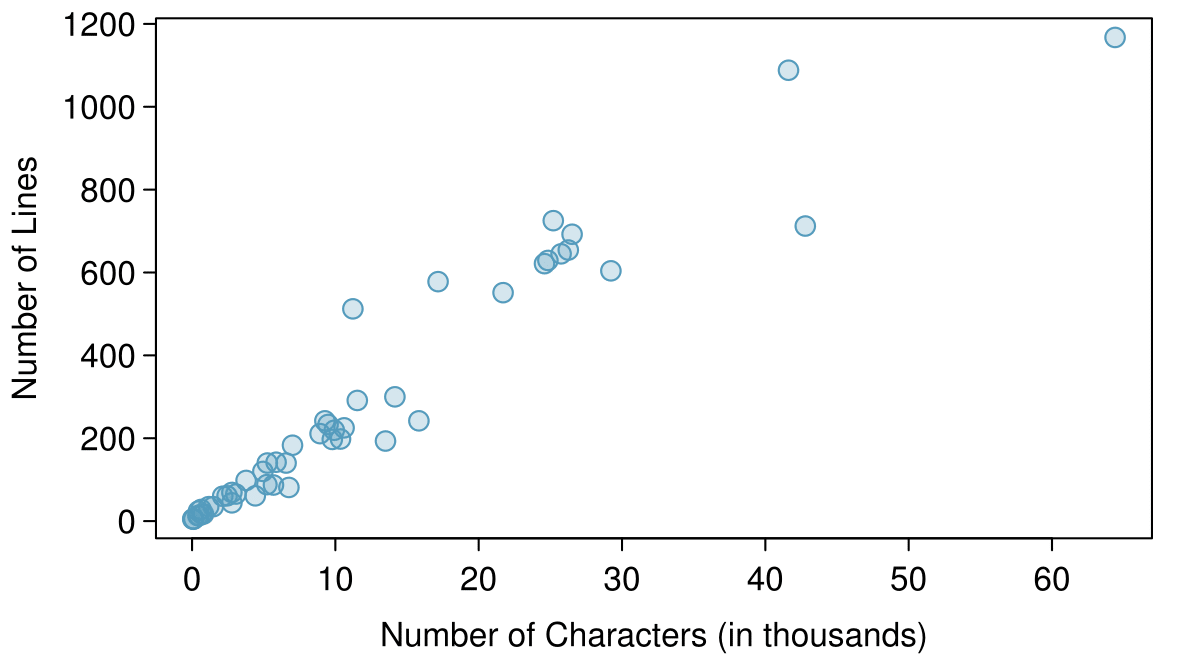
line_breaks versus num_char for the email50 data.A scatterplot requires paired data. What does paired data mean?
Solution
We say observations are paired when the two observations correspond to each other. In unpaired data, there is no such correspondence. Here the two observations correspond to a particular email.
The variable that is suspected to be the response variable is plotted on the vertical (y) axis and the variable that is suspected to be the explanatory variable is plotted on the horizontal (x) axis. In this example, the variables could be switched since either variable could reasonably serve as the explanatory variable or the response variable.
TIP: Drawing scatterplots
Decide which variable should go on each axis, and draw and label the two axes.
Note the range of each variable, and add tick marks and scales to each axis.
Plot the dots as you would on an \(x,y\)-coordinate plane.
The association between two variables can be positive or negative, or there can be no association. Positive association means that larger values of the first variable are associated with larger values of the second variable. Additionally, the association can follow a linear trend or a curved (nonlinear) trend.
Guided Practice 2.1.4
What would it mean for two variables to have a negative association? What about no association? 1 Negative association implies that larger values of the first variable are associated with smaller values of the second variable. No association implies that the values of the second variable tend to be independent of changes in the first variable.
Guided Practice 2.1.5
What does the scatterplot in Figure 2.1.2 reveal about the email data? 2 The association between the number of characters in an email and the number of lines in an email is positive (when one is larger, the other tends to be larger as well). As the number of characters increases, number of lines increases is an approximately linear fashion.
Example 2.1.6
Consider a new data set of 54 cars with two variables: vehicle price and weight. 3 Subset of data from www.amstat.org/publications/jse/v1n1/datasets.lock.html A scatterplot of vehicle price versus weight is shown in Example 2.1.6. What can be said about the relationship between these variables?
Solution
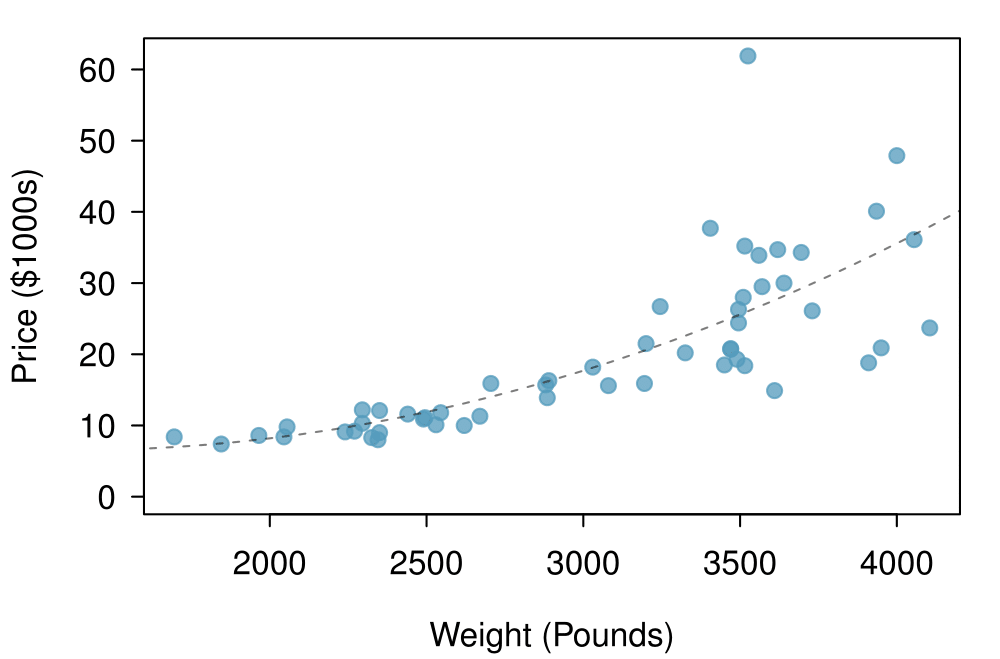
Figure 2.1.7 A scatterplot of
The relationship is evidently nonlinear, as highlighted by the dashed line. This is different from previous scatterplots we've seen, such as Figure 1.2.11 and Figure 2.1.2, which show relationships that are very linear.
price versus weight for 54 cars.Guided Practice 2.1.8
Describe two variables that would have a horseshoe shaped (i.e. “U”-shaped) association in a scatterplot. 4 Consider a variable that represents something that is only good in moderation. Water consumption fits this description since water becomes toxic when consumed in excessive quantities. If health was represented on the vertical axis and water consumption on the horizontal axis, then we would create an upside down “U” shape.
Subsection 2.1.2 Stem-and-leaf plots and dot plots
¶Sometimes two variables is one too many: only one variable may be of interest. In these cases we want to focus not on the association between two variables, but on the distribution of a single variable. The term distribution refers to the values that a variable takes and the frequency of these values. Let's take a closer look at the email50 data set and focus on the number of characters in each email. To simplify the data, we will round the numbers and record the values in thousands. Thus, 22105 is recorded as 22.
| 22 | 0 | 64 | 10 | 6 | 26 | 25 | 11 | 4 | 14 |
| 7 | 1 | 10 | 2 | 7 | 5 | 7 | 4 | 14 | 3 |
| 1 | 5 | 43 | 0 | 0 | 3 | 25 | 1 | 9 | 1 |
| 2 | 9 | 0 | 5 | 3 | 6 | 26 | 11 | 25 | 9 |
| 42 | 17 | 29 | 12 | 27 | 10 | 0 | 0 | 1 | 16 |
Rather than look at the data as a list of numbers, which makes the distribution difficult to discern, we will organize it into a table called a stem-and-leaf plot shown in Figure 2.1.10. In a stem-and-leaf plot, each number is broken into two parts. The first part is called the stem and consists of the beginning digit(s). The second part is called the leaf and consists of the final digit(s). The stems are written in a column in ascending order, and the leaves that match up with those stems are written on the corresponding row. Figure 2.1.10 shows a stem-and-leaf plot of the number of characters in 50 emails. The stem represents the ten thousands place and the leaf represents the thousands place. For example, 1|2 corresponds to 12 thousand. When making a stem-and-leaf plot, remember to include a legend that describes what the stem and what the leaf represent. Without this, there is no way of knowing if 1 \(|\) 2 represents 1.2, 12, 120, 1200, etc.
  0 | 00000011111223334455566777999
  1 | 0001124467
  2 | 25556679
  3 |
  4 | 23
  5 |
  6 | 4

Legend: 1 | 2 = 12,000
Guided Practice 2.1.11
There are a lot of numbers on the first row of the stem-and-leaf plot. Why is this the case? 5 There are a lot of numbers on the first row because there are a lot of values in the data set less than 10 thousand.
When there are too many numbers on one row or there are only a few stems, we split each row into two halves, with the leaves from 0-4 on the first half and the leaves from 5-9 on the second half. The resulting graph is called a split stem-and-leaf plot. Figure 2.1.12 shows the previous stem-and-leaf redone as a split stem-and-leaf.
  0 | 000000111112233344
  0 | 55566777999
  1 | 00011244
  1 | 67
  2 | 2
  2 | 5556679
  3 |
  3 |
  4 | 23
  4 |
  5 |
  5 |
  6 | 4

Legend: 1 | 2 = 12,000
Guided Practice 2.1.13
What is the smallest number in this data set? What is the largest? 6 The smallest number is less than 1 thousand, and the largest is 64 thousand. That is a big range!
Another simple graph for numerical data is a dot plot. A dot plot uses dots to show the frequency, or number of occurrences, of the values in a data set. The higher the stack of dots, the greater the number occurrences there are of the corresponding value. An example using the same data set, number of characters from 50 emails, is shown in Figure 2.1.14.
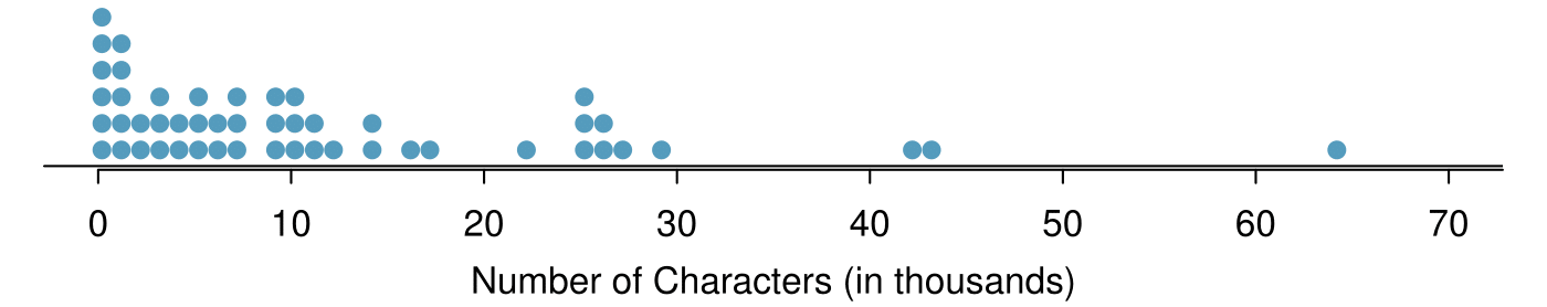
num_char for the email50 data set.Guided Practice 2.1.15
Imagine rotating the dot plot 90 degrees clockwise. What do you notice? 7 It has a similar shape as the stem-and-leaf plot! The values on the horizontal axis correspond to the stems and the number of dots in each interval correspond the number of leaves needed for each stem.
These graphs make it easy to observe important features of the data, such as the location of clusters and presence of gaps.
Example 2.1.16
Based on both the stem-and-leaf and dot plot, where are the values clustered and where are the gaps for the email50 data set?
Solution
There is a large cluster in the 0 to less than 20 thousand range, with a peak around 1 thousand. There are gaps between 30 and 40 thousand and between the two values in the 40 thousands and the largest value of approximately 64 thousand.
Additionally, we can easily identify any observations that appear to be unusually distant from the rest of the data. Unusually distant observations are called outliers. Later in this chapter we will provide numerical rules of thumb for identifying outliers. For now, it is sufficient to identify them by observing gaps in the graph. In this case, it would be reasonable to classify the emails with character counts of 42 thousand, 43 thousand, and 64 thousand as outliers since they are numerically distant from most of the data.
Outliers are extreme
An outlier is an observation that appears extreme relative to the rest of the data.
TIP: Why it is important to look for outliers
Examination of data for possible outliers serves many useful purposes, including
Identifying asymmetry in the distribution.
Identifying data collection or entry errors. For instance, we re-examined the email purported to have 64 thousand characters to ensure this value was accurate.
Providing insight into interesting properties of the data.
Guided Practice 2.1.17
The observation 64 thousand, a suspected outlier, was found to be an accurate observation. What would such an observation suggest about the nature of character counts in emails? 8 That occasionally there may be very long emails.
Guided Practice 2.1.18
Consider a data set that consists of the following numbers: 12, 12, 12, 12, 12, 13, 13, 14, 14, 15, 19. Which graph would better illustrate the data: a stem-and-leaf plot or a dot plot? Explain. 9 Because all the values begin with 1, there would be only one stem (or two in a split stem-and-leaf). This would not provide a good sense of the distribution. For example, the gap between 15 and 19 would not be visually apparent. A dot plot would be better here.
Subsection 2.1.3 Histograms
¶Stem-and-leaf plots and dot plots are ideal for displaying data from small samples because they show the exact values of the observations and how frequently they occur. However, they are impractical for larger samples. For larger samples, rather than showing the frequency of every value, we prefer to think of the value as belonging to a bin. For example, in the email50 data set, we create a table of counts for the number of cases with character counts between 0 and 5,000, then the number of cases between 5,000 and 10,000, and so on. Such a table, shown in Table 2.1.19, is called a frequency table. Observations that fall on the boundary of a bin (e.g. 5,000) are generally allocated to the lower bin. 10 This is called left inclusive. These binned counts are plotted as bars in Figure 2.1.21 into what is called a histogram or frequency histogram, which resembles the stacked dot plot shown in Figure 2.1.14.
| Characters (in thousands) |
0-5 | 5-10 | 10-15 | 15-20 | 20-25 | 25-30 | \(\cdots\) | 55-60 | 60-65 | |
| Count | 19 | 12 | 6 | 2 | 3 | 5 | \(\cdots\) | 0 | 1 | |
num_char data.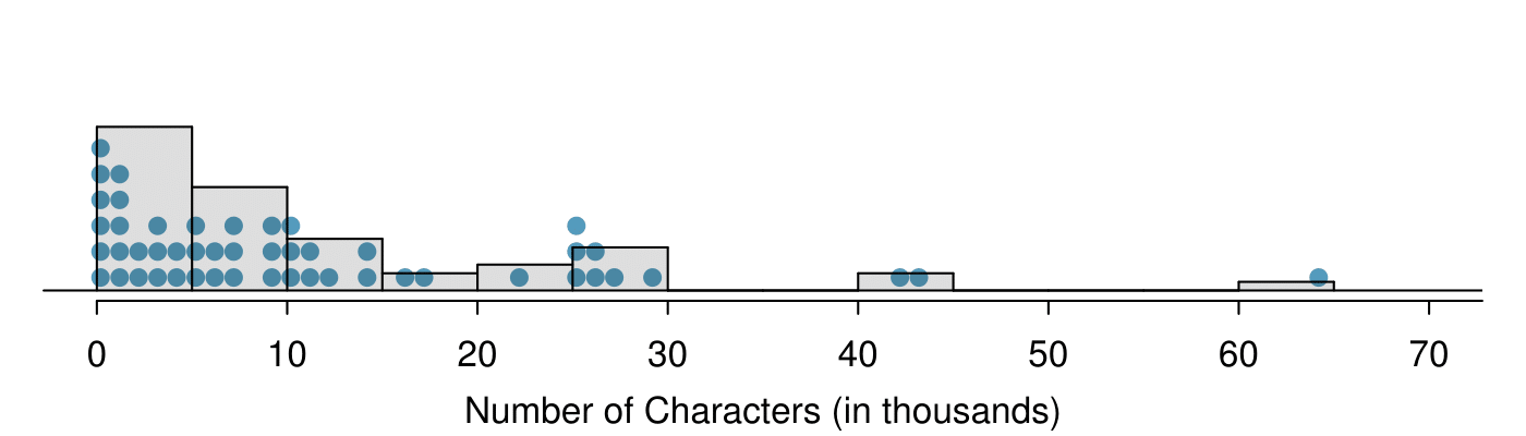
num_char. This histogram is drawn over the corresponding dot plot.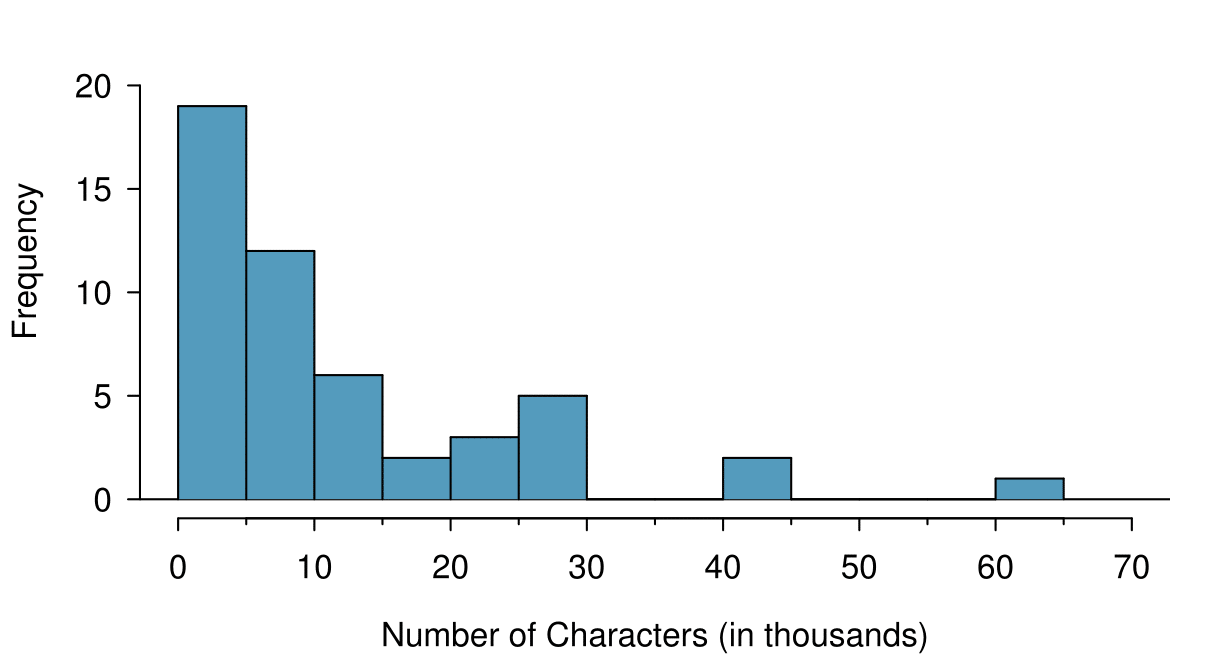
num_char. This histogram uses bins or class intervals of width 5.Guided Practice 2.1.22
What can you see in the dot plot and stem-and-leaf plot that you cannot see in the frequency histogram? 11 Character counts for individual emails.
TIP: Drawing histograms
The variable is always placed on the horizontal axis. Before drawing the histogram, label both axes and draw a scale for each.
Draw bars such that the height of the bar is the frequency of that bin and the width of the bar corresponds to the bin width.
Histograms provide a view of the data density. Higher bars represent where the data are relatively more common. For instance, there are many more emails between 0 and 10,000 characters than emails between 10,000 and 20,000 in the data set. The bars make it easy to see how the density of the data changes relative to the number of characters.
Example 2.1.23
How many emails had fewer than 10 thousand characters?
Solution
The height of the bars corresponds to frequency. There were 19 cases from 0 to less than 5 thousand and 12 cases from 5 thousand to less than 10 thousand, so there were \(19+12=31\) emails with fewer than 10 thousand characters.
Example 2.1.24
Approximately how many emails had fewer than 1 thousand chacters?
Solution
Based just on this histogram, we cannot know the exact answer to this question. We only know that 19 emails had between 0 and 5 thousand characters. If the number of emails is evenly distribution on this interval, then we can estimate that approximately 19/5 \(\approx\) 4 emails fell in the range between 0 and 1 thousand.
Example 2.1.25
What percent of the emails had 10 thousand or more characters?
Solution
From the first example, we know that 31 emails had fewer than 10 thousand characters. Since there are 50 emails in total, there must be 19 emails that have 10 thousand or more characters. To find the percent, compute \(19/50 = 0.38 = 38\text{.}\)
Sometimes questions such as the ones above can be answered more easily with a cumulative frequency histogram. This type of histogram shows cumulative, or total, frequency achieved by each bin, rather than the frequency in that particular bin.
| Characters (in thousands) |
0-5 | 5-10 | 10-15 | 15-20 | 20-25 | 25-30 | 30-35 | \(\cdots\) | 55-60 | 60-65 |
| Cumulative Frequency |
19 | 31 | 37 | 39 | 42 | 47 | 47 | \(\cdots\) | 49 | 50 |
num_char data.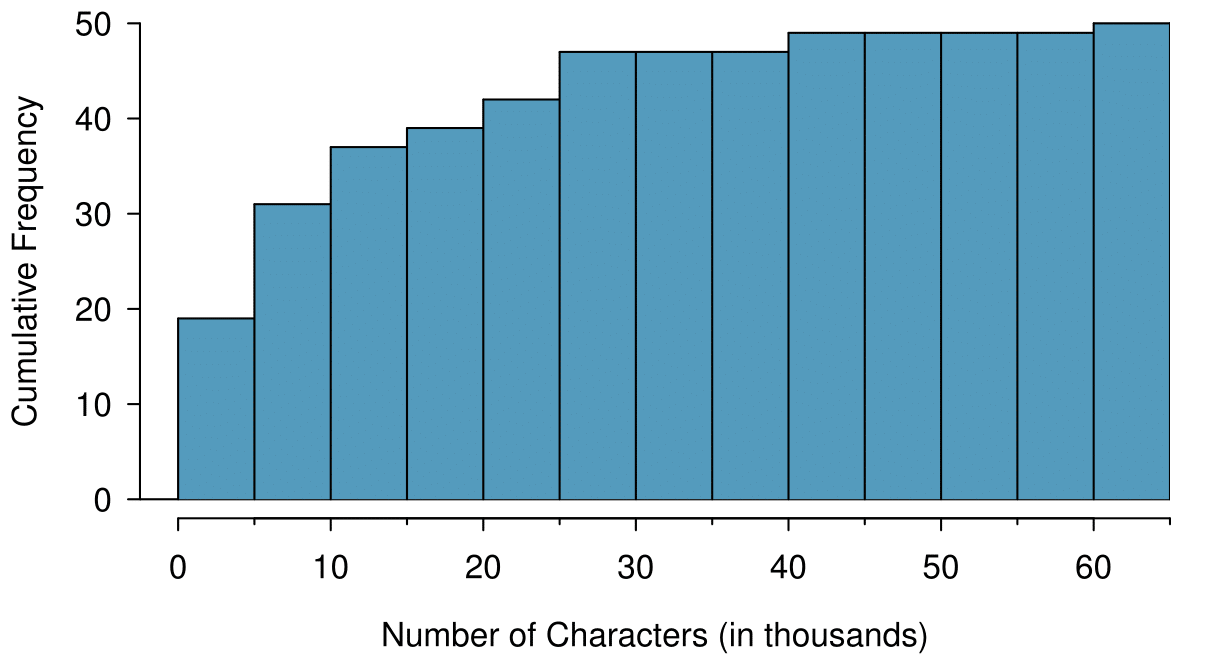
num_char. This histogram uses bins or class intervals of width 5.Example 2.1.28
How many of the emails had fewer than 20 thousand characters?
Solution
By tracing the height of the 15-20 thousand bin over to the vertical axis, we can see that it has a height just under 40 on the cumulative frequency scale. Therefore, we estimate that \(\approx\)39 of the emails had fewer than 30 thousand characters. Note that, unlike with a regular frequency histogram, we do not add up the height of the bars in a cumulative frequency histogram because each bar already represents a cumulative sum.
Example 2.1.29
Using the cumulative frequency histogram, how many of the emails had 10-15 thousand characters?
Solution
To answer this question, we do a htraction. \(\approx\)39 had fewer than 15-20 thousand emails and \(\approx\)37 had fewer than 10-15 thousand emails, so \(\approx\)2 must have had between 10-15 thousand emails.
Example 2.1.30
Approximately 25 of the emails had fewer than how many characters?
Solution
This time we are given a cumulative frequency, so we start at 25 on the vertical axis and trace it across to see which bin it hits. It hits the 5-10 thousand bin, so 25 of the emails had fewer than a value somewhere between 5 and 10 thousand characters.
Knowing that 25 of the emails had fewer than a value between 5 and 10 thousand characters is useful information, but it is even more useful if we know what percent of the total 25 represents. Knowing that there were 50 total emails tells us that \(25 / 50 = 0.5 = 50\) of the emails had fewer than a value between 5 and 10 thousand characters. When we want to know what fraction or percent of the data meet a certain criteria, we use relative frequency instead of frequency. Relative frequency is a fancy term for percent or proportion. It tells us how large a number is relative to the total.
Just as we constructed a frequency table, frequency histogram, and cumulative frequency histogram, we can construct a relative frequency table, relative frequency histogram, and cumulative relative frequency histogram.
Guided Practice 2.1.31
How will the shape of the relative frequency histograms differ from the frequency histograms? 12 The shape will reidx exactly the same. Changing from frequency to relative frequency involves dividing all the frequencies by the same number, so only the vertical scale (the numbers on the y-axis) change.
Caution: Pay close attention to the vertical axis of a histogram
We can misinterpret a histogram if we forget to check whether the vertical axis represents frequency, relative frequency, cumulative frequency, or cumulative relative frequency.
Subsection 2.1.4 Describing Shape
¶Frequency and relative frequency histograms are especially convenient for describing the shape of the data distribution . Figure 2.1.21 shows that most emails have a relatively small number of characters, while fewer emails have a very large number of characters. When data trail off to the right in this way and have a longer right tail, the shape is said to be right skewed. 13 Other ways to describe data that are skewed to the right: skewed to the right, skewed to the high end, or skewed to the positive end.
Data sets with the reverse characteristic — a long, thin tail to the left — are said to be left skewed. We also say that such a distribution has a long left tail. Data sets that show roughly equal trailing off in both directions are called symmetric.
Long tails to identify skew
When data trail off in one direction, the distribution has a long tail. If a distribution has a long left tail, it is left skewed. If a distribution has a long right tail, it is right skewed.
Guided Practice 2.1.32
Take a look at the dot plot in Figure 2.1.14. Can you see the skew in the data? Is it easier to see the skew in the frequency histogram, the dot plot, or the stem-and-leaf plot? 14 The skew is visible in all three plots. However, it is not easily visible in the cumulative frequency histogram.
Guided Practice 2.1.33
Would you expect the distribution of number of pets per household to be right skewed, left skewed, or approximately symmetric? Explain. 15 We suspect most households would have 0, 1, or 2 pets but that a smaller number of households will have 3, 4, 5, or more pets, so there will be greater density over the small numbers, suggesting the distribution will have a long right tail and be right skewed.
In addition to looking at whether a distribution is skewed or symmetric, histograms, stem-and-leaf plots, and dot plots can be used to identify modes. A mode is represented by a prominent peak in the distribution. 16 Another definition of mode, which is not typically used in statistics, is the value with the most occurrences. It is common to have no observations with the same value in a data set, which makes this other definition useless for many real data sets. There is only one prominent peak in the histogram of num_char.
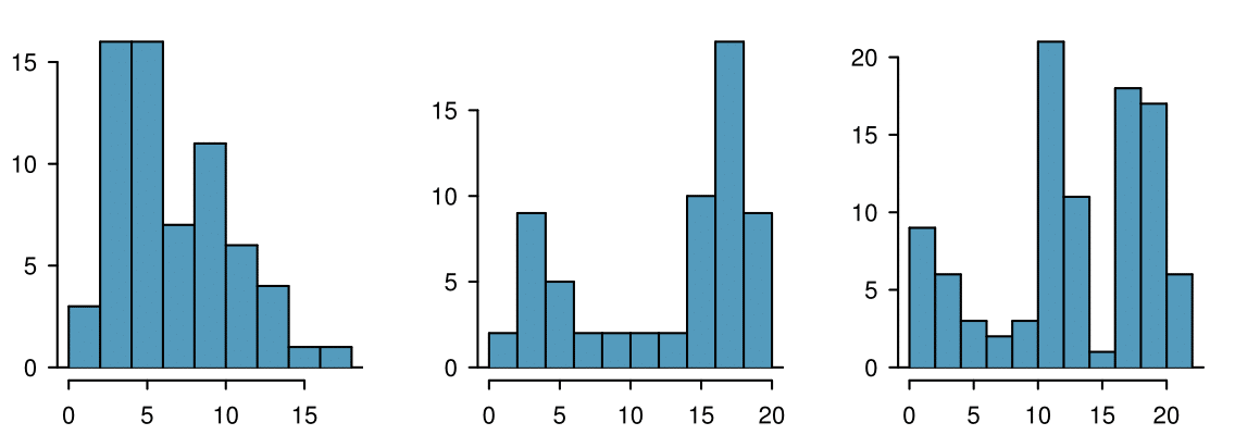
Figure 2.1.34 shows histograms that have one, two, or three prominent peaks. Such distributions are called unimodal, bimodal, and multimodal, respectively. Any distribution with more than 2 prominent peaks is called multimodal. Notice that in Figure 2.1.21 there was one prominent peak in the unimodal distribution with a second less prominent peak that was not counted since it only differs from its neighboring bins by a few observations.
Guided Practice 2.1.35
Height measurements of young students and adult teachers at a K-3 elementary school were taken. How many modes would you anticipate in this height data set? 17 There might be two height groups visible in the data set: one of the students and one of the adults. That is, the data are probably bimodal.
TIP: Looking for modes
Looking for modes isn't about finding a clear and correct answer about the number of modes in a distribution, which is why prominent is not rigorously defined in this book. The important part of this examination is to better understand your data and how it might be structured.