In the previous section, we saw that modes can occur anywhere in a data set. Therefore, mode is not a measure of center. We understand the term center intuitively, but quantifying what is the center can be a little more challenging. This is because there are different definitions of center. Here we will focus on the two most common: the mean and median.
The mean, sometimes called the average, is a common way to measure the center of a distribution of data. To find the mean number of characters in the 50 emails, we add up all the character counts and divide by the number of emails. For computational convenience, the number of characters is listed in the thousands and rounded to the first decimal.
The sample mean is often labeled \(\bar{x}\text{.}\) The letter \(x\) is being used as a generic placeholder for the variable of interest, num_char, and the bar on the \(x\) communicates that the average number of characters in the 50 emails was 11,600.
Mean
The sample mean of a numerical variable is computed as the sum of all of the observations divided by the number of observations:
where \(\sum\) is the capital Greek letter sigma and \(\sum{x_{i}}\) means take the sum of all the individual \(x\) values. \(x_1, x_2, \dots, x_n\) represent the \(n\) observed values.
Examine Equation (2.2.1) and Equation (2.2.2) above. What does \(x_1\) correspond to? And \(x_2\text{?}\) What does \(x_i\) represent? 1 \(x_1\) corresponds to the number of characters in the first email in the sample (21.7, in thousands), \(x_2\) to the number of characters in the second email (7.0, in thousands), and \(x_i\) corresponds to the number of characters in the \(i^{th}\) email in the data set.
What was \(n\) in this sample of emails? 2 The sample size was \(n=50\text{.}\)
The email50 data set represents a sample from a larger population of emails that were received in January and March. We could compute a mean for this population in the same way as the sample mean, however, the population mean has a special label: \(\mu\text{.}\) The symbol \(\mu\) is the Greek letter mu and represents the average of all observations in the population. Sometimes a subsript, such as \(_x\text{,}\) is used to represent which variable the population mean refers to, e.g. \(\mu_x\text{.}\)
The average number of characters across all emails can be estimated using the sample data. Based on the sample of 50 emails, what would be a reasonable estimate of \(\mu_x\text{,}\) the mean number of characters in all emails in the email data set? (Recall that email50 is a sample from email.)
The sample mean, 11,600, may provide a reasonable estimate of \(\mu_x\text{.}\) While this number will not be perfect, it provides a point estimate of the population mean. In Chapter 5 and beyond, we will develop tools to characterize the reliability of point estimates, and we will find that point estimates based on larger samples tend to be more reliable than those based on smaller samples.
We might like to compute the average income per person in the US. To do so, we might first think to take the mean of the per capita incomes across the 3,143 counties in the county data set. What would be a better approach?
The county data set is special in that each county actually represents many individual people. If we were to simply average across the income variable, we would be treating counties with 5,000 and 5,000,000 residents equally in the calculations. Instead, we should compute the total income for each county, add up all the counties' totals, and then divide by the number of people in all the counties. If we completed these steps with the county data, we would find that the per capita income for the US is $27,348.43. Had we computed the simple mean of per capita income across counties, the result would have been just $22,504.70!
Example 2.2.5 used what is called a weighted mean, which will not be a key topic in this textbook. However, we have provided an online supplement on weighted means for interested readers:
The median provides another measure of center. The median splits an ordered data set in half. There are 50 character counts in the email50 data set (an even number) so the data are perfectly split into two groups of 25. We take the median in this case to be the average of the two middle observations: \((6,768+7,012)/2 = 6,890\text{.}\) When there are an odd number of observations, there will be exactly one observation that splits the data into two halves, and in this case that observation is the median (no average needed).
Median: the number in the middle
In an ordered data set, the median is the observation right in the middle. If there are an even number of observations, the median is the average of the two middle values.
Graphically, we can think of the mean as the balancing point. The median is the value such that 50% of the area is to the left of it and 50% of the area is to the right of it.
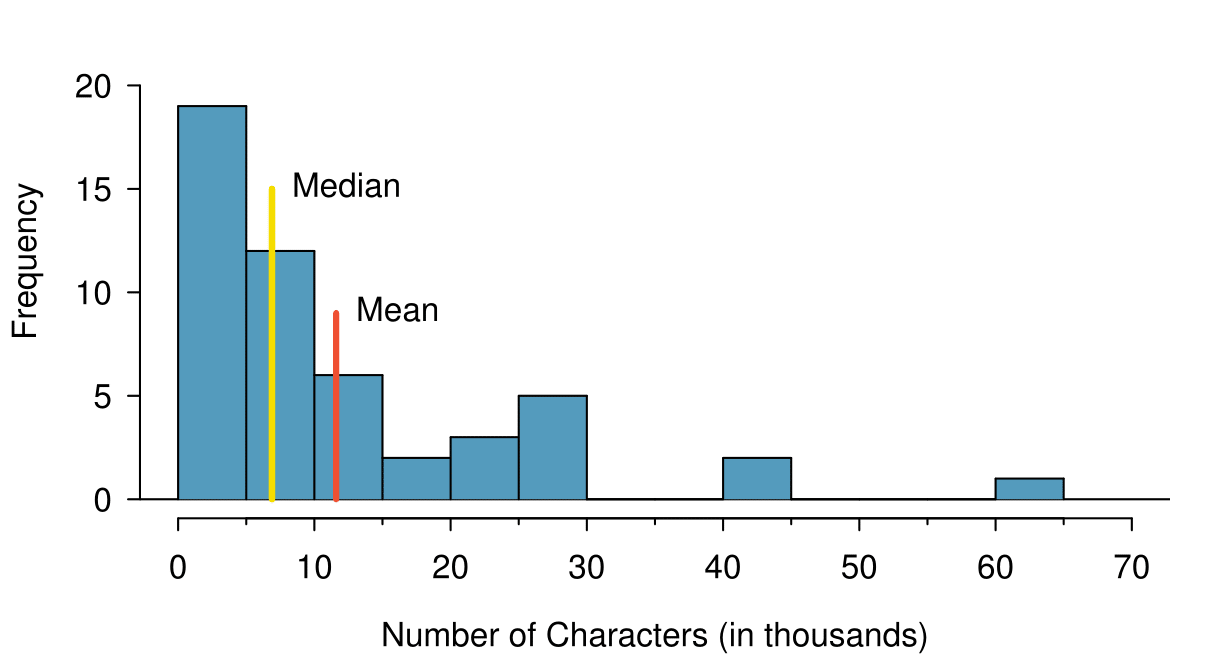
Figure2.2.6 A histogram of num_char with its mean and median shown.
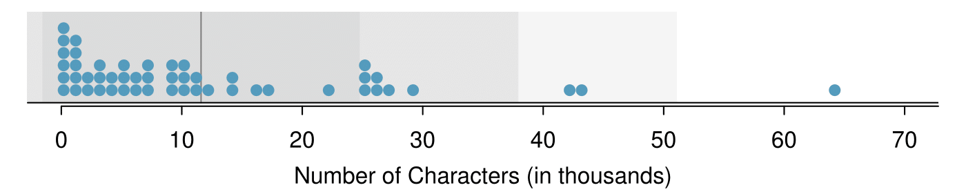
Consider the three largest values of 42 thousand, 43 thousand, and 64 thousand. These values drag up the mean because they hstantially increase the sum (the total). However, they do not drag up the median because their magnitude does not change the location of the middle value.
The mean follows the tail
In a right skewed distribution, the mean is greater than the median.
In a left skewed distribution, the mean is less than the median.
In a symmetric distribution, the mean and median are approximately equal.
Consider the distribution of individual income in the United States. Which is greater: the mean or median? Why? 3 Because a small percent of individuals earn extremely large amounts of money while the majority earn a modest amount, the distribution is skewed to the right. Therefore, the mean is greater than the median.
Subsection2.2.2Standard deviation as a measure of spread
The U.S. Census Bureau reported that in 2012, the median family income was $62,241 and the mean family income was $82,743. 4 www.census.gov/hhes/www/income/
Is a family income of $60,000 far from the mean or somewhat close to the mean? In order to answer this question, it is not enough to know the center of the data set and its range (maximum value - minimum value). We must know about the variability of the data set within that range. Low variability or small spread means that the values tend to be more clustered together. High variability or large spread means that the values tend to be far apart.
Yes. An example is: 1, 1, 1, 1, 1, 9, 9, 9, 9, 9 and 1, 5, 5, 5, 5, 5, 5, 5, 5, 5, 9.
The first data set has a larger spread because values tend to be farther away from each other while in the second data set values are clustered together at the mean.
Here, we introduce the standard deviation as a measure of spread. Though its formula is a bit tedious to calculate by hand, the standard deviation is very useful in data analysis and roughly describes how far away, on average, the observations are from the mean.
We call the distance of an observation from its mean its deviation. Below are the deviations for the \(1^{st}_{}\text{,}\) \(2^{nd}_{}\text{,}\) \(3^{rd}\text{,}\) and \(50^{th}_{}\) observations in the num_char variable. For computational convenience, the number of characters is listed in the thousands and rounded to the first decimal.
We divide by \(n-1\text{,}\) rather than dividing by \(n\text{,}\) when computing the variance; you need not worry about this mathematical nuance for the material in this textbook. Notice that squaring the deviations does two things. First, it makes large values much larger, seen by comparing \(10.1^2\text{,}\) \((-4.6)^2\text{,}\) \((-11.0)^2\text{,}\) and \(4.2^2\text{.}\) Second, it gets rid of any negative signs.
The standard deviation is defined as the square root of the variance:
The standard deviation of the number of characters in an email is about 13.13 thousand. A hscript of \(_x\) may be added to the variance and standard deviation, i.e. \(s_x^2\) and \(s_x^{}\text{,}\) as a reminder that these are the variance and standard deviation of the observations represented by \(x_1^{}\text{,}\) \(x_2^{}\text{,}\) ..., \(x_n^{}\text{.}\) The \(_{x}\) subsript is usually omitted when it is clear which data the variance or standard deviation is referencing.
Calculating the standard deviation
The standard deviation is the square root of the variance. It is roughly the average distance of the observations from the mean.
\begin{gather}
s = \sqrt{\frac{1}{n-1} \sum{(x_i - \bar{x})^2}}\label{sd_formula}\tag{2.2.3}
\end{gather}
The variance is useful for mathematical reasons, but the standard deviation is easier to interpret because it has the same units as the data set. The units for variance will be the units squared (e.g. meters\(^2\)). Formulas and methods used to compute the variance and standard deviation for a population are similar to those used for a sample. 5 The only difference is that the population variance has a division by \(n\) instead of \(n-1\text{.}\) However, like the mean, the population values have special symbols: \(\sigma_{}^2\) for the variance and \(\sigma\) for standard deviation. The symbol \(\sigma\) is the Greek letter sigma.
Figure2.2.10 In the num_char data, 40 of the 50 emails (80%) are within 1 standard deviation of the mean, and 47 of the 50 emails (94%) are within 2 standard deviations. Usually about 68% (or approximately 2/3) of the data are within 1 standard deviation of the mean and 95% are within 2 standard deviations, though this rule of thumb is less accurate for skewed data, as shown in this example.
TIP: thinking about the standard deviation
It is useful to think of the standard deviation as the average distance that observations fall from the mean.
The empirical rule tells us that usually about 68% of the data will be within one standard deviation of the mean and about 95% will be within two standard deviations of the mean. However, as seen in Figure 2.2.10 and Figure 2.2.11, these percentages are not strict rules. 6 We will learn where these two numbers come from in Chapter 4 when we study the normal distribution.
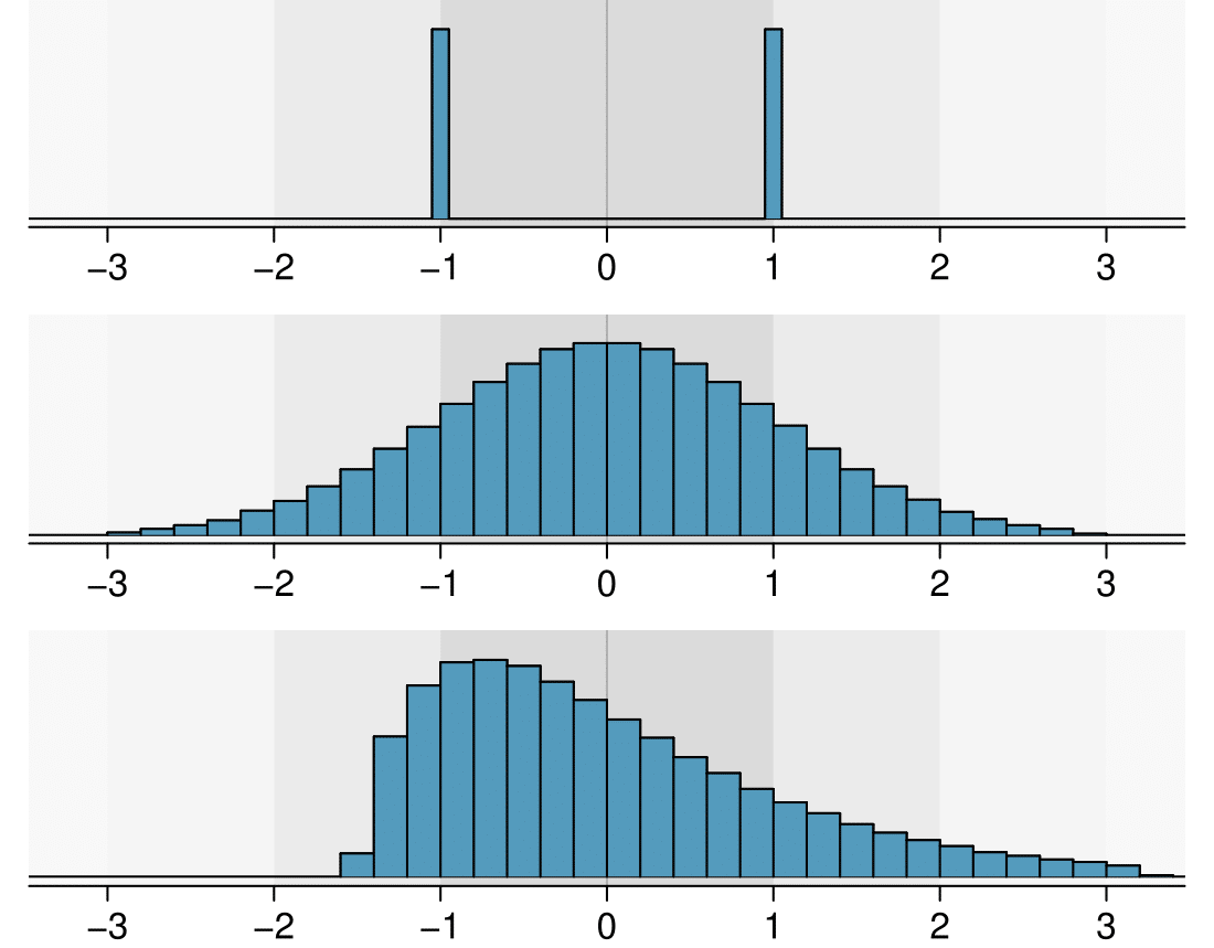
Figure2.2.11 Three very different population distributions with the same mean \(\mu=0\) and standard deviation \(\sigma=1\text{.}\)
In Subsection 2.1.4, the concept of shape of a distribution was introduced. A good description of the shape of a distribution should include modality and whether the distribution is symmetric or skewed to one side. Using Figure 2.2.11 as an example, explain why such a description is important. 7 Figure 2.2.11 shows three distributions that look quite different, but all have the same mean, variance, and standard deviation. Using modality, we can distinguish between the first plot (bimodal) and the last two (unimodal). Using skewness, we can distinguish between the last plot (right skewed) and the first two. While a picture, like a histogram, tells a more complete story, we can use modality and shape (symmetry/skew) to characterize basic information about a distribution.
Earlier we reported that the mean family income in the U.S. in 2012 was $82,743. Estimating the standard deviation of income as approximately $50,000, is a family income of $60,000 unusually far from the mean or relatively close to the mean?
Because $60,000 is less that one standard deviation from the mean, it is relatively close to the mean. If the value were more than 2 standard deviations away from the mean, we would consider it far from the mean.
When describing any distribution, comment on the three important characteristics of center, spread, and shape. Also note any especially unusual cases.
The distribution of email character counts is unimodal and very strongly skewed to the right. Many of the counts fall near the mean at 11,600, and most fall within one standard deviation (13,130) of the mean. There is one exceptionally long email with about 65,000 characters.
In this chapter we use standard deviation as a descriptive statistic to describe the variability in a given data set. In Chapter 5 we will use the standard deviation to assess how close a sample mean is to the population mean.
Subsection2.2.3Box plots and quartiles
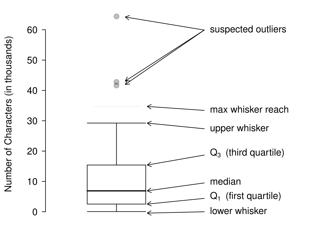
A box plot summarizes a data set using five summary statistics while also plotting unusual observations, called outliers. Figure 2.2.16 provides a box plot of the num_char variable from the email50 data set.
Figure2.2.16 A labeled box plot for the nuber of characters in 50 emails. The median (6,890) splits the data into the bottom 50% and the top 50%.
The five summary statistics used in a box plot are known as the five-number summary, which consists of the minimum, the maximum, and the three quartiles (\(Q_1\text{,}\) \(Q_2\text{,}\) \(Q_3\)) of the data set being studied.
\(Q_2\) represents the second quartile, which is equivalent to the 50th percentile (i.e. the median). Previously, we saw that Q\(_2\) (the median) for the email50 data set was the average of the two middle values: \(\frac{\text{ 6,768 } + \text{ 7,012 } }{2} = \text{ 6,890 }\text{.}\)
\(Q_1\) represents the first quartile, which is the 25th percentile, and is the median of the smaller half of the data set. There are 25 values in the lower half of the data set, so \(Q_1\) is the middle value: 2,454 characters. \(Q_3\) represents the third quartile, or 75th percentile, and is the median of the larger half of the data set: 15,829 characters.
We calculate the variability in the data using the range of the middle 50% of the data: \(Q_3 - Q_1 = \text{ 13,375 }\text{.}\) This quantity is called the interquartile range (IQR, for short). It, like the standard deviation, is a measure of variability or spread in data. The more variable the data, the larger the standard deviation and IQR tend to be.
Interquartile range (IQR)
The IQR is the length of the box in a box plot. It is computed as
\begin{gather*}
IQR = Q_3 - Q_1
\end{gather*}
where \(Q_1\) and \(Q_3\) are the \(25^{th}\) and \(75^{th}\) percentiles.
Outliers in the context of a box plot
When in the context of a box plot, define an outlier as an observation that is more than \(1.5 \times IQR\) above \(Q_3\) or \(1.5 \times IQR\) below \(Q_1\text{.}\) Such points are marked using a dot or asterisk in a box plot.
To build a box plot, draw an axis (vertical or horizontal) and draw a scale. Draw a dark line denoting \(Q_2\text{,}\) the median. Next, draw a line at \(Q_1\) and at \(Q_3\text{.}\) Connect the \(Q_1\) and \(Q_3\) lines to form a rectangle. The width of the rectangle corresponds to the IQR and the middle 50% of the data is in this interval.
Extending out from the rectangle, the whiskers attempt to capture all of the data reidxing outside of the box, except outliers. In Figure 2.2.16, the upper whisker does not extend to the last three points, which are beyond \(Q_3 + 1.5\times IQR\) and are outliers, so it extends only to the last point below this limit. 8 You might wonder, isn't the choice of \(1.5 \times IQR\) for defining an outlier arbitrary? It is! In practical data analyses, we tend to avoid a strict definition since what is an unusual observation is highly dependent on the context of the data. The lower whisker stops at the lowest value, 33, since there are no additional data to reach. Outliers are each marked with a dot or asterisk. In a sense, the box is like the body of the box plot and the whiskers are like its arms trying to reach the rest of the data.
Compare the box plot to the graphs previously discussed: stem-and-leaf plot, dot plot, frequency and relative frequency histogram. What can we learn more easily from a box plot? What can we learn more easily from the other graphs?
It is easier to immediately identify the quartiles from a box plot. The box plot also more prominently highlights outliers. However, a box plot, unlike the other graphs, does not show the distribution of the data. For example, we cannot generally identify modes using a box plot.
Yes. Looking at the lower and upper whiskers of this box plot, we see that the lower 25% of the data is squished into a shorter distance than the upper 25% of the data, implying that there is greater density in the low values and a tail trailing to the upper values. This box plot is right skewed.
True or false: there is more data between the median and \(Q_3\) than between \(Q_1\) and the median. 9 False. Since \(Q_1\) is the 25th percentile and the median is the 50th percentile, 25% of the data fall between \(Q_1\) and the median. Similarly, 25% of the data fall between \(Q_2\) and the median. The distance between the median and \(Q_3\) is larger because that 25% of the data is more spread out.
Find the 5 number summary and identify how small or large a value would need to be to be considered an outlier. Are there any outliers in this data set?
There are nine numbers in this data set. Because \(n\) is odd, the median is the middle number: 15. When finding \(Q_1\text{,}\) we find the median of the lower half of the data, which in this case includes 4 numbers (we do not include the 15 as belonging to either half of the data set). \(Q_1\) then is the average of 5 and 9, which is \(Q_1 = 7\text{,}\) and \(Q_3\) is the average of 20 and 30, so \(Q_3 = 35\text{.}\) The min is 5 and the max is 80. To see how small a number needs to be to be an outlier on the low end we do:
There are no numbers less than -41, so there are no outliers on the low end. The observation at 80 is greater than 77, so 80 is an outlier on the high end.
The first step in summarizing data or making a graph is to enter the data set into a list. Use STAT, Edit.
Press STAT.
Choose 1:Edit.
Enter data into L1 or another list.
Casio fx-9750GII: Entering data
video
Navigate to STAT (MENU button, then hit the 2 button or select STAT).
Optional: use the left or right arrows to select a particular list.
Enter each numerical value and hit EXE.
TI-84: Calculating Summary Statistics
VIDEO
Use the STAT, CALC, 1-Var Stats command to find summary statistics such as mean, standard deviation, and quartiles.
Enter the data as described previously.
Press STAT.
Right arrow to CALC.
Choose 1:1-Var Stats.
Enter L1 (i.e. 2ND1) for List. If the data is in a list other than L1, type the name of that list.
Leave FreqList blank.
Choose Calculate and hit ENTER.
TI-83: Do steps 1-4, then type L1 (i.e. 2nd1) or the list's name and hit ENTER.
Calculating the summary statistics will return the following information. It will be necessary to hit the down arrow to see all of the summary statistics.
\({\bar{\text{x} }}\)
Mean
minX
Minimum
\({\Sigma x}\)
Sum of all the data values
\({Q_1}\)
First quartile
\({\Sigma x^2}\)
Sum of all the squared data values
Med
Median
\({\sigma x}\)
Population standard deviation
maxX
Maximum
n
Sample size or # of data points
TI-83/84: Drawing a box plot
VIDEO
Enter the data to be graphed as described previously.
Hit 2NDY= (i.e. STAT PLOT).
Hit ENTER (to choose the first plot).
Hit ENTER to choose ON.
Down arrow and then right arrow three times to select box plot with outliers.
Down arrow again and make Xlist:L1 and Freq:1.
Choose ZOOM and then 9:ZoomStat to get a good viewing window.
Casio fx-9750GII: Drawing a box plot and 1-variable statistics
VIDEO
Navigate to STAT (MENU, then hit 2) and enter the data into a list.
Go to GRPH (F1).
Next go to SET (F6) to set the graphing parameters.
To use the 2nd or 3rd graph instead of GPH1, select F2 or F3.
Move down to Graph Type and select the \({\triangleright}\) (F6) option to see more graphing options, then select Box (F2).
If XList does not show the list where you entered the data, hit LIST (F1) and enter the correct list number.
Leave Frequency at 1.
For Outliers, choose On (F1).
Hit EXE and then choose the graph where you set the parameters F1 (most common), F2, or F3.
If desired, explore 1-variable statistics by selecting 1-Var (F1).
Enter the following 10 data points into the first list on a calculator: 5, 8, 1, 19, 3, 1, 11, 18, 20, 5. Find the summary statistics and make a box plot of the data.
For the email50 data set,\(Q_1=\) 2,536 and \(Q_3=15,411\text{.}\) \(\bar{x}\) = 11,600 and \(s\) = 13,130. What values would be considered an outlier on the low end using each rule? 10 \(Q_1 - 1.5\times IQR = 2536 - 1.5 \times (15411 - 2536) = -16,749.5\text{,}\) so values less than -16,749.5 would be considered an outlier using the first rule of thumb. Using the second rule of thumb, a value less than \(\bar{x} - 2\times s = 11,600 - 2 \times 13,130 = -14,660\) would be considered an outlier. Note tht these are just rules of thumb and yield different values.
Because there are no negative values in this data set, there can be no outliers on the low end. What does the fact that there are outliers on the high end but not on the low end suggestion? 11 It suggests that the distribution has a right hand tail, that is, that it is right skewed.
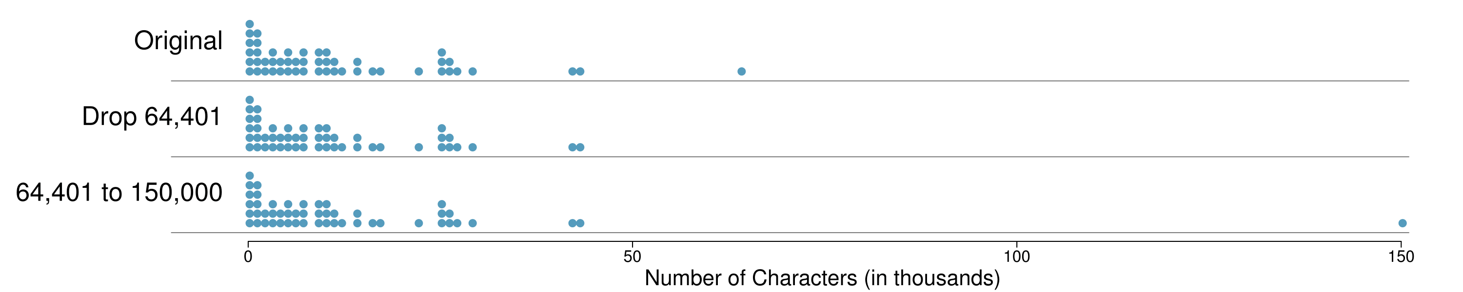
How are the sample statistics of the num_char data set affected by the observation, 64,401? What would have happened if this email wasn't observed? What would happen to these summary statistics if the observation at 64,401 had been even larger, say 150,000? These scenarios are plotted alongside the original data in Figure 2.2.24, and sample statistics are computed under each scenario in Table 2.2.25.
Figure2.2.24 Dot plots of the original character count data and two modified data sets.
robust
not robust
scenario
median
IQR
\(\bar{x}\)
\(s\)
original num_char data
6,890
12,875
11,600
13,130
drop 64,401 observation
6,768
11,702
10,521
10,798
move 64,401 to 150,000
6,890
12,875
13,310
22,434
Table2.2.25 A comparison of how the median, IQR, mean (\(\bar{x}\)), and standard deviation (\(s\)) change when extreme observations are present.
(a) Which is more affected by extreme observations, the mean or median? Table 2.2.25 may be helpful. (b) Is the standard deviation or IQR more affected by extreme observations? 12 (a) Mean is affected more. (b) Standard deviation is affected more. Complete explanations are provided in the material following Guided Practice 2.2.26.
The median and IQR are called robust estimates because extreme observations have little effect on their values. The mean and standard deviation are much more affected by changes in extreme observations.
Since there are no large gaps between observations around the three quartiles, adding, deleting, or changing one value, no matter how extreme that value, will have little effect on their values.
The distribution of vehicle prices tends to be right skewed, with a few luxury and sports cars lingering out into the right tail. If you were searching for a new car and cared about price, should you be more interested in the mean or median price of vehicles sold, assuming you are in the market for a regular car? 13 Buyers of a “regular car” should be concerned about the median price. High-end car sales can drastically inflate the mean price while the median will be more robust to the influence of those sales.
Begin with the following list: 1, 1, 5, 5. Multiply all of the numbers by 10. What happens to the mean? What happens to the standard deviation? How do these compare to the mean and the standard deviation of the original list?
The original list has a mean of 3 and a standard deviation of 2. The new list: 10, 10, 50, 50 has a mean of 30 with a standard deviation of 20. Because all of the values were multiplied by 10, both the mean and the standard deviation were multiplied by 10. 14 Here, the population standard deviation was used in the calculation. These properties can be proven mathematically using properties of sigma (summation).
Start with the following list: 1, 1, 5, 5. Multiply all of the numbers by -0.5. What happens to the mean? What happens to the standard deviation? How do these compare to the mean and the standard deviation of the original list?
The new list: -0.5, -0.5, -2.5, -2.5 has a mean of -1.5 with a standard deviation of 1. Because all of the values were multiplied by -0.5, the mean was multiplied by -0.5. Multiplying all of the values by a negative flipped the sign of numbers, which affects the location of the center, but not the spread. Multiplying all of the values by -0.5 multiplied the standard deviation by +0.5 since the standard deviation cannot be negative.
Again, start with the following list: 1, 1, 5, 5. Add 100 to every entry. How do the new mean and standard deviation compare to the original mean and standard deviation?
The new list is: 101, 101, 105, 105. The new mean of 103 is 100 greater than the original mean of 3. The new standard deviation of 2 is the same as the original standard deviation of 2. Adding a constant to every entry shifted the values, but did not stretch them.
Suppose that a researcher is looking at a list of 500 temperatures recorded in Celsius (C). The mean of the temperatures listed is given as 27°C with a standard deviation of 3 °C. Because she is not familiar with the Celsius scale, she would like to convert these summary statistics into Fahrenheit (F). To convert from Celsius to Fahrenheit, we use the following conversion:
Fortunately, she does not need to convert each of the 500 temperatures to Fahrenheit and then recalculate the mean and the standard deviation. The unit conversion above is a linear transformation of the following form, where \(a=9/5\) and \(b=32\text{:}\)
\begin{gather*}
aX + b
\end{gather*}
Using the examples as a guide, we can solve this temperature-conversion problem. The mean was 27°C and the standard deviation was 3 °C. To convert to Fahrenheit, we multiply all of the values by \(9/5\text{,}\) which multiplies both the mean and the standard deviation by \(9/5\text{.}\) Then we add 32 to all of the values which adds 32 to the mean but does not change the standard deviation further.
Figure2.2.32 500 temperatures shown in both Celsius and Fahrenheit.
Adding shifts the values, multiplying stretches or contracts them
Adding a constant to every value in a data set shifts the mean but does not affect the standard deviation. Multiplying the values in a data set by a constant will change the mean and the standard deviation by the same multiple, except that the standard deviation will always reidx positive.
The median is affected in the same way as the mean and the IQR is affected in the same way as the standard deviation. To get the new median, multiply the old median by \(9/5\) and add 32. The IQR is computed by htracting \(Q_1\) from \(Q_3\text{.}\) While \(Q_1\) and \(Q_3\) are each affected in the same way as the median, the additional 32 added to each will cancel when we take \(Q_3 - Q_1\text{.}\) That is, the IQR will be increase by a factor of \(9/5\) but will be unaffected by the addition of 32.
For a more mathematical explanation of the IQR calculation, see the footnote. 15 new IQR = \(\left(\frac{9}{5} Q_3 + 32\right) - \left(\frac{9}{5} Q_1 + 32\right) = \frac{9}{5} \left(Q_3 - Q_1\right) = \frac{9}{5} \times \text{ (old IQR) }\text{.}\)
Subsection2.2.7Comparing numerical data across groups
Some of the more interesting investigations can be considered by examining numerical data across groups. The methods required here aren't really new. All that is required is to make a numerical plot for each group. To make a direct comparison between two groups, create a pair of dot plots or a pair of histograms drawn using the same scales. It is also common to use back-to-back stem-and-leaf plots, parallel box plots, and hollow histograms, the three of which are explored here.
We will take a look again at the county data set and compare the median household income for counties that gained population from 2000 to 2010 versus counties that had no gain. While we might like to make a causal connection here, remember that these are observational data and so such an interpretation would be unjustified.
There were 2,041 counties where the population increased from 2000 to 2010, and there were 1,099 counties with no gain (all but one were a loss). A random sample of 100 counties from the first group and 50 from the second group are shown in Table 2.2.34.(a) to give a better sense of some of the raw data, and Figure 2.2.35 shows a back-to-back stem-and-leaf plot.
population gain
41.2
33.1
30.4
37.3
79.1
34.5
22.9
39.9
31.4
45.1
50.6
59.4
47.9
36.4
42.2
43.2
31.8
36.9
50.1
27.3
37.5
53.5
26.1
57.2
57.4
42.6
40.6
48.8
28.1
29.4
43.8
26
33.8
35.7
38.5
42.3
41.3
40.5
68.3
31
46.7
30.5
68.3
48.3
38.7
62
37.6
32.2
42.6
53.6
50.7
35.1
30.6
56.8
66.4
41.4
34.3
38.9
37.3
41.7
51.9
83.3
46.3
48.4
40.8
42.6
44.5
34
48.7
45.2
34.7
32.2
39.4
38.6
40
57.3
45.2
33.1
43.8
71.7
45.1
32.2
63.3
54.7
71.3
36.3
36.4
41
37
66.7
50.2
45.8
45.7
60.2
53.1
35.8
40.4
51.5
66.4
36.1
no gain
40.3
33.5
34.8
29.5
31.8
41.3
28
39.1
42.8
38.1
39.5
22.3
43.3
37.5
47.1
43.7
36.7
36
35.8
38.7
39.8
46
42.3
48.2
38.6
31.9
31.1
37.6
29.3
30.1
57.5
32.6
31.1
46.2
26.5
40.1
38.4
46.7
25.9
36.4
41.5
45.7
39.7
37
37.7
21.4
29.3
50.1
43.6
39.8
(a)(b)
Figure2.2.34 In this table, median household income (in $1000s) from a random sample of 100 counties that gained population over 2000-2010 are shown on the left. Median incomes from a random sample of 50 counties that had no population gain are shown on the right.
Population: Gain               Population: No Gain

                    3| 2 |12
                98766| 2 |66899
      444433222211100| 3 |00112234
  9999888777766666655| 3 |56667788888999
 44433332221111110000| 4 |0000001223344
        9988876665555| 4 |666778
            443221100| 5 |0
               977775| 5 |8
                  320| 6 |
                88766| 6 |
                   21| 7 |

 Legend: 4 | 5 = 45,000 median income
Figure2.2.35 Back-to-back stem-and-leaf plot for median income, split by whether the count had a population gain or no gain.
The parallel box plot is a traditional tool for comparing across groups. An example is shown in the left panel of Figure 2.2.36, where there are two box plots, one for each group, placed into one plotting window and drawn on the same scale.
Figure2.2.36 Side-by-side box plot (left panel) and hollow histograms (right panel) for med_income, where the counties are split by whether there was a population gain or loss from 2000 to 2010. The income data were collected between 2006 and 2010.
Another useful plotting method uses hollow histograms to compare numerical data across groups. These are just the outlines of histograms of each group put on the same plot, as shown in the right panel of Figure 2.2.36.
Use the plots in Figure 2.2.36 to compare the incomes for counties across the two groups. What do you notice about the approximate center of each group? What do you notice about the variability between groups? Is the shape relatively consistent between groups? How many prominent modes are there for each group? 16 Answers may vary a little. The counties with population gains tend to have higher income (median of about $45,000) versus counties without a gain (median of about $40,000). The variability is also slightly larger for the population gain group. This is evident in the IQR, which is about 50% bigger in the gain group. Both distributions show slight to moderate right skew and are unimodal. There is a secondary small bump at about $60,000 for the no gain group, visible in the hollow histogram plot, that seems out of place. (Looking into the data set, we would find that 8 of these 15 counties are in Alaska and Texas.) The box plots indicate there are many observations far above the median in each group, though we should anticipate that many observations will fall beyond the whiskers when using such a large data set.
TIP: comparing distributions
When comparing distributions, compare them with respect to center, spread, and shape as well as any unusual observations. Such descriptions should be in context.
What components of each plot in Figure 2.2.36 do you find most useful? 17 Answers will vary. The parallel box plots are especially useful for comparing centers and spreads, while the hollow histograms are more useful for seeing distribution shape, skew, and groups of anomalies.
Do these graphs tell us about any association between income for the two groups? 18 No, to see association we require a scatterplot. Moreover, these data are not paired, so the discussion of association does not make sense here.
Looking at an association is different than comparing distributions. When comparing distributions, we are interested in questions such as, “Which distribution has a greater average?” and “How do the shapes of the distribution differ?” The number of elements in each data set need not be the same (e.g. height of women and height of men). When we look at association, we are interested in whether there is a positive, negative, or no association between the variables. This requires two data sets of equal length that are essentially paired (e.g. height and weight of individuals).
TIP: comparing distributions versus looking at association
We compare two distributions with respect to center, spread, and shape. To compare the distributions visually, we use 2 single-variable graphs, such as two histograms, two dot plots, parallel box plots, or a back-to-back stem-and-leaf. When looking at association, we look for a positive, negative, or no relationship between the variables. To see association visually, we require a scatterplot.
Subsection2.2.8Mapping data (special topic)
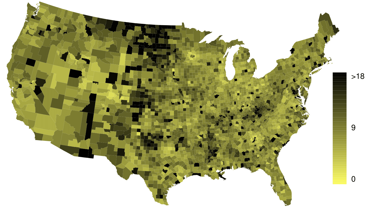
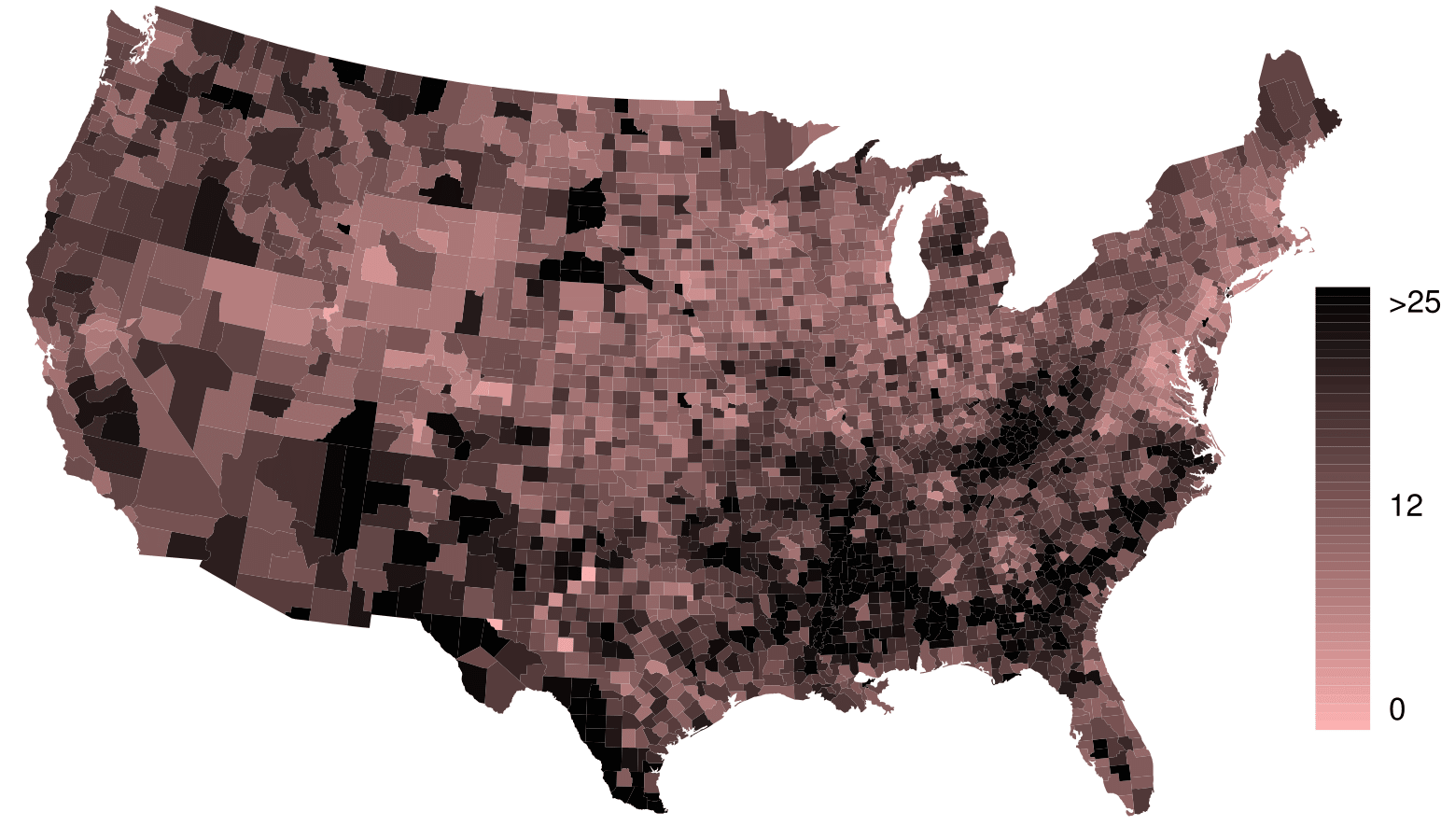
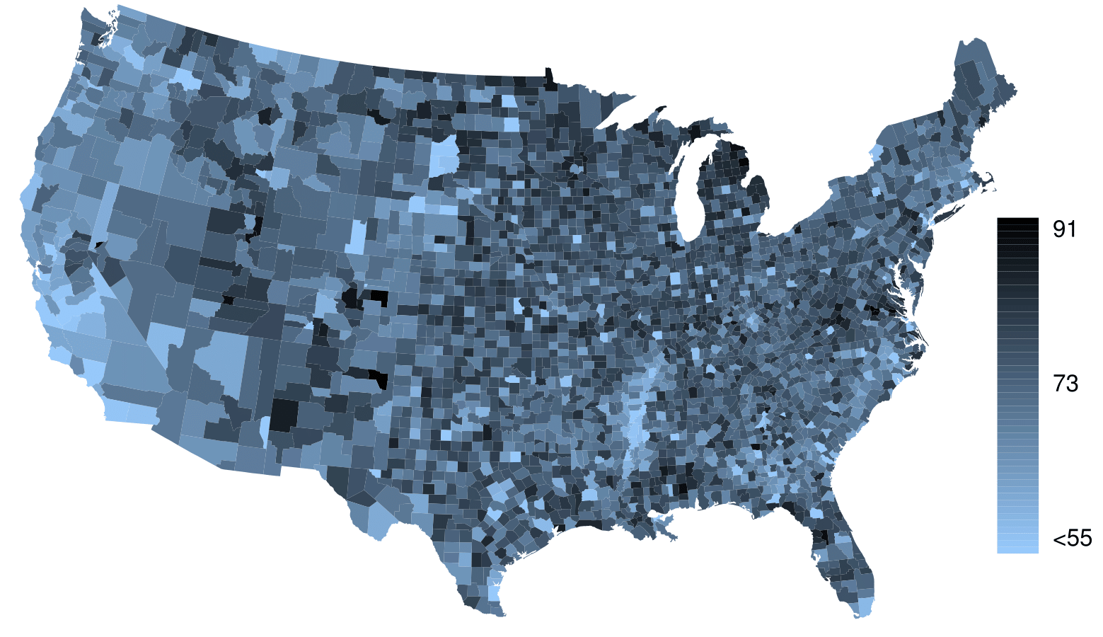
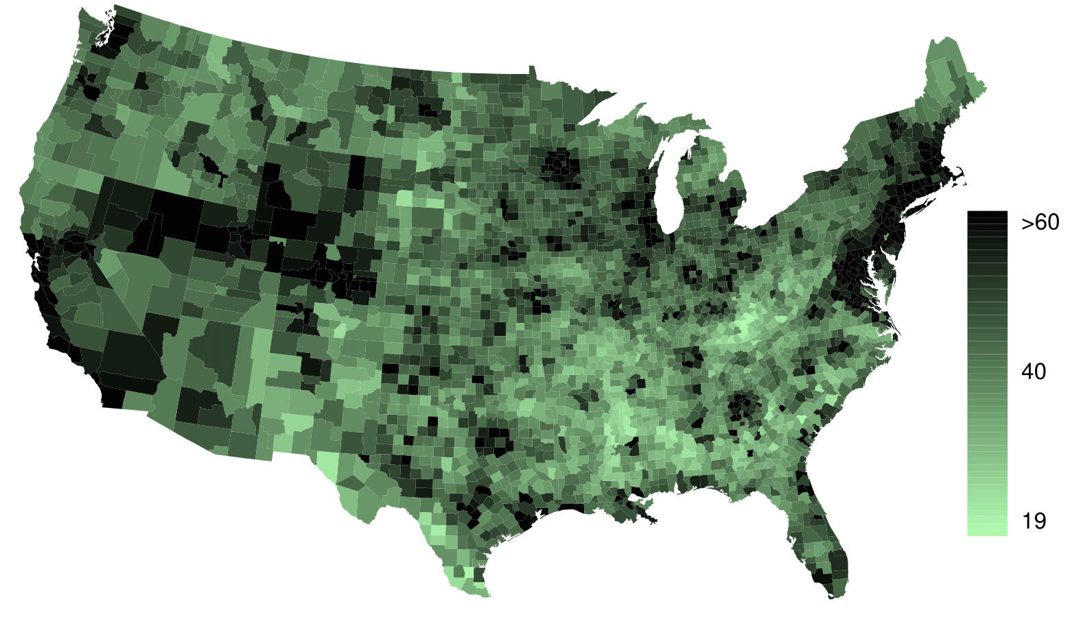
The county data set offers many numerical variables that we could plot using dot plots, scatterplots, or box plots, but these miss the true nature of the data. Rather, when we encounter geographic data, we should map it using an intensity map, where colors are used to show higher and lower values of a variable. Figure 2.2.40 and Figure 2.2.42 shows intensity maps for federal spending per capita (fed_spend), poverty rate in percent (poverty), homeownership rate in percent (homeownership), and median household income (med_income). The color key indicates which colors correspond to which values. Note that the intensity maps are not generally very helpful for getting precise values in any given county, but they are very helpful for seeing geographic trends and generating interesting research questions.
Figure2.2.40 Map of federal spending (dollars per capita).
Figure2.2.41 Intensity map of poverty rate (percent).
Figure2.2.42 Intensity map of homeownership rate (percent)
Figure2.2.43 Intensity map of median household income ($1000s).
The federal spending intensity map shows hstantial spending in the Dakotas and along the central-to-western part of the Canadian border, which may be related to the oil boom in this region. There are several other patches of federal spending, such as a vertical strip in eastern Utah and Arizona and the area where Colorado, Nebraska, and Kansas meet. There are also seemingly random counties with very high federal spending relative to their neighbors. If we did not cap the federal spending range at $18 per capita, we would actually find that some counties have extremely high federal spending while there is almost no federal spending in the neighboring counties. These high-spending counties might contain military bases, companies with large government contracts, or other government facilities with many employees.
Poverty rates are evidently higher in a few locations. Notably, the deep south shows higher poverty rates, as does the southwest border of Texas. The vertical strip of eastern Utah and Arizona, noted above for its higher federal spending, also appears to have higher rates of poverty (though generally little correspondence is seen between the two variables). High poverty rates are evident in the Mississippi flood plains a little north of New Orleans and also in a large section of Kentucky and West Virginia.
What interesting features are evident in the med_income intensity map? 19 Note: answers will vary. There is a very strong correspondence between high earning and metropolitan areas. You might look for large cities you are familiar with and try to spot them on the map as dark spots.