

Caution: Watch out for curved trends
We only consider models based on straight lines in this chapter. If data show a nonlinear trend, like that in the right panel of Figure 8.1.4, more advanced techniques should be used.
It is helpful to think deeply about the line fitting process. In this section, we examine criteria for identifying a linear model and introduce a new statistic, correlation.
Scatterplots were introduced in Chapter 2 as a graphical technique to present two numerical variables simultaneously. Such plots permit the relationship between the variables to be examined with ease. Figure 8.1.2 shows a scatterplot for the head length and total length of 104 brushtail possums from Australia. Each point represents a single possum from the data.
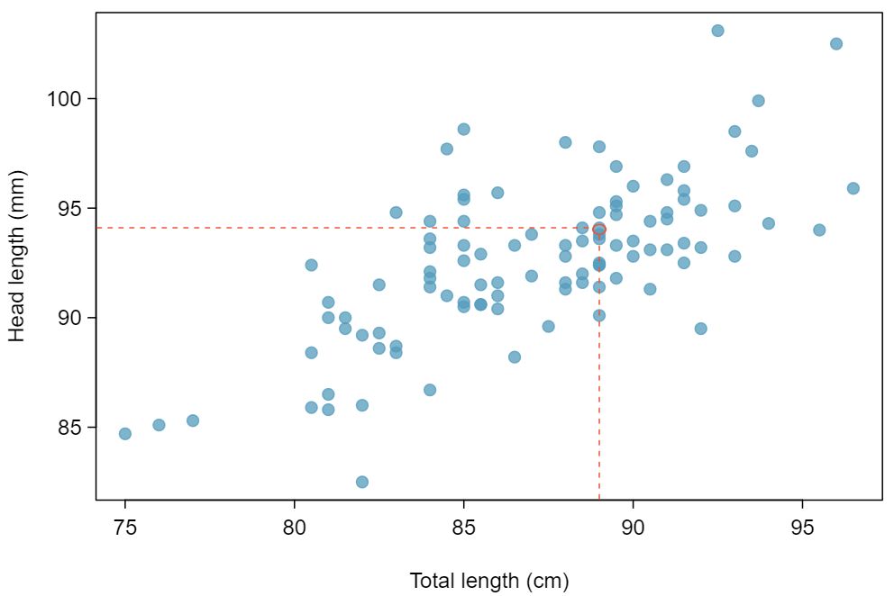
The head and total length variables are associated. Possums with an above average total length also tend to have above average head lengths. While the relationship is not perfectly linear, it could be helpful to partially explain the connection between these variables with a straight line.
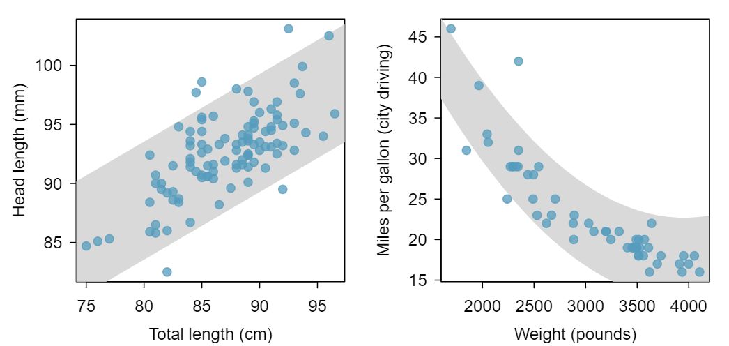
weight and mpgCity from the cars data set.Straight lines should only be used when the data appear to have a linear relationship, such as the case shown in the left panel of Figure 8.1.4. The right panel of Figure 8.1.4 shows a case where a curved line would be more useful in understanding the relationship between the two variables.
We only consider models based on straight lines in this chapter. If data show a nonlinear trend, like that in the right panel of Figure 8.1.4, more advanced techniques should be used.
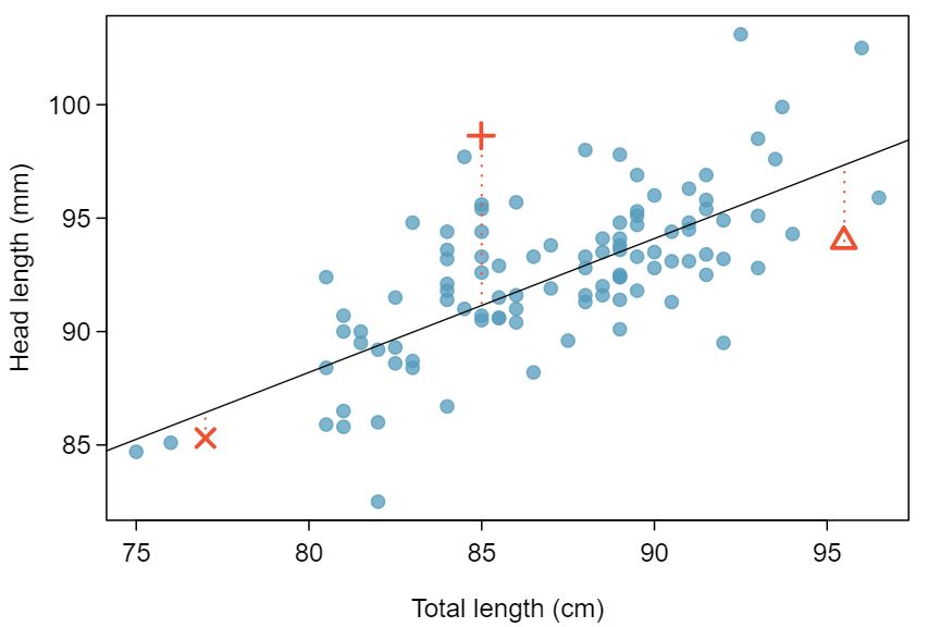
We want to describe the relationship between the head length and total length variables in the possum data set using a line. In this example, we will use the total length as the predictor variable, \(x\text{,}\) to predict a possum's head length, \(y\text{.}\) We could fit the linear relationship by eye, as in Figure 8.1.5. The equation for this line is
We can use this line to discuss properties of possums. For instance, the equation predicts a possum with a total length of 80 cm will have a head length of
A “hat” on \(y\) is used to signify that this is an estimate. This estimate may be viewed as an average: the equation predicts that possums with a total length of 80 cm will have an average head length of 88.2 mm. Absent further information about an 80 cm possum, the prediction for head length that uses the average is a reasonable estimate.
Residuals are the leftover variation in the data after accounting for the model fit:
Each observation will have a residual. If an observation is above the regression line, then its residual, the vertical distance from the observation to the line, is positive. Observations below the line have negative residuals. One goal in picking the right linear model is for these residuals to be as small as possible.
Three observations are noted specially in Figure 8.1.5. The observation marked by an “×” has a small, negative residual of about -1; the observation marked by “\(+\)” has a large residual of about +7; and the observation marked by “\(\triangle\)” has a moderate residual of about -4. The size of a residual is usually discussed in terms of its absolute value. For example, the residual for “\(\triangle\)” is larger than that of “×” because \(|-4|\) is larger than \(|-1|\text{.}\)
The residual of the \(i^{th}\) observation \((x_i, y_i)\) is the difference of the observed response (\(y_i\)) and the response we would predict based on the model fit (\(\hat{y}_i\)):
We typically identify \(\hat{y}_i\) by plugging \(x_i\) into the model.
The linear fit shown in Figure 8.1.5 is given as \(\hat{y} = 41 + 0.59x\text{.}\) Based on this line, formally compute the residual of the observation \((77.0, 85.3)\text{.}\) This observation is denoted by “×” on the plot. Check it against the earlier visual estimate, -1.
We first compute the predicted value of point “×” based on the model:
Next we compute the difference of the actual head length and the predicted head length:
This is very close to the visual estimate of -1.
If a model underestimates an observation, will the residual be positive or negative? What about if it overestimates the observation? 1 If a model underestimates an observation, then the model estimate is below the actual. The residual, which is the actual observation value minus the model estimate, must then be positive. The opposite is true when the model overestimates the observation: the residual is negative.
Compute the residuals for the observations \((85.0, 98.6)\) (“\(+\)” in the figure) and \((95.5, 94.0)\) (“\(\triangle\)”) using the linear relationship \(\hat{y} = 41 + 0.59x\text{.}\) 2 (\(+\)) First compute the predicted value based on the model:
\begin{equation*}
\hat{y}_{+} = 41+0.59x_{+} = 41+0.59\times 85.0 = 91.15
\end{equation*}
Then the residual is given by
\begin{equation*}
residual_{+} = y_{+} - \hat{y}_{+} = 98.6-91.15=7.45
\end{equation*}
This was close to the earlier estimate of 7.
\begin{equation*}
(\triangle)\hat{y}_{\triangle} = 41+0.59x_{\triangle} = 97.3.\text{ } residual_{\triangle} = y_{\triangle} - \hat{y}_{\triangle} = -3.3
\end{equation*}
Close to the estimate of -4.
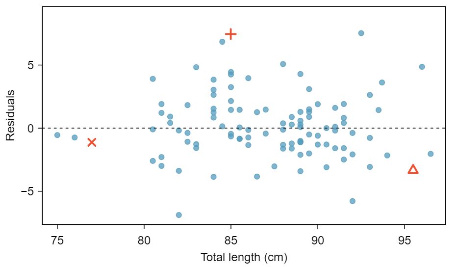
Residuals are helpful in evaluating how well a linear model fits a data set. We often display them in a residual plot such as the one shown in Figure 8.1.10 for the regression line in Figure 8.1.5. The residuals are plotted at their original horizontal locations but with the vertical coordinate as the residual. For instance, the point \((85.0,98.6)_{+}\) had a residual of 7.45, so in the residual plot it is placed at \((85.0, 7.45)\text{.}\) Creating a residual plot is sort of like tipping the scatterplot over so the regression line is horizontal.
From the residual plot, we can better estimate the standard deviation of the residuals, often denoted by the letter \(s\text{.}\) The standard deviation of the residuals tells us the average size of the residuals. As such, it is a measure of the average deviation between the \(y\) values and the regression line. In other words, it tells us the average prediction error using the linear model.
Estimate the standard deviation of the residuals for predicting head length from total length using the regression line. Also, interpret the quantity in context.
To estimate this graphically, we use the residual plot. The approximate 68, 95 rule for standard deviations applies. Approximately 2/3 of the points are within \(\pm\) 2.5 and approximately 95% of the points are within \(\pm\) 5, so 2.5 is a good estimate for the standard deviation of the residuals. On average, the prediction of head length is off by about 2.5 cm.
The standard deviation of the residuals, often denoted by the letter \(s\text{,}\) tells us the average error in the predictions using the regression model. It can be estimated from a residual plot.
One purpose of residual plots is to identify characteristics or patterns still apparent in data after fitting a model. Example 8.1.11 shows three scatterplots with linear models in the first row and residual plots in the second row. Can you identify any patterns reidxing in the residuals?
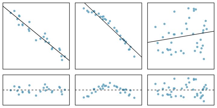
In the first data set (first column), the residuals show no obvious patterns. The residuals appear to be scattered randomly around the dashed line that represents 0.
The second data set shows a pattern in the residuals. There is some curvature in the scatterplot, which is more obvious in the residual plot. We should not use a straight line to model these data. Instead, a more advanced technique should be used.
The last plot shows very little upwards trend, and the residuals also show no obvious patterns. It is reasonable to try to fit a linear model to the data. However, it is unclear whether there is statistically significant evidence that the slope parameter is different from zero. The point estimate of the slope parameter, labeled \(b_1\text{,}\) is not zero, but we might wonder if this could just be due to chance. We will address this sort of scenario in Section 8.4.
Correlation, which always takes values between -1 and 1, describes the strength of the linear relationship between two variables. It can be strong, moderate, or weak.
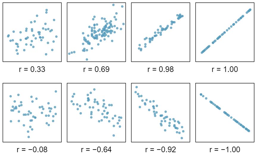
We can compute the correlation coefficient (or just correlation for short) using a formula, just as we did with the sample mean and standard deviation. However, this formula is rather complex, 3 Formally, we can compute the correlation for observations \((x_1, y_1)\text{,}\) \((x_2, y_2)\text{,}\) ..., \((x_n, y_n)\) using the formula \(r = \frac{1}{n-1}\sum_{i=1}^{n} \frac{x_i-\bar{x}}{s_x}\frac{y_i-\bar{y}}{s_y}\text{,}\) where \(\bar{x}\text{,}\) \(\bar{y}\text{,}\) \(s_x\text{,}\) and \(s_y\) are the sample means and standard deviations for each variable. so we generally perform the calculations on a computer or calculator. Figure 8.1.13 shows eight plots and their corresponding correlations. Only when the relationship is perfectly linear is the correlation either -1 or 1. If the relationship is strong and positive, the correlation will be near +1. If it is strong and negative, it will be near -1. If there is no apparent linear relationship between the variables, then the correlation will be near zero.
The correlation is intended to quantify the strength of a linear trend. Nonlinear trends, even when strong, sometimes produce correlations that do not reflect the strength of the relationship; see three such examples in Figure 8.1.14.
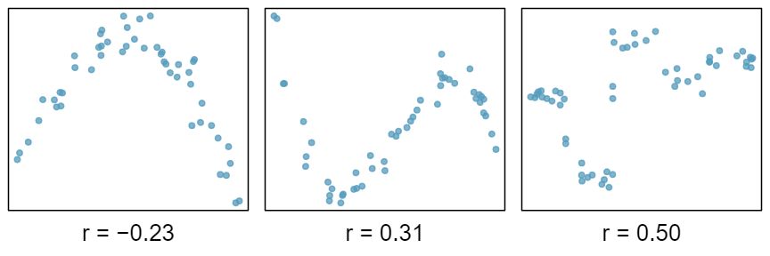
It appears no straight line would fit any of the datasets represented in Figure 8.1.14. Try drawing nonlinear curves on each plot. Once you create a curve for each, describe what is important in your fit. 4 We'll leave it to you to draw the lines. In general, the lines you draw should be close to most points and reflect overall trends in the data.
Take a look at Figure 8.1.5. How would this correlation change if head length were measured in cm rather than mm? What if head length were measure in inches rather than mm?
Here, changing the units of \(y\) corresponds to multiplying all the \(y\) values by a certain number. This would change the mean and the standard deviation of \(y\text{,}\) but it would not change the correlation. To see this, imagine dividing every number on the vertical axes by 10. The units of \(y\) are now cm rather than mm, but the graph has reidx exactly the same
The correlation between two variables should not be dependent upon the units in which the variables are recorded. Adding a constant, subtracting a constant, or multiplying a positive constant to all values of \(x\) or \(y\) does not affect the correlation.