
Section 2.3 Considering categorical data
¶OpenIntro: Considering Categroical Data video
Like numerical data, categorical data can also be organized and analyzed. In this section, we will introduce tables and other basic tools for categorical data that are used throughout this book. The email50 data set represents a sample from a larger email data set called email. This larger data set contains information on 3,921 emails. In this section we will examine whether the presence of numbers, small or large, in an email provides any useful value in classifying email as spam or not spam.
Subsection 2.3.1 Contingency tables and bar plots
Table 2.3.2 summarizes two variables: spam and number. Recall that number is a categorical variable that describes whether an email contains no numbers, only small numbers (values under 1 million), or at least one big number (a value of 1 million or more). A table that summarizes data for two categorical variables in this way is called a contingency table. Each value in the table represents the number of times a particular combination of variable outcomes occurred. For example, the value 149 corresponds to the number of emails in the data set that are spam and had no number listed in the email. Row and column totals are also included. The row totals provide the total counts across each row (e.g. \(149 + 168 + 50 = 367\)), and column totals are total counts down each column.
Table 2.3.3 shows a frequency table for the number variable. If we replaced the counts with percentages or proportions, the table is a relative frequency table.
number |
||||||
| none | small | big | Total | |||
spam |
spam | 149 | 168 | 50 | 367 | |
| not spam | 400 | 2659 | 495 | 3554 | ||
| Total | 549 | 2827 | 545 | 3921 | ||
spam and number.| none | small | big | Total |
| 549 | 2827 | 545 | 3921 |
number variable.Because the numbers in these tables are counts, not to data points, they cannot be graphed using the methods we applied to numerical data. Instead, another set of graphing methods are needed that are suitable for categorical data.
A bar plot is a common way to display a single categorical variable. The left panel of Figure 2.3.4 shows a bar plot for the number variable. In the right panel, the counts are converted into proportions (e.g. \(549/3921=0.140\) for none), showing the proportion of observations that are in each level (i.e. in each category).
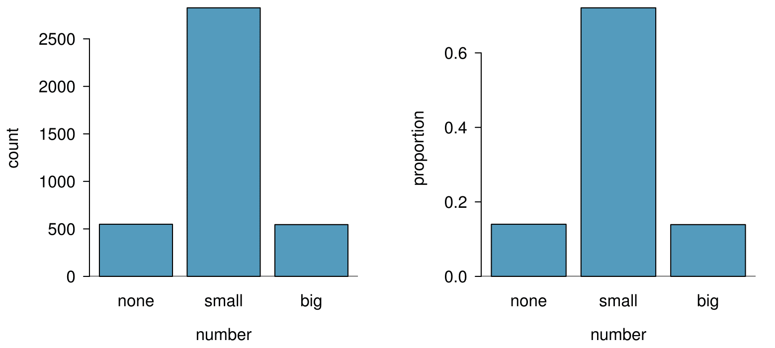
number. The left panel shows the counts, and the right panel shows the proportions in each group.Subsection 2.3.2 Row and column proportions
Table 2.3.5 shows the row proportions for Table 2.3.2. The row proportions are computed as the counts divided by their row totals. The value 149 at the intersection of spam and none is replaced by \(149/367=0.406\text{,}\) i.e. 149 divided by its row total, 367. So what does 0.406 represent? It corresponds to the proportion of spam emails in the sample that do not have any numbers.
| none | small | big | Total | |
| spam | \(149/367 = 0.406\) | \(168/367 = 0.458\) | \(50/367 = 0.136\) | 1.000 |
| not spam | \(400/3554 = 0.113\) | \(2657/3554 = 0.748\) | \(495/3554 = 0.139\) | 1.000 |
| Total | \(549/3921 = 0.140\) | \(2827/3921 = 0.721\) | \(545/3921 = 0.139\) | 1.000 |
spam and number variables.A contingency table of the column proportions is computed in a similar way, where each column proportion is computed as the count divided by the corresponding column total. Table 2.3.6 shows such a table, and here the value 0.271 indicates that 27.1% of emails with no numbers were spam. This rate of spam is much higher compared to emails with only small numbers (5.9%) or big numbers (9.2%). Because these spam rates vary between the three levels of number (none, small, big), this provides evidence that the spam and number variables are associated.
| none | small | big | Total | |
| spam | \(149/549 = 0.271\) | \(168/2827 = 0.059\) | \(50/545 = 0.092\) | \(367/3921 = 0.094\) |
| not spam | \(400/549 = 0.729\) | \(2659/2827 = 0.941\) | \(495/545 = 0.908\) | \(3684/3921 = 0.906\) |
| Total | 1.000 | 1.000 | 1.000 | 1.000 |
spam and number variables.We could also have checked for an association between spam and number in Table 2.3.5 using row proportions. When comparing these row proportions, we would look down columns to see if the fraction of emails with no numbers, small numbers, and big numbers varied from spam to not spam.
What does 0.458 represent in Table 2.3.5? What does 0.059 represent in Table 2.3.6? 1 0.458 represents the proportion of spam emails that had a small number. 0.059 represents the fraction of emails with small numbers that are spam.
Guided Practice 2.3.8
What does 0.139 at the intersection of not spam and big represent in Table 2.3.5? What does 0.908 represent in the Table 2.3.6? 2 0.139 represents the fraction of non-spam email that had a big number. 0.908 represents the fraction of emails with big numbers that are non-spam emails.
Example 2.3.9
Data scientists use statistics to filter spam from incoming email messages. By noting specific characteristics of an email, a data scientist may be able to classify some emails as spam or not spam with high accuracy. One of those characteristics is whether the email contains no numbers, small numbers, or big numbers. Another characteristic is whether or not an email has any HTML content. A contingency table for the spam and format variables from the email data set are shown in Table 2.3.10. Recall that an HTML email is an email with the capacity for special formatting, e.g. bold text. In Table 2.3.10, which would be more helpful to someone hoping to classify email as spam or regular email: row or column proportions?
Solution
Such a person would be interested in how the proportion of spam changes within each email format. This corresponds to column proportions: the proportion of spam in plain text emails and the proportion of spam in HTML emails.
If we generate the column proportions, we can see that a higher fraction of plain text emails are spam (\(209/1195 = 17.5\)) than compared to HTML emails (\(158/2726 = 5.8\)). This information on its own is insufficient to classify an email as spam or not spam, as over 80% of plain text emails are not spam. Yet, when we carefully combine this information with many other characteristics, such as number and other variables, we stand a reasonable chance of being able to classify some email as spam or not spam.
| text | HTML | Total | |
| spam | 209 | 158 | 367 |
| not spam | 986 | 2568 | 3554 |
| Total | 1195 | 2726 | 3921 |
spam and format.Example 2.3.9 points out that row and column proportions are not equivalent. Before settling on one form for a table, it is important to consider each to ensure that the most useful table is constructed.
Guided Practice 2.3.11
Look back to Table 2.3.5 and Table 2.3.6. Which would be more useful to someone hoping to identify spam emails using the number variable? 3 The column proportions in Table 2.3.6 will probably be most useful, which makes it easier to see that emails with small numbers are spam about 5.9% of the time (relatively rare). We would also see that about 27.1% of emails with no numbers are spam, and 9.2% of emails with big numbers are spam.
Subsection 2.3.3 Segmented bar plots
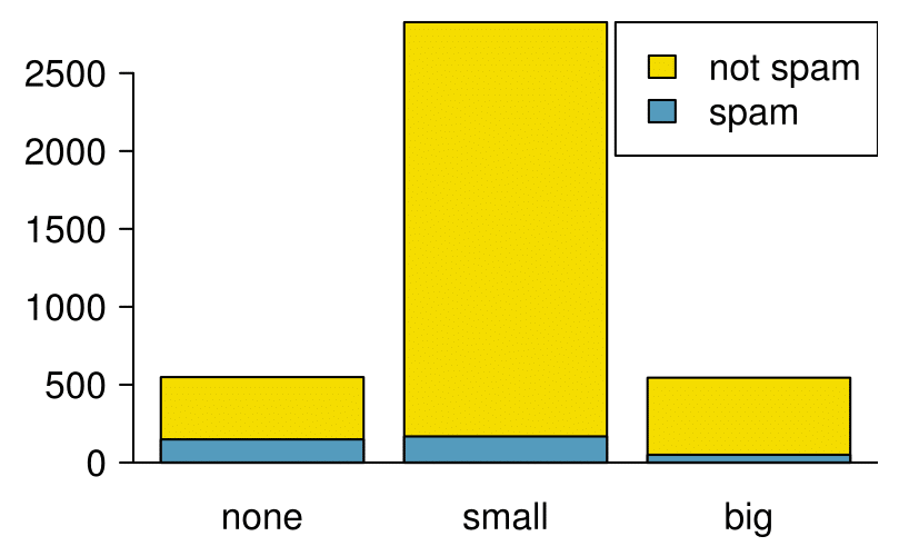
¶Contingency tables using row or column proportions are especially useful for examining how two categorical variables are related. Segmented bar plots provide a way to visualize the information in these tables.
A segmented bar plot is a graphical display of contingency table information. For example, a segmented bar plot representing Table 2.3.6 is shown in Figure 2.3.12, where we have first created a bar plot using the number variable and then separated each group by the levels of spam. The column proportions of Table 2.3.6 have been translated into a standardized segmented bar plot in Figure 2.3.13, which is a helpful visualization of the fraction of spam emails in each level of number.
spam.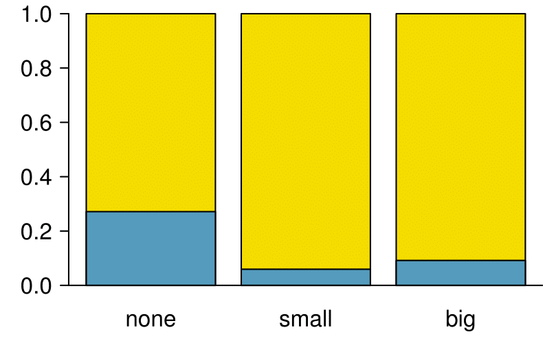
Example 2.3.14
Examine both of the segmented bar plots. Which is more useful?
Solution
Figure 2.3.12 contains more information, but Figure 2.3.13 presents the information more clearly. This second plot makes it clear that emails with no number have a relatively high rate of spam email — about 27%! On the other hand, less than 10% of email with small or big numbers are spam.
Since the proportion of spam changes across the groups in Figure 2.3.13, we can conclude the variables are dependent, which is something we were also able to discern using table proportions. Because both the none and big groups have relatively few observations compared to the small group, the association is more difficult to see in Figure 2.3.12.
In some other cases, a segmented bar plot that is not standardized will be more useful in communicating important information. Before settling on a particular segmented bar plot, create standardized and non-standardized forms and decide which is more effective at communicating features of the data.
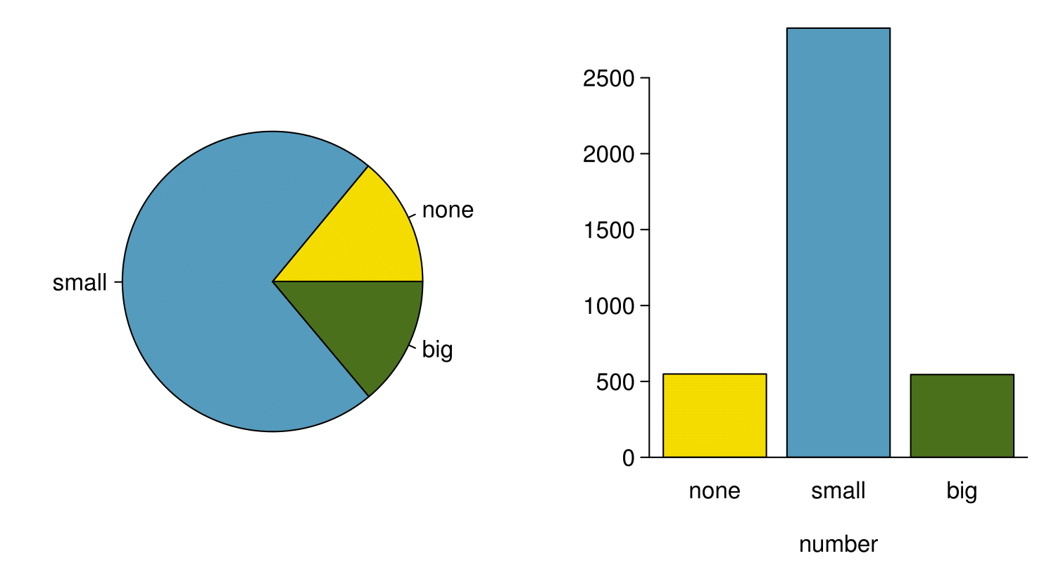
Subsection 2.3.4 The only pie chart you will see in this book
While pie charts are well known, they are not typically as useful as other charts in a data analysis. A pie chart is shown in Figure 2.3.15 alongside a bar plot. It is generally more difficult to compare group sizes in a pie chart than in a bar plot, especially when categories have nearly identical counts or proportions. In the case of the none and big categories, the difference is so slight you may be unable to distinguish any difference in group sizes for either plot!
number for the email data set.