Style Imagery
This document is a preview.

Imagery

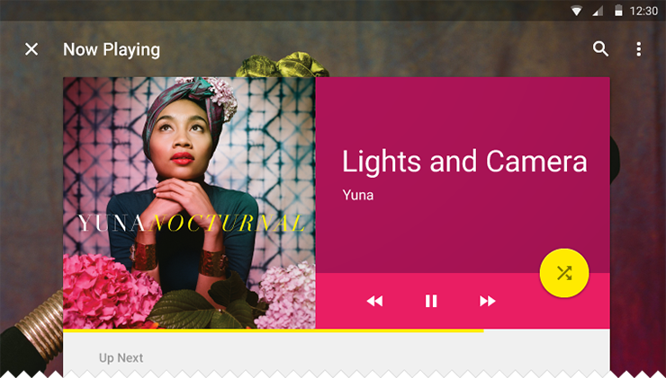
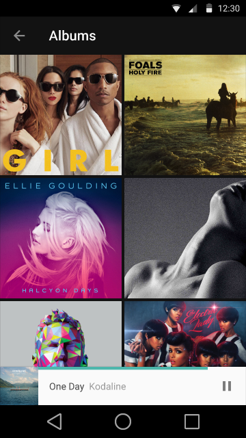
Bold, graphic, and intentional imagery helps to engage the user. Imagery is more than decoration. It’s a powerful tool to help you communicate and differentiate your product. Whether the mood is subdued and muted or bright and colorful, the following principles and best practices can help you incorporate imagery successfully and bring your apps to life, no matter what the visual brand.

Principles Expand and collapse content An arrow that points down when collapsed and points up when expanded.

When using photography and illustration to enhance the user experience, choose images that express personal relevance, information and delight. These principles will help inform imagery considerations in your product.
Personal Relevance
An intelligent app has imagery that accurately reflects the context and the world the user inhabits.
Information
Convey specific information. Facilitate and expedite comprehension.
Delight
Aesthetic thoughtfulness combined with appropriate context will delight your users. Delight makes your product feel special and your user feel relevant.

Appreciation of context
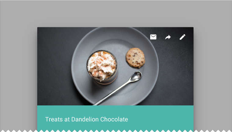
Incorporate logic to ensure images are dynamic, context-intelligent, and context-relevant. Predictive visuals display a level of intelligence that substantially improves the user experience.

Be Immersive

Don’t be afraid of obscuring or alluding to integrated hero images and thumbnails through color and content overlays.

Best Practices Expand and collapse content An arrow that points down when collapsed and points up when expanded.

Use Multiple Mediums

Both illustration and photography can live within the same product. Photography automatically implies a degree of specificity and should be used to showcase specific entities and stories. Illustration is effective for representing concepts and metaphors where specific photography might be alienating.


Do.
For specific entities, look first to photographic representation.
Do.
When total specificity is not available or applicable, illustration conveys your app's intelligence while allowing at-a-glance comprehension of content.
Do.
If you use photography to convey a concept, develop considered, even metaphorical, pieces.
Don't.
Don't default to literal stock photography.

Stay away from stock

Use imagery to express a distinctive voice and exemplify creative excellence.

For specific entities or branded content, use specific imagery. For more abstract content, be interpretive. Photographic stock and clipart is neither specific nor interpretive.

Stay away from stock
Do.
Strive for images that represent genuine stories.
Don't.
Stock images can feel inauthentic.

Have a point of focus

Have an iconic point of focus in your imagery. Focus ranges from a single entity to an overarching composition. Ensure that a clear concept is conveyed to the user in a memorable way.

Make the meaning immediately discernible.
Do.
Make the meaning immediately discernible.
San Francisco
Don't.
Avoid making the user hunt for the meaning in the image.
Do.
The most powerful iconic images consist of a few meaningful elements, with minimal distractions.
Don't.
When the point of focus is obscured, the iconic quality of the image is lost.
Do.
A clear focus communicates the concept at a glance.
Don't.
A lack of focus makes the image meaningless.

Build narratives

Create an immersive story and a sense of context to humanize your app. Define the mood through visual storytelling: is the mood aspirational? Somber? Celebratory?
Do.
An image that tells a story is infinitely more interesting, and even more informative.
Don't.
An image that lacks a story loses an opportunity to convey mood, brand, and context.
Do.
Properly contextualized concepts convey your message and brand more effectively.
Don't.
A representation of an entity that is dissociated from context feels unnatural and can be confusing.

Don't Over-Manipulate

Maintain the original integrity of the image. Don’t apply heavy filters or gaussian blurs to imagery, especially when trying to hide degradation.

Do.
Don't.
Do.
Don't.

UI Integration Expand and collapse content An arrow that points down when collapsed and points up when expanded.

Resolution

Make sure your images are appropriately sized for their containers and across platforms. The framework emphasizes large images. Ideally, the assets should not appear pixelated. Test appropriate resolution sizes for specific ratios and devices.


Do.
Appropriately sized imagery
Don't.
Degraded imagery

Introduce Scale

Introduce alternative scales to create levels of visual importance.
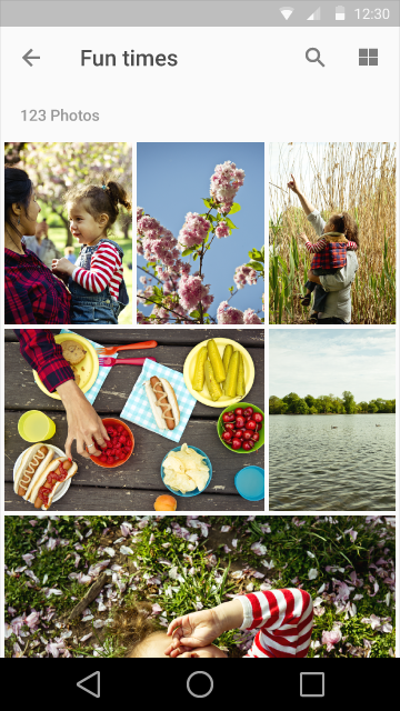
Within a gallery context, introduce thumbnails of various sizes to convey content hierarchy.
Encourage multiple containers living in the same ecosystem.

Text Protection

To make typography legible on imagery, add text protection scrims.

Do.
Dark scrims should ideally be between 20%-40% opacity depending on the content. Light scrims should ideally range from 40%-60% opacity depending on the content.
Don't.
Don't heavily obscure imagery with text protection scrims.
 
 
Do.
For larger real estate, target specific areas for text protection instead of blanketing the entire image.
Don't.
Don’t "over-scrim" large images.
 
Do.
Color overlays are different than text-protection scrims and can be used as a design element. When creating complementary color overlays, use the Palette API to define your color scheme based on content.
Do.
You can use your brand’s color palette decoratively to enhance imagery.

Avatars and Thumbnails

Avatars and thumbnails represent entities or content, either literally through photography or conceptually through illustration. Generally, they are tap targets that lead to a primary view of the entity or content.

Avatars can be used to represent people. For personal avatars, offer personalization options. As users may choose not to personalize an avatar, provide delightful defaults. When used with a specific logo, avatars can also be used to represent brand.

Thumbnails allude to more information—letting the user peek into content—and assist navigation. Thumbnails let you include imagery in tight spaces.

Avatars make an app feel more personal—and occupy minimal space.
A brand avatar communicates information at a glance, as does the thumbnail image.

Hero Images

Hero images are images that are usually anchored in a prominent position, above the fold, such as a banner at the top of the screen. They serve to draw in a user, provide context about the content, or reinforce brand.
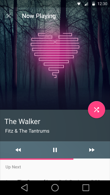
Feature image
A feature image is a bold, primary point of focus within a heterogeneous layout.
Integrated hero image
Integrated hero images create a setting for heterogeneous pieces of content within a layout. They are not the primary points of focus.