This section covers the high level structure of our apps ranging from mobile to desktop and contains a few points of guidance.
Apps come in many varieties that address very different needs. For example:
- Apps built around a single focused activity handled from a single screen (such as a calculator, a camera, and many games)
- Apps whose main purpose is to switch between different activities without deeper navigation (such as a phone dialer offering favorites, recents, and contacts)
- Apps that combine a broad set of data views with deep navigation (such as different folders for a mail app or product categories in a shopping app)
Your app's structure will depend largely on the content and tasks you want to surface for your users.
The layout of your start screen requires special attention. This is the first screen people see after launching your app, so it should be an equally rewarding experience for new and frequent visitors alike.
Ask yourself: "What will typical users most likely want to do in my app?", and structure your start screen experience accordingly.
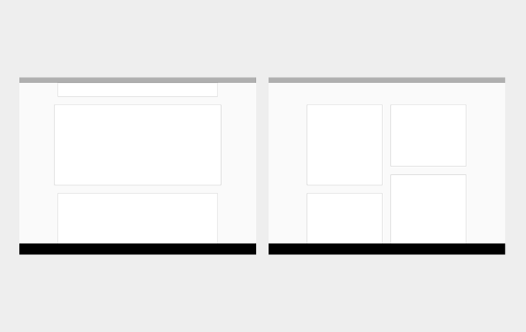
Put content forward. Many apps focus on the content display. Avoid navigation-only screens and instead let people get to the core experience of your app right away by making content the centerpiece of your start screen. Choose layouts that are visually engaging and appropriate for the data type and screen size.
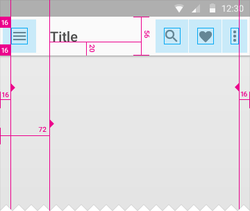
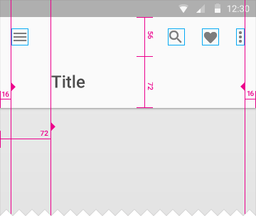
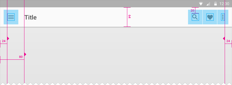
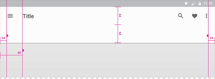
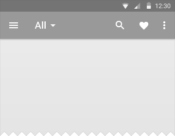
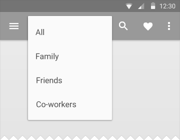
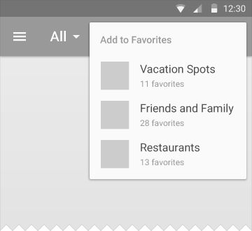
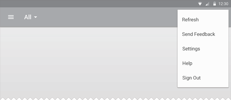
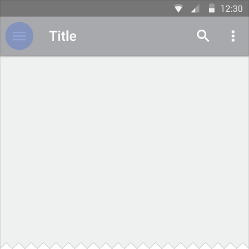
Anchor navigation and actions. Like any toolbar, the app bar can organize important actions. Its position at the top of a screen makes it ideal for presenting navigation controls, including switching between tabs or opening the left navigation bar. If your content is searchable, include the Search action in the app bar so people can cut through the navigation hierarchy.
Be opinionated about functionality. When your app has a large amount of content or capabilities, direct the user’s focus to the most critical aspects of your product. Highlight navigation to important destinations within the content area. Promote the most characterful action as a floating action button. De-emphasize less frequently traveled paths in your app.
The top level communicates your app’s capabilities by introducing the user to the major functional areas. Some apps will be very focused and have modest navigation needs. In other apps, the top level will consist of multiple views, and you'll want to make sure that the user can navigate between them efficiently.
Select the approach that best matches your app's navigation needs.
Focus on a single view with embedded navigation. By putting all necessary navigation directly inline with other app content, you make it extremely visible to the user. This can be appropriate when the app’s navigation model is very simple. However, presenting a large number of navigation paths in this manner can reduce the space available to display content, and these pathways could be distributed throughout the screen rather than co-located in a predictable and convenient location.
Use in-context navigation if:
- Your app has a strong primary view, and no or few alternate ones.
- Your users can complete the most common tasks easily within the main view.
- You expect users will use your app very infrequently and will appreciate well-exposed paths.
Use tabs to switch between a small number of equally important views. If your app has only a handful of functional areas, each with shallow hierarchies, using tabs increases the awareness of these peer top-level views. It also accelerates switching between them, bringing them into view with just a click or a swipe. However, displaying the tabs takes up significant space on smaller displays, and is efficient only for a small number of peers with succinct labels.
Use tabs if:
- You expect your app's users to switch views frequently.
- You have a limited number of top-level views.
- You want the user to be highly aware of the alternate views.
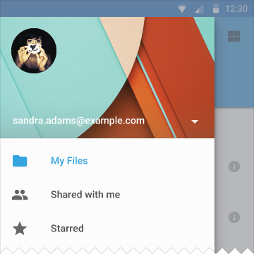
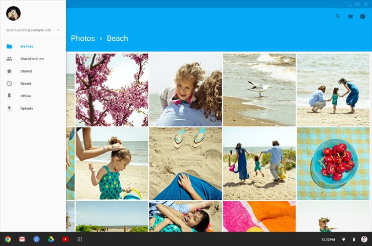
Manage more complex structure through a left navigation drawer. The left nav panel can display large numbers of navigation targets concurrently. It is particularly useful when your app has a single, natural “home”, and the drawer can then act as an index of less frequently visited destinations. If your app requires cross-navigation directly from a lower-level screen to other important sections of your app, the ability to swipe in the left nav panel from any point in your app can make that context switch more efficient for the user. However, because it is a less obvious affordance, it may take the user time to familiarize themselves with the contents.
Use a navigation drawer if:
- Your app has a large number of top-level views.
- You want to enable quick cross-navigation between views which aren’t directly related.
- You have particularly deep navigation branches and want to accelerate returning to the top of the app.
- You want to reduce the visibility and user awareness of less frequently visited destinations.
Regardless of the top-level view strategy you select, in-context navigation is always a powerful tactic for moving between related sets of data. Some examples are providing direct links between one song and another from the same artist; between recent items and a complete history; or between one post from a user and their overall profile. These direct paths make it natural to extend from a main task into a related one.
Mobile
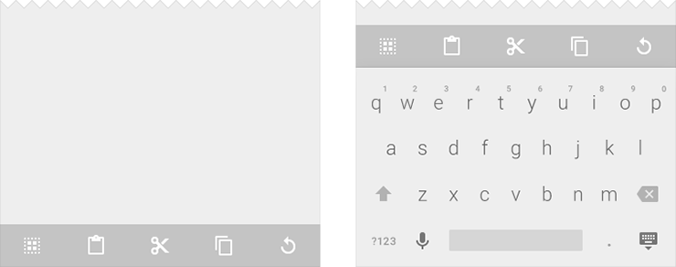
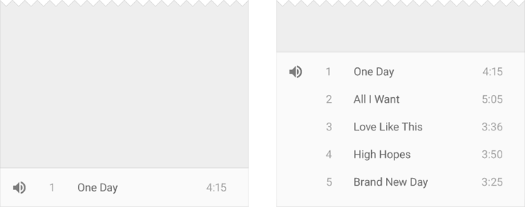
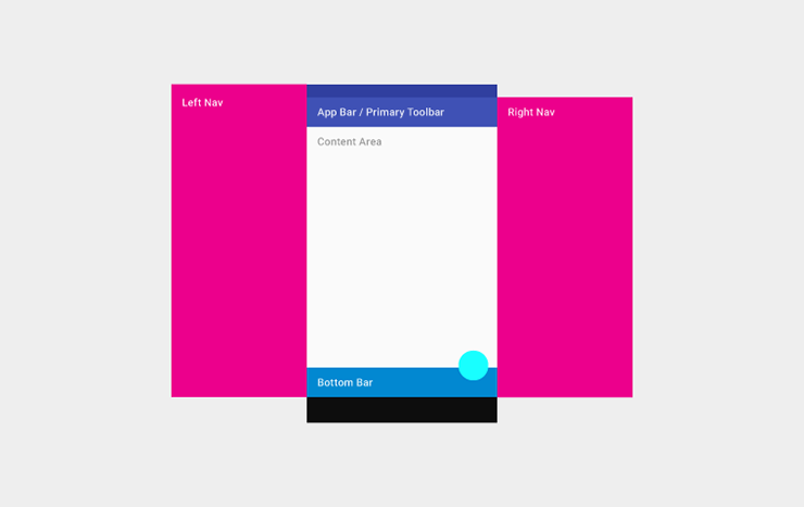
This structure includes a permanent app bar and floating action button. An optional bottom bar can be added for additional functionality or action overflow. Side nav menus that users can access as needed overlay all other structural elements.
Tablet
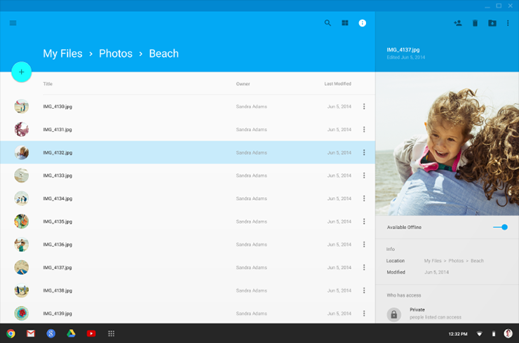
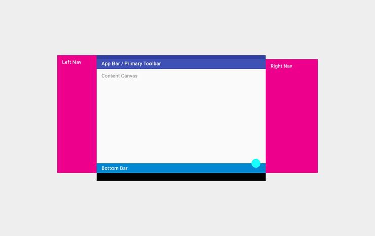
This structure shows a permanent app bar with floating action button. The app bar absorbs elements from tablet and mobile bottom bars. An optional bottom bar can be added for additional functionality or action overflow. A left navigation menu that users can can access as needed overlays all other structural elements. A right nav menu can be accessed temporarily or pinned for permanent display.
Desktop
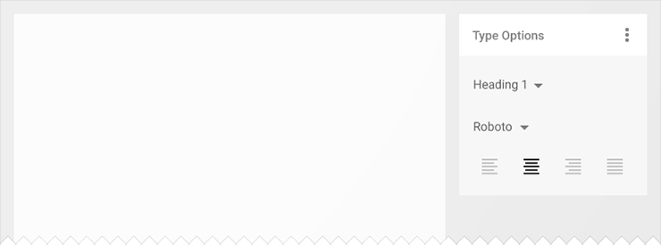
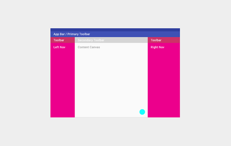
This structure contains a permanent app bar with floating action button. The app bar absorbs elements from tablet and mobile bottom bars. Where possible, the window controls are absorbed into the app bar. Side navigation menus can be accessed temporarily or pinned for permanent display. Side nav menus as well as the content canvas can have their own secondary toolbars for tabs, palettes, or secondary actions.
UI Guidance
Define a primary horizontal or vertical divider.
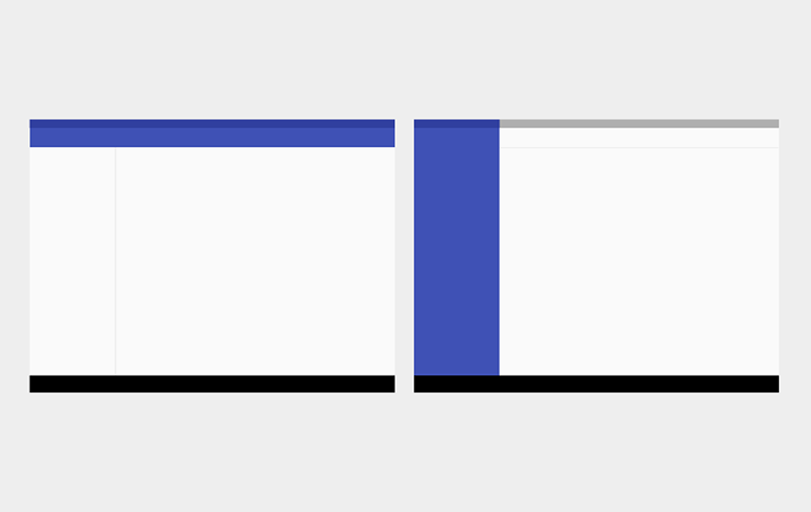
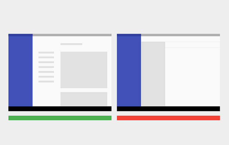
Avoid slicing up the interface into too many regions which can cause L shapes. Instead, use whitespace to delineate secondary areas.
Break edges with cards and floating action buttons.
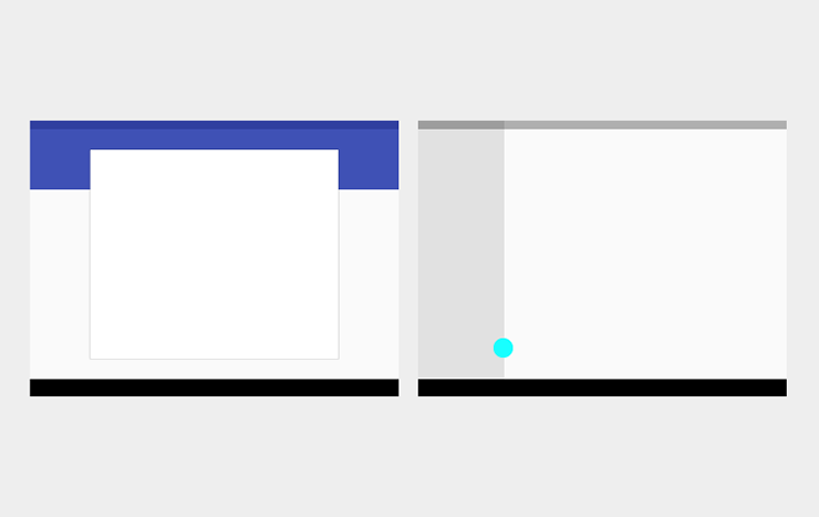
Use cards to organize content when specific behaviors are needed or if informational groupings require greater separation than whitespace or dividers can provide.
