Components Tooltips
This document is a preview.

Tooltips

Usage Expand and collapse content An arrow that points down when collapsed and points up when expanded.

Use tooltips for elements that are 1) interactive and 2) primarily graphical (not textual).

Do.
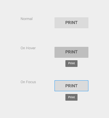
Don't.

Tooltips are different then hovercards, which display richer information including images and formatted text.

Tooltips are different than ALT-attributes, which are intended primarily for static images.
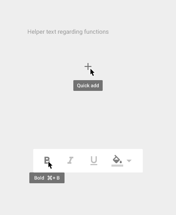
Do.

Don't.

Cursor/keyboard Tooltips Expand and collapse content An arrow that points down when collapsed and points up when expanded.

Text: Roboto Medium 10 sp

Background fill: 90% opaque

Tooltip motion

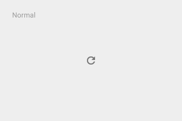
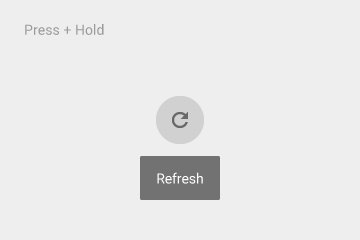
Touch UI Tooltips Expand and collapse content An arrow that points down when collapsed and points up when expanded.

Touch UI Tooltips

Text is Roboto Medium 14 sp

Background fill is 90% opaque