
Section 8.4 Transformations for skewed data
¶County population size among the counties in the US is very strongly right skewed. Can we apply a transformation to make the distribution more symmetric? How would such a transformation affect the scatterplot and residual plot when another variable is graphed against this variable? In this section, we will see the power of transformations for very skewed data.
Subsection 8.4.1 Learning objectives
See how a log transformation can bring symmetry to an extremely skewed variable.
Recognize that data can often be transformed to produce a linear relationship, and that this transformation often involves log of the \(y\)-values and sometimes log of the \(x\)-values.
Use residual plots to assess whether a linear model for transformed data is reasonable.
Subsection 8.4.2 Introduction to transformations
Example 8.4.1.
Consider the histogram of county populations shown in Figure 8.4.2.(a), which shows extreme skew. What isn't useful about this plot?
Nearly all of the data fall into the left-most bin, and the extreme skew obscures many of the potentially interesting details in the data.
There are some standard transformations that may be useful for strongly right skewed data where much of the data is positive but clustered near zero. A transformation is a rescaling of the data using a function. For instance, a plot of the logarithm (base 10) of county populations results in the new histogram in Figure 8.4.2.(b). This data is symmetric, and any potential outliers appear much less extreme than in the original data set. By reigning in the outliers and extreme skew, transformations like this often make it easier to build statistical models against the data.
Transformations can also be applied to one or both variables in a scatterplot. A scatterplot of the population change from 2010 to 2017 against the population in 2010 is shown in Figure 8.4.3.(a). In this first scatterplot, it's hard to decipher any interesting patterns because the population variable is so strongly skewed. However, if we apply a log\(_{10}\) transformation to the population variable, as shown in Figure 8.4.3.(b), a positive association between the variables is revealed. While fitting a line to predict population change (2010 to 2017) from population (in 2010) does not seem reasonable, fitting a line to predict population from log\(_{10}\)(population) does seem reasonable.
Transformations other than the logarithm can be useful, too. For instance, the square root (\(\sqrt{\text{ original observation } }\)) and inverse (\(\frac{1}{\text{ original observation } }\)) are commonly used by data scientists. Common goals in transforming data are to see the data structure differently, reduce skew, assist in modeling, or straighten a nonlinear relationship in a scatterplot.
Subsection 8.4.3 Transformations to achieve linearity
Example 8.4.5.
Consider the scatterplot and residual plot in Figure 8.4.4. The regression output is also provided. Is the linear model \(\hat{y} = -52.3564 + 2.7842 x\) a good model for the data?
The regression equation is

y = -52.3564 + 2.7842 x

Predictor       Coef   SE Coef         T          P
Constant    -52.3564    7.2757    -7.196      3e-08
x             2.7842    0.1768    15.752    < 2e-16

S = 13.76    R-Sq = 88.26%    R-Sq(adj) = 87.91%
We can note the \(R^2\) value is fairly large. However, this alone does not mean that the model is good. Another model might be much better. When assessing the appropriateness of a linear model, we should look at the residual plot. The \(\cup\)-pattern in the residual plot tells us the original data is curved. If we inspect the two plots, we can see that for small and large values of \(x\) we systematically underestimate \(y\text{,}\) whereas for middle values of \(x\text{,}\) we systematically overestimate \(y\text{.}\) The curved trend can also be seen in the original scatterplot. Because of this, the linear model is not appropriate, and it would not be appropriate to perform a \(t\)-test for the slope because the conditions for inference are not met. However, we might be able to use a transformation to linearize the data.
Regression analysis is easier to perform on linear data. When data are nonlinear, we sometimes transform the data in a way that makes the resulting relationship linear. The most common transformation is log of the \(y\) values. Sometimes we also apply a transformation to the \(x\) values. We generally use the residuals as a way to evaluate whether the transformed data are more linear. If so, we can say that a better model has been found.
Example 8.4.6.
Using the regression output for the transformed data, write the new linear regression equation.
The regression equation is

log(y) = 1.722540 + 0.052985 x

Predictor         Coef     SE Coef        T          P
Constant      1.722540    0.056731    30.36    < 2e-16
x             0.052985    0.001378    38.45    < 2e-16

S = 0.1073    R-Sq = 97.82%    R-Sq(adj) = 97.75%
The linear regression equation can be written as: \(\widehat{\text{ log } (y)} = 1.723 +0.053 x\)
Checkpoint 8.4.8.
Which of the following statements are true? There may be more than one.
There is an apparent linear relationship between \(x\) and \(y\text{.}\)
There is an apparent linear relationship between \(x\) and \(\widehat{\text{ log } (y)}\text{.}\)
The model provided by Regression I (\(\hat{y} = -52.3564 + 2.7842 x\)) yields a better fit.
The model provided by Regression II (\(\widehat{\text{ log } (y)} = 1.723 +0.053 x\)) yields a better fit. 1
Subsection 8.4.4 Section summary
A transformation is a rescaling of the data using a function. When data are very skewed, a log transformation often results in more symmetric data.
Regression analysis is easier to perform on linear data. When data are nonlinear, we sometimes transform the data in a way that results in a linear relationship. The most common transformation is log of the \(y\)-values. Sometimes we also apply a transformation to the \(x\)-values.
To assess the model, we look at the residual plot of the transformed data. If the residual plot of the original data has a pattern, but the residual plot of the transformed data has no pattern, a linear model for the transformed data is reasonable, and the transformed model provides a better fit than the simple linear model.
Exercises 8.4.5 Exercises
1. Used trucks.
The scatterplot below shows the relationship between year and price (in thousands of $) of a random sample of 42 pickup trucks. Also shown is a residuals plot for the linear model for predicting price from year.
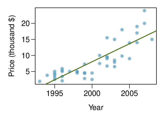
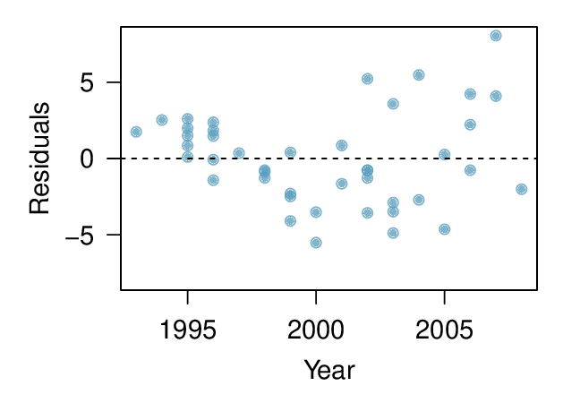
Describe the relationship between these two variables and comment on whether a linear model is appropriate for modeling the relationship between year and price.
-
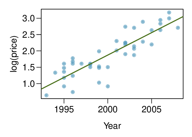
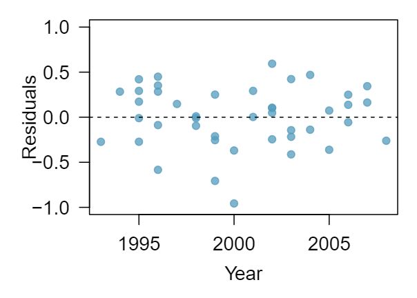
The scatterplot below shows the relationship between logged (natural log) price and year of these trucks, as well as the residuals plot for modeling these data. Comment on which model (linear model from earlier or logged model presented here) is a better fit for these data.
-
The output for the logged model is given below. Interpret the slope in context of the data.
Estimate Std. Error t value Pr\((>|t|)\) (Intercept) -271.981 25.042 -10.861 0.000 Year 0.137 0.013 10.937 0.000
(a) The relationship is positive, non-linear, and somewhat strong. Due to the non-linear form of the relationship and the clear non-constant variance in the residuals, a linear model is not appropriate for modeling the relationship between year and price.
(b) The logged model is a much better fit: the scatter plot shows a linear relationships and the residuals do not appear to have a pattern.
(c) For each year increase in the year of the truck (for each year the truck is newer) we would expect the price of the truck to increase on average by a factor of \(e^{0.137} \approx 1.15\text{,}\) i.e. by 15%.
2. Income and hours worked.
The scatterplot below shows the relationship between income and years worked for a random sample of 787 Americans. Also shown is a residuals plot for the linear model for predicting income from hours worked. The data come from the 2012 American Community Survey. 2
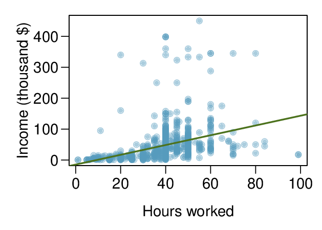
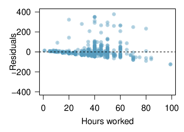
Describe the relationship between these two variables and comment on whether a linear model is appropriate for modeling the relationship between year and price.
-
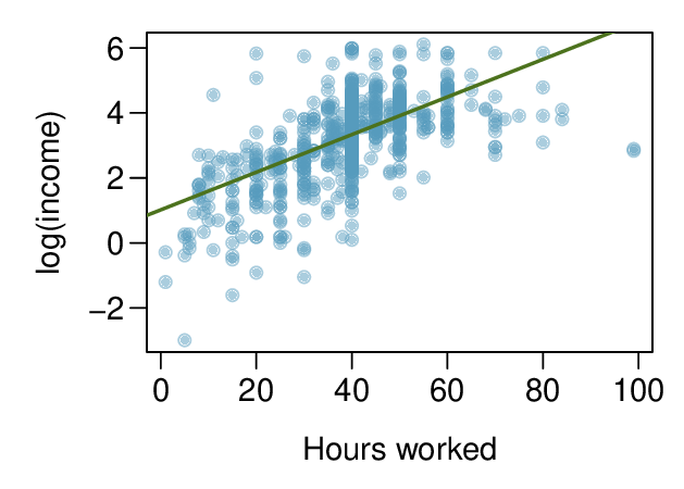
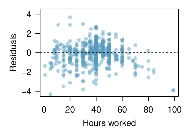
The scatterplot below shows the relationship between logged (natural log) income and hours worked, as well as the residuals plot for modeling these data. Comment on which model (linear model from earlier or logged model presented here) is a better fit for these data.
-
The output for the logged model is given below. Interpret the slope in context of the data.
Estimate Std. Error t value Pr\((>|t|)\) (Intercept) 1.017 0.113 9.000 0.000 hrs_work 0.058 0.003 21.086 0.000
Subsection 8.4.6 Chapter Highlights
This chapter focused on describing the linear association between two numerical variables and fitting a linear model.
The correlation coefficient, \(r\text{,}\) measures the strength and direction of the linear association between two variables. However, \(r\) alone cannot tell us whether data follow a linear trend or whether a linear model is appropriate.
The explained variance, \(R^2\text{,}\) measures the proportion of variation in the \(y\) values explained by a given model. Like \(r\text{,}\) \(R^2\) alone cannot tell us whether data follow a linear trend or whether a linear model is appropriate.
Every analysis should begin with graphing the data using a scatterplot in order to see the association and any deviations from the trend (outliers or influential values). A residual plot helps us better see patterns in the data.
When the data show a linear trend, we fit a least squares regression line of the form: \(\hat{y} = a+bx\text{,}\) where \(a\) is the \(y\)-intercept and \(b\) is the slope. It is important to be able to calculate \(a\) and \(b\) using the summary statistics and to interpret them in the context of the data.
A residual, \(y-\hat{y}\text{,}\) measures the error for an individual point. The standard deviation of the residuals, \(s\text{,}\) measures the typical size of the residuals.
\(\hat{y} = a+bx\) provides the best fit line for the observed data. To estimate or hypothesize about the slope of the population regression line, first confirm that the residual plot has no pattern and that a linear model is reasonable, then use a \(t\)-interval for the slope or a \(t\)-test for the slope with \(n-2\) degrees of freedom.
In this chapter we focused on simple linear models with one explanatory variable. More complex methods of prediction, such as multiple regression (more than one explanatory variable) and nonlinear regression can be studied in a future course.