Section 24 Side-by-Side Gallery
This subsection attempts to survey all the possible items that can be placed into a sidebyside element, in various combinations. While intended to be exhaustive across contents, it does not test all possibilities, and is not meant to be instructive (see Section 23 for that). The layout is identical for each sidebyside, 5% margins, panel widths of 40% and 45%, leaving 5% for the space between the panels. The vertical alignment is left at the default, top.
We begin with “simpler” atomic items. If necessary, comments follow each.
Vestibulum sit amet est non lacus accumsan iaculis aliquam nec leo. Maecenas placerat consequat quam, a lobortis odio convallis vitae. Curabitur sagittis, risus non suscipit pulvinar, enim tortor posuere purus, id dignissim sapien sapien non dui. Vestibulum ultrices, enim a ornare consectetur, nisl est iaculis arcu, eget scelerisque nunc magna a nisl. Vestibulum vestibulum ante sit amet ex vulputate, eu facilisis sapien tempor.
Aliquam dui nisi, pharetra id enim vel, imperdiet laoreet risus. Nunc convallis elit eu erat imperdiet tincidunt. Sed eget augue et nunc mollis tempor. Suspendisse luctus elit non lorem scelerisque, nec lacinia lectus dictum.
Vivamus ut orci nisl. Donec eleifend ultricies tortor, a pellentesque neque dignissim in. Praesent maximus, augue eu pretium auctor, dolor quam feugiat augue, ut vulputate nunc eros vitae massa. Phasellus quis ante quis est venenatis dapibus eget luctus ipsum.
<p> (left), <stack> (right)Blue
Red
Green
Purple
Violet
Brown
-
Vestibulum sit amet est non lacus accumsan iaculis aliquam nec leo. Maecenas placerat consequat quam, a lobortis odio convallis vitae.
Curabitur sagittis, risus non suscipit pulvinar, enim tortor posuere purus, id dignissim sapien sapien non dui.
-
Vestibulum ultrices, enim a ornare consectetur, nisl est iaculis arcu, eget scelerisque nunc magna a nisl.
Vestibulum vestibulum ante sit amet ex vulputate, eu facilisis sapien tempor.
<ol> with simple items, a <ul> with items with paragraphsn_loops <- 10
x.means <- numeric(n_loops)
for (i in 1:n_loops){
x <- as.integer(runif(100, 1, 7))
x.means[i] <- mean(x)
}
x.means
pi@rpi ~$ gcc -o intAndFloat intAndFloat.c
pi@rpi ~$ ./intAndFloat
19088743 (integer) and 19088.742188 (float)
pi@rpi ~$
<program> and a <console>Note that these two chunks of verbatim text will very likely exceed the right side of a too-skinny panel. We have severly edited these two examples from previous appearances just to fit here.
To A Friend Whose Work Has Come To Nothing
| Organism | Classification |
| Trout | Fish |
| Monkey | Mammal |
| Crow | Bird |
| Crimini | Fungus |
| Bee | Insect |
<poem> and a <tabular>A tabular can exceed the width of its panel in print, while in HTML it may reflow individual cells to stay within a panel, depending on their contents.
Vestibulum sit amet est non
    lacus accumsan iaculis
aliquam nec leo. Maecenas
placerat consequat quam, a
lobortis odio convallis
vitae.
Vestibulum sit amet est non
    lacus accumsan iaculis
aliquam nec leo. Maecenas
    placerat consequat quam,
a lobortis odio convallis
        vitae.
<pre>, and a <pre> employing <cline>Be aware that the lines of pre can spill outside of its panel without any word-wrapping. So you may need to vary panel widths or rearrange line breaks manually. Page width is a scarce resource.
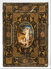
<image>, twiceImages will scale to fill their panel's width. We provide no services to change the aspect ratio of your images, that is your responsibility to accomplish elsewhere. This rectangular image will have slightly different widths, and so will be slightly deeper in the right panel (at a 45:40 ratio). Remember, vertical alignment is at the top.
Now we turn to “captioned” items: figure, table, listing, and the anomalous “named list”, list, whose future is uncertain. We test subcaptions here. Note that many different atomic items can go in a figure, and largely they will behave in a sidebyside much as they do when placed in a panel all by themselves (i.e. captionless).
| Organism | Classification |
| Trout | Fish |
| Monkey | Mammal |
| Crow | Bird |
| Crimini | Fungus |
| Bee | Insect |
<figure> and a <table>n_loops <- 10
x.means <- numeric(n_loops)
for (i in 1:n_loops){
x <- as.integer(runif(100, 1, 7))
x.means[i] <- mean(x)
}
x.means
We have named list of colors.
Blue
Red
Green
Purple
Violet
Brown
That was nice.
<listing> and a <list>Now we have some more interactive elements.
Videos can be placed quite compactly for HTML output, but we display a fair amount of information for a YouTube video in print, and therefore two videos side-by-side gets pretty crowded. The examples above have the bare minimum amount of information attached (not in an overarching figure), and the bare amount which which is displayed in print. We could relax our common spacing to make it a bit better. Read about “side-by-side” groups (sbsgroup) and experiment with stacking several sub-captioned videos into an overall captioned figure (Subsection 23.15). For other examples see Section 17 and Subsection 26.2.