Responsive Web Design
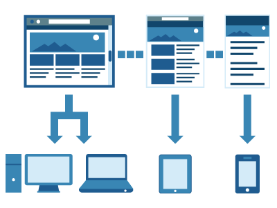
Responsive Web Design is about designing a website that provide optimal viewing experience for the users: easy to read and navigate with a minimum resizing, panning, and scrolling, no matter what devices they used to view the site (from mobile phones to desktop computer monitors). A website designed with Responsive web design adapts the layout to the viewing environment by using fluid, proportion-based grids, flexible images, and CSS3 media queries (an extension of the @media rule).
A responsive web design uses "media queries" to figure out what resolution of device it's being served on. Flexible images and fluid grids then size correctly to fit the screen. When you view this page on a desktop browser, try making your browser window smaller. The content will shrink. On touch devices, the page content is resize accordingly. The benefits are obvious: you build a website once, and it works seamlessly across thousands of different screens.

(credit to Paul Olyslager)
(credit to Dan Berthiaume - CMS Wire)

(credit to Kayla Knight - Smashing Magazine)
Resources:
- Responsive web design guidelines and tutorials - The Smashing Editorial
- John Polacek website to learn more about Responsive Web Design.
- A List Apart - Responsive web design.
- Designing for a responsive web with Heuristic methods - Design Reviver.
- Application by ProtoFluid - Rapid prototyping of adaptive CSS and Responsive design. You can test the website for free using ProtoFluid.
- Responsive design testing tool - Matt Kersley. Test your responsive design website while you design and build them.
- Best website examples of designs with responsive design.
Using Media Queries to Create Fluid Website for Different Devices
Using media queries allow the page to use different CSS style rules based on the characteristics of the device the sire is being displayed on, most commonly the width of the browser.
Some designers would also prefer to link to a separate style sheet for certain media queries, which is perfectly fine if the organizational benefits outweigh the efficiency lost. For devices that do not switch orientation or for screens whose browser width cannot be changed manually, using a separate style sheet should be fine.
<!--normal-->
<link rel="stylesheet" href="../../assets/stylesheet.css" type="text/css">
<!-- mobile -->
<link rel="stylesheet" type="text/css" media="screen and (min-width: 320px) and (max-width: 480px) " href="../../assets/mobile.css"/>
<!-- tablet -->
<link rel="stylesheet" type="text/css" media="screen and (min-width: 481px) and (max-width: 955px)" href="../../assets/tablet.css"/>
<!-- 960 -->
<link rel="stylesheet" type="text/css" media="screen and (min-width: 956px)" href="../../assets/960.css"/>
You might want, for example, to place media queries all in one style sheet for devices like the iPad. Because such a device can switch from portrait to landscape in an instant, if these two media queries were placed in separate style sheets, the website would have to call each style sheet file every time the user switched orientations. Placing a media query for both the horizontal and vertical orientations of the iPad in the same style sheet file would be far more efficient.
Another example is a flexible design meant for a standard computer screen with a resizable browser. If the browser can be manually resized, placing all variable media queries in one style sheet would be best.
Nevertheless, organization can be key, and a designer may wish to define media queries in a standard HTML link tag:
<link rel="stylesheet" media="screen and (max-width: 600px)" href="small.css" />
<link rel="stylesheet" media="screen and (min-width: 600px)" href="large.css" />
<link rel="stylesheet" media="print" href="print.css" />
Resources:
- CSS Media Queries & Using Available Space (from CSS-Tricks)
- CSS3 Media Queries (from Web designer wall)
- Using CSS3 Media Queries (article from Smashing Magazine)
- CSS media queries (from Mozilla Developer Network)
- CSS Media Queries Overview (by Niels Van Hove)
Using JavaScript as a back-up
Another method that can be used is JavaScript, especially as a back-up to devices that don’t support all of the CSS3 media query options. Fortunately, there is already a pre-made JavaScript library that makes older browsers (IE 5+, Firefox 1+, Safari 2) support CSS3 media queries. If you’re already using these queries, just grab a copy of the library, and include it in the mark-up: css3-mediaqueries.js.
In addition, below is a sample jQuery snippet that detects browser width and changes the style sheet accordingly — if one prefers a more hands-on approach:
<script type="text/javascript" src="http://ajax.googleapis.com/ajax/libs/jquery/1.4.4/jquery.min.js"></script>
<script type="text/javascript">
$(document).ready(function(){
$(window).bind("resize", resizeWindow);
function resizeWindow(e){
var newWindowWidth = $(window).width();
// If width width is below 600px, switch to the mobile stylesheet
if(newWindowWidth < 600){ $("link[rel=stylesheet]").attr({href : "mobile.css"}); } // Else if width is above 600px, switch to the large stylesheet else if(newWindowWidth > 600){
$("link[rel=stylesheet]").attr({href : "style.css"});
}
}
});
</script>
There are many solutions for pairing up JavaScript with CSS media queries. Remember that media queries are not an absolute answer, but rather are fantastic options for responsive Web design when it comes to pure CSS-based solutions. With the addition of JavaScript, we can accomodate far more variations. For detailed information on using JavaScript to mimic or work with media queries, look at “Combining Media Queries and JavaScript.”
