Div Tags
The <div> tag is nothing more than a container for other tags, similar like the <body> tag. Div elements are block elements and work behind the scenes grouping other tags together. Div tags are the most important and versatile layout or structural element in HTML. You should plan to design all your Web pages with a div structure and not use a table structure for layout.
When HTML first began, web designer only had two options: using table layout or frames. The div element provides a third alternative and fluid design, since a div can contain any or every other type of html element within its beginning and ending tag.
There are five attributes you can use with div tag:
- id
- width
- height
- title
- style
What are frames?
Frames allow for multiple ".html" documents to be displayed inside of one browser window at a time. This means that one page has no content on it, but rather tells the browser which web pages you would like to open. With CSS, frames have become outdated. Below is an example of how a web page created using frames:


Instructor Note:
Please do not use frames to create a web page anymore. Frames are difficult to work with and it's ancient history. If you notice the sample above, the title page has more content, but can't display everything when you have a smaller window. That is one of the issues of using frames. Another issue with frames is when your users want to print the page, they need to specify which frame where the page resides that they want to print.
Tables
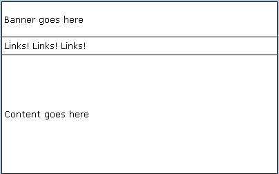
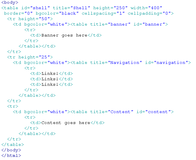
Below is an example of how you would write the HTML code to create a web page using tables.


Here is another web page example using table layout:


Problems with Table Tags for Layout
While the table tag may appear to be an easier structural element to layout your Web pages, there are several reasons to avoid table tags for layout.
Consider this long list of issues with tables:
- Editing the content (for example, adding or taking away some text) on tables in Dreamweaver or elsewhere usually causes the tds (cells) or rows to change size. This will then require you to fix the size, row by row, or cell by cell.
- Tables don't degrade gracefully (i.e., work well) on browsers that are text-only or devices like cell phones that have small screen browsers.
- Tables load slower than divs with CSS positioning.
- Positioning ability with tables is limited.
- Browsers inconsistently display table properties. This is an issue with divs as well, but the inconsistencies are not on the magnitude of the problems displaying tables.
- All the tds of the table require height and width adjustments to display content properly, otherwise tables from page to page will have different content placement. Visual consistency is not easy to maintain with tables throughout your site.
- Correcting the inconsistencies in table display routinely requires page by page adjustment of the tables which is time consuming.
- Presentational data and content are mixed in the table (not separate as they are with div tags) which means the page will load slower with table layout, and your Web page file sizes will tend to be larger.
- Tables load the content into the browser from left to right and top to bottom. There is no way to control the display order.
- There is more HTML code required to construct a table which increases your ratio of code to content on the page. This can negatively affect your search engine placement with some search engines, including Google.
- Tables do not print well.
- The Web standard layout element is the div tag, not the table tag. Modern browsers are designed to render based on Web standards.
In other words, if it wasn't clear from that list above, follow this one rule: don't use tables to layout your Web pages.
Div tags are industry-standard and you will not be taken seriously as a Web designer among your designing peers if you continue to use table tags for layout. Check out this div layout example in a 2 columns and 3 columns to see how they work. Div tag can be placed at the insertion point, after the start of a tag, or before a tag.
Instructor Note:
You can still use tables, just use them for tabular data as they were intended, and not for Web page layout. I also like to use them to contain form fields on form pages because forms lend themselves to the row and column separation that tables were meant for.
Positioning Divs
Div tags can be positioned in four ways: static, relative, absolute and fixed. The choice static is the default for all items and behaves very much like relative positioning. (If you don't include a position property for a div, the default is assumed to be position: static.)
Check out this div positioning example and view the embedded CSS source to understand how they work.
Instructor Note:
When you view the link above, be sure to change the size of your browser window and scroll through the text to see how the three types of divs work on a page and with each other. This is a great demonstration of how they work!
Fixed positioning is a novelty (i.e., rarely used) when it comes to placing divs because fixed divs stay fixed in place in the browser window. In other words, when you scroll other content, they will still remain in place so that other content will scroll above or below them. This can pose a serious problem in a small viewport (like on a mobile device) because the fixed div will be stuck in one place and likely take up a significant portion of the viewable area on the device's browser so the user cannot see content around it.
Important characteristics:
- Rarely used since they always stay in one place in the browser window
- Cannot be floated (because they don't interact with other divs)
- Cannot have margin adjustments (again, because they don't interact with other divs)
- Can use positioning properties (like z-index, top, left, etc.)
Absolute Positioning
Absolute positioning is used to place divs in one immobile spot on the page. Absolute positioned divs are set outside the normal text flow of the page, thus they do not interact with each other -- they don't position off each other nor can you use margin to push one away from another. This positioning works well for fixed-height layouts.
However, fixed-height layouts are very rare. Fixed-height means all the content on all the pages of a site have a set height. Bear in mind, fixed-width layouts are the dominant layouts, but fixed-height is very restricting to designers. The implication with fixed-height is that you will have the exact same amount of content (text and images) on every page, or at least very close so it doesn't leave a lot of extra space.
Important characteristics:
- Sometimes used with background divs (ones that hold the background image, gradient image or other colors)
- Good to use in a situation when you want to put text on top of an inserted image
- Cannot be floated (because they don't interact with other divs)
- Cannot have margin adjustments (again, because they don't interact with other divs)
- Can use positioning properties (like z-index, top, left, etc.)
- You can draw an AP div in a page in Design view of Dreamweaver.
Static Positioning
Static positioning is used to ensure divs will interact with one another so you can create flexible columns, flexible height, and use margins to push them away from one another. This is the default and most common type of div positioning used.
Important characteristics:
- Most common type of div
- This is the default position type and does not have to be indicated in the style with divs
- Can be floated and cleared
- Can have margin adjustments
- Cannot use positioning properties (z-index, top, left, etc.) -- this is the difference between relative and static positioning
Relative Positioning
Relative positioning is used to ensure divs will interact with one another so you can create flexible columns, flexible height, and use margins to push them away from one another. The big difference between relative and static positioned divs is that you can use the positioning properties left, top and right and z-index with relative positioned objects, but not with static objects. (You can still use margin-left, margin-top, etc., with both for the same effect.) Otherwise though, the differences are very minor with these two.
Other characteristics:
- Useful on the container div in a fixed width page layout, especially if you are using an absolute div in the background, or whenever you plan to stack this div with others (using z-index)
- Can be floated and cleared
- Can have margin adjustments
- Can use positioning properties (z-index, top, left, etc.)
Check out this W3Schools positioning example to get a better feel for what these types will do given the same properties. For the best results, make your browser window viewport small so you can scroll the content up and down to see what happens.
It is industry-standard and most common to use relative or static positioning and NOT absolute positioning with your divs to avoid "the footer problem" -- this is a situation in absolute positioning in which the variable amount of content from page to page causes the footer to appear too far (or too close) to the content above it. Check out this past student project to see the footer problem with absolute positioning and be sure to click from page to page and watch the footer (where the copyright info is contained at the bottom of each page). Since this student used absolute positioning for his divs, the footer is effectively stuck in place from page to page. On pages where there is very little content, the footer seems to be very far from the divs above it. If he had used relative or static positioning instead, the footer would rise up to meet the div above it.
The following links can help you understand div tags and positioning better:
- Barely Fitz Designs: Learn CSS Positioning in 10 Steps
- AutisticCuckoo site: Relative-Absolute
- A List Apart: CSS Positioning 101
Columns with Divs
Making columns with relative divs is easy. For a three column layout, here's the HTML that goes in the body section:
- <div id="container">
- <div id="leftcolumn"></div>
- <div id="middlecolumn"></div>
- <div id="rightcolumn"></div>
- </div>
Here's the minimum CSS that will make it into three columns:
- #container { width: 900px; }
- #leftcolumn { position: relative; float: left; width: 300px }
- #middlecolumn { position: relative; float: left; width: 300px }
- #rightcolumn { position: relative; float: left; width: 300px }
If you float each of the divs left, they will stack up next to each other, one after another. As long as their total width doesn't exceed the container, it should work perfectly. (Position set to relative is a good idea when designing sites for older browsers since they can be confused by the div's positioning if you don't state it when using the float property.)
Bear in mind, you can make any number of columns with this approach as long as their total width is less than or equal to their container width.